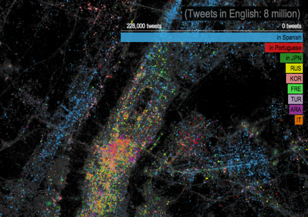
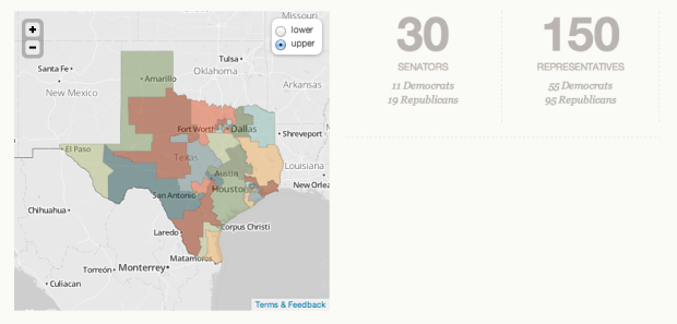
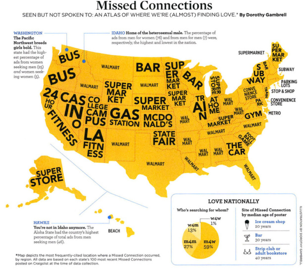
• Mapping data over time can be challenging, especially when you have a lot of data to load in the beginning. Torque, the new open source project by CartoDB, is a step towards making the process easier.

    Torque allows you to create beautiful visualizations with big temporal datasets by bundling HTML5 browser rendering technologies with a generic and efficient temporal data transfer format created using the CartoDB SQL API. Torque visualisations work on desktop and ipads, and work well on temporal datasets with hundreds of thousands or even millions of datapoints.

    It’s still in the early stages but should be one to keep an eye on.

    Check out this map for a sense of what Torque can help you do. The map animates historical edits to OpenStreetMap in Madrid. Also this. [Thanks, Carlos]

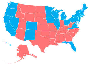
  • In case you’re interested in learning how much you suck at US state geography, here’s a game to help. The goal is to match up states on the blank country map, and you end with an average error in miles. I did not do well. [via kottke]

  • Jeffrey Heer on visualization for interactive exploration:

    We were visualizing the results of a chain of models, including text modeling and dimensionality reduction. These models can sometimes give rise to misleading results, which we then spotted in the visualization. This result led us to consider how visualizations must do more than just turn data into images — it is vital that visualizations support interactive exploration and verification, so that one can not only uncover new hypotheses but begin the process of assessing their credibility. Another result of this work is that the insights gained from the visualizations enabled us to design better machine learning methods, such that our mathematical models of textual similarity better matched the judgments of human experts.

    The rest of the Scientific American article is worth reading, mostly for the other quotes from Heer and Ben Shneiderman.

  • Yes, this is real. Israeli Prime Minister Benjamin Netanyahu used a bomb-shaped diagram to illustrate the line that must be drawn to prevent Iran from creating nuclear weapons. No doubt this a serious matter, but I’m not sure the drawing lends value to the message.

  • In the same spirit of the quick update site on Olympic records a couple of months ago, the Guardian and Real Clear Politics tell you if Obama is still president and if Romney is president. Each balloon represents a state, sized by electoral votes, and the number of balloons in each hand represent projected voting, based on current polls. Straight to the point.

  • Hey, I think it’s election season, and you know what that means. It’s time to dig into campaign finance data from the Federal Election Commission. The Washington Post gives you a view into the amount of money raised and spent in both camps, where it’s coming from and where it’s going. They start with the high-level aggregates, and as you scroll down, you get the time series, followed by the breakdowns for money raised.

    The spending categories at the bottom are the most interesting bit. They cover advertising and mail, down to consulting and events. Payroll was a lot higher than I would’ve thought.

  • In the latest Chrome experiment, Google mapped cloud coverage around the world in Cloud Globe. The interactive animation shows coverage from July 1, 2010 to September 12, 2012, with a globe that you can move around as expected and a timeline on the bottom that indicates high levels of coverage. As the animation plays through, storms are highlighted with a circle and pointer. Finally, you can turn on the vegetation layer, and the green regions happen to be under the clouds. Imagine that.

  • Jo Wood, a professor of visual analytics, visualized five million bike rides using data from Barclays Cycle Hire.

    In the animation (see below) the least travelled routes begin to fade out after about 15 seconds – “like a graphic equaliser,” says collaborator Andrew Huddart, also at City University. Around the 1-minute mark, structure emerges from the chaos and three major systems become clear: routes around, and through, the lozenge-shaped Hyde Park in the west, and commutes in and out of King’s Cross St Pancras in the north and between Waterloo and the City in the east.

    Each arc represents a trip from point A to point B (obviously not a true path or we’d see roads), and flow direction indicates which way people went the most between the two. [via The Guardian]

  • Now that you know how color labeling changes by gender, I bet you’re wondering how it varies by language. Dave Oleson and Dawn Ho had a look in this simple color wheel. You can hover over colors for labels by country, and you can search for colors via text box.

    On the whole, it looks like countries have extremely similar conceptions of color. Type “blue” into the search box, click on the different countries, and you can see the overlap. There are outliers though. Some narrower colors – such as “purple” – are used much more in Japan than in Russia. The use of certain modifiers such as “light” are used pretty uniformly across the color spectrum in English, but much more prevalently in the Blue-Green region in Japanese.

    I wish there were a better way to see differences between countries. Luckily, you can download the data and have a look yourself. [Thanks, Dave]

    Update: When you search for a color and then click on the flags, you can see the differences between countries.

  • Visualization is a great way to explain and describe data to people who don’t know data. Good visualization lets the data speak, as they say. But this doesn’t mean you shove your data into a program or stick it into a presentation template and expect others to care. You still have to analyze and explore the data yourself, find what’s interesting, and you present that.

    “But how do I make this graphic look cool?”

    Tell people something more about the data that isn’t just, “Here’s the data.”

    You could use an obscure visualization method in place of your standard one, but what’s the point if you just say the same thing? You might catch an eye or two because of the novelty, but those eyes will bolt just as quickly if there isn’t any substance.

    So instead of showing the same non-message in different ways, you iterate. You cut and explore the data in different ways, and you make a lot of graphics that never see the light of day. Many will be ugly, and most of them will be uninteresting, but you might also find something worthwhile. Let that something guide you.

  • I’m so glad there are people like Jake Porway in the world. The founder and executive director of DataKind gives his quick pitch on “using data in the service of humanity.”