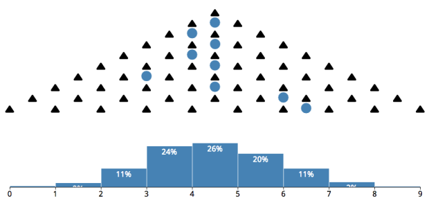
• How many people does it take for there to be a 50% chance that a pair in the group has the same birthday? Only 23 people. What about a 99% chance? Maybe even more shocking: 57 people. This is the birthday problem, which every undergrad who’s taken a stat course has seen. Steven Strogataz explains the logic and calculations.

    Intuitively, how can 23 people be enough? It’s because of all the combinations they create, all the opportunities for luck to strike. With 23 people, there are 253 possible pairs of people (see the notes for why), and that turns out to be enough to push the odds of a match above 50 percent.

    Incidentally, if you go up to 43 people — the number of individuals who have served as United States president so far — the odds of a match increase to 92 percent. And indeed two of the presidents do have the same birthday: James Polk and Warren Harding were both born on Nov. 2.

    The Johnny Carson clip referenced in the article is worth watching. Carson tries to test the results with the audience, but goes about it the wrong way.

  • Members Only

    You saw how to make basic heat maps a while back, but you might want more flexibility for a specific data set. Once you understand the components of a heat map, the rest is straightforward.

  • My central air conditioner started to suck about a month ago, so I…

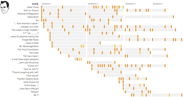
  • Santiago Ortiz visualized every episode of the show in the interactive Lostalgic. It’s a set a four views that shows character occurrences and relationships and the lines they said during various parts of each episode.

    The first view, shown above, is a bar chart vertically arranged by time, where each row represents an act. A profile picture is shown whenever the corresponding character says something. The next two views, the network graph and co-occurrence matrix show interactions between characters, and finally, if you want to relive it all over again, you can choose the reenactment, and the animation will cycle through the characters and scripts.

    I only watched a handful of episodes right before the last one, but realized my efforts to watch all six seasons would be useless, even if I watched 24/7 before the finale. I got to the part where they found a dead person in a tree. So I’m only appreciating this from the technical side. I suspect fans of the show will love it. [Thanks, Santiago]

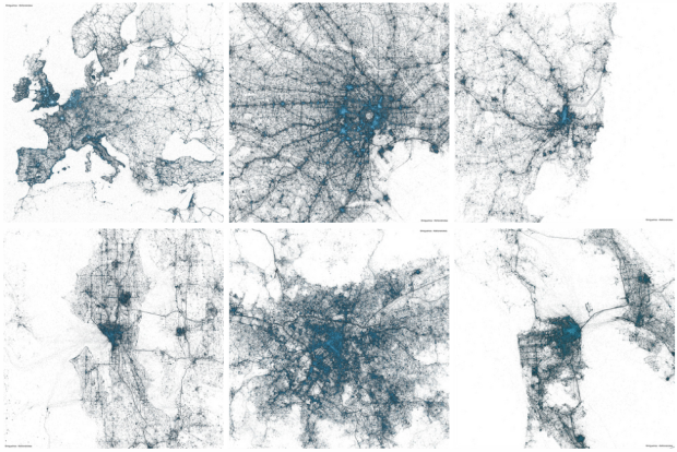
  • Mapping data over time can be challenging, especially when you have a lot of data to load in the beginning. Torque, the new open source project by CartoDB, is a step towards making the process easier.

    Torque allows you to create beautiful visualizations with big temporal datasets by bundling HTML5 browser rendering technologies with a generic and efficient temporal data transfer format created using the CartoDB SQL API. Torque visualisations work on desktop and ipads, and work well on temporal datasets with hundreds of thousands or even millions of datapoints.

    It’s still in the early stages but should be one to keep an eye on.

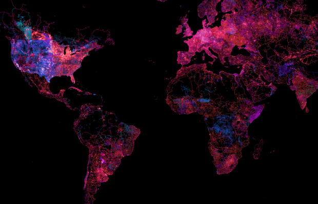
    Check out this map for a sense of what Torque can help you do. The map animates historical edits to OpenStreetMap in Madrid. Also this. [Thanks, Carlos]

  • In case you’re interested in learning how much you suck at US state geography, here’s a game to help. The goal is to match up states on the blank country map, and you end with an average error in miles. I did not do well. [via kottke]

  • Jeffrey Heer on visualization for interactive exploration:

    We were visualizing the results of a chain of models, including text modeling and dimensionality reduction. These models can sometimes give rise to misleading results, which we then spotted in the visualization. This result led us to consider how visualizations must do more than just turn data into images — it is vital that visualizations support interactive exploration and verification, so that one can not only uncover new hypotheses but begin the process of assessing their credibility. Another result of this work is that the insights gained from the visualizations enabled us to design better machine learning methods, such that our mathematical models of textual similarity better matched the judgments of human experts.

    The rest of the Scientific American article is worth reading, mostly for the other quotes from Heer and Ben Shneiderman.

  • Yes, this is real. Israeli Prime Minister Benjamin Netanyahu used a bomb-shaped diagram to illustrate the line that must be drawn to prevent Iran from creating nuclear weapons. No doubt this a serious matter, but I’m not sure the drawing lends value to the message.