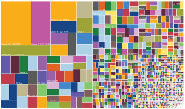
The Guardian posted a small collection of useless infographics. It kind of looks like my suggestion inbox.
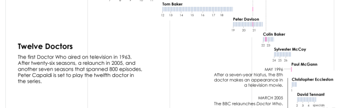
I have yet to see a full episode of Doctor Who, “the longest-running…
The Guardian posted a small collection of useless infographics. It kind of looks like my suggestion inbox.
The title caption reads: “A classmate was caught using his phone in maths. The teacher took his phone and set a passcode. He gave him this back with his phone and said good luck unlocking it.”
Hopefully the student was the guy who sits in the back and goofs off because the class is too easy. [via @FryRsquared]
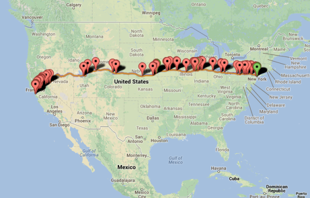
BreweryMap, a Google Maps mashup and mobile app, provides two main functions. The first is that it tells you where the nearest brewery is so that you’ll never go thirsty again. The second and far more important function is that you can punch in two addresses, and BreweryMap tells you all the breweries that are on the way from point A to point B.
Let your fantasy become a reality. Just make sure to spread out your trips.
 John Nelson of IDV Solutions strung together satellite imagery for dramatic animated GIFs.
Having spent much of my life living near the center of that mitten-shaped peninsula in North America, I have had a consistent seasonal metronome through which I track the years of my life. When I stitch together what can be an impersonal snapshot of an entire planet, all of the sudden I see a thing with a heartbeat. I can track one location throughout a year to compare the annual push and pull of snow and plant life there, while in my periphery I see the oscillating wave of life advancing and retreating, advancing and retreating. And I’m reassured by it.
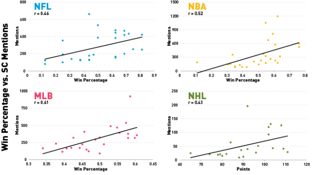
Patrick Burns for Deadspin watched 23,000 minutes of SportsCenter, keeping track of the specifics of what the show covered over the year, such as what teams, players, and player descriptions.
The graphic above, by my fellow Deadspinner Reuben Fischer-Baum, shows the correlation between winning percentage—or points, in the case of the possibly nonexistent NHL—and SportsCenter mentions for teams across the four major leagues.* Our focus here is on just what about a team attracted the attention of SportsCenter’s all-seeing eyebeams over the course of a normal season. Our conclusion is that there was a reasonably strong correlation between winning percentage and SportsCenter mentions. It was statistically significant for all leagues except the NHL.
Unfortunately, they did not track how many times commentator predictions were completely wrong.
Mike Pelletier experimented with quantified emotion in his piece Parametric Expression. This is what you get when you break facial expressions and mannerisms into bits: part human, part creepy.
[via Boing Boing]
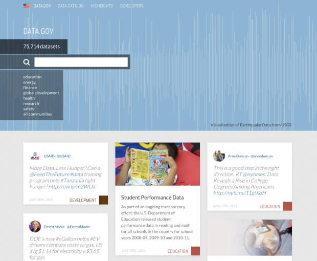
After budget cuts a couple of years ago, I assumed Data.gov was all but dead, but apparently there’s a new site in the works.
The original version of Data.gov was hard to use, and you rarely found the data you wanted. I always ended up on Google and landed on the department’s source instead. It looks like they improved the interface, and their aim is towards a community built around the data where people can share projects and analyses.
However, the data available on the site still looks slim and dated, which was a challenge with the original version. I mean the homepage says you can search 100s of APIs and over 75,000 datasets, but then click over to the Data Catalog and it says only 409 datasets found. So there’s still work to be done.
I’m glad the project is still alive though. We’ll have to see where this goes.
I’m not entirely sure how to interpret this music video from Franz Ferdinand, but I’m taking it as a critique on internet culture, with less-than-meaningful charts playing a part. There are lots of colors, geometric shapes, and pictograms flying around the band, with no information attached. I guess that’s about right. [Thanks, @augustjoki]
The people I follow on Twitter almost never use emojis, but every now and then I peek into trending topics or tweets near me, and it’s a completely different experience. People use emojis. A lot. The emojitracker, a small project by the Rocket Workshop, does exactly what the name says. It keeps track of the emojis people use on Twitter in real-time.
Warning: The view might cause a seizure.
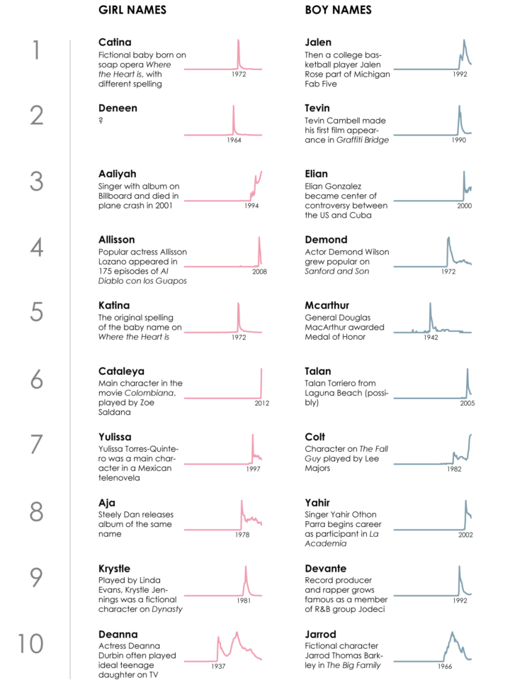
Names are incredibly personal things. It’s how we identity ourselves. We associate others,…
GE has a short video series on a fictional town called Datalandia where machines talk to each other and data is exchanged in a hero-like fashion. “This summer the most cliched movie plots won’t be coming to a theatre near you. This summer the most cliched movie plots are about to collide with big data!”
It’s like IBM’s Smarter Planet commercials combined with Team America. [Thanks, Chris]

Erica Fischer, known around these parts for her dot maps, describes the lessons she learned (along with practical tips) from mapping millions of tweets to be visible on many devices. The views above show what you get when you vary dot size when you zoom in to a dot-filled map.
The first thing that becomes clear when you start drawing the same dots at different scales is that it doesn’t look right if you just scale the dots proportionately as you scale the area. Each time you zoom in on a web map, only a quarter of the area that was visible before is still visible, but if you match that and draw the dots four times as big as you did at the previous zoom level, the image is very crowded and fuzzy by the time you get zoomed in all the way. The Gnip maps instead double the area of the dots for each level you zoom in. Here’s what it looks like to zoom in on Times Square with dots that quadruple, double, or don’t change size at all with each zoom level.
Louise Ma, along with Chris Parker and Lola Kalman, started a six-part short video series on what love looks like. Above is the first one. This is part of an ongoing project that Ma started last year, and it’s still going strong.
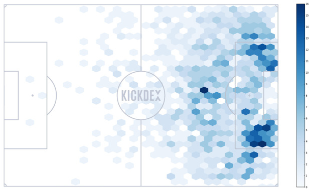
Using Opta data for assists in the Premier League, Kickdex made this straightforward chart to look at where assists typically come from on the field.
It is clear that to rack up the assists, a direct style isn’t the way to go. Only 14% of all assists come from long balls, and 29% from crosses (many of which are also classified as long balls). Over two thirds of all assists are short, precision passes made from just in front of the box and wide within the box. – See more at: http://blog.kickdex.com/post/56157934804/the-perfect-assist#sthash.lwE8wHgc.dpuf
As you might expect, most of the passes are aimed towards the goal. [via The Daily Viz]
Artist Charles Sowers specializes in public art works and display of physical phenomena. In Windswept, Sowers displays wind patterns in the actual space.
Read More
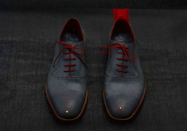
Inspired by The Wizard of Oz, where Dorothy clicks her heels to get home, artist Dominic Wilcox created “No Place Like Home,” a pair of GPS shoes to show you the way.
Read More
 Visualize This: The FlowingData Guide to Design, Visualization, and Statistics (2nd Edition)
New tools, refined process.


