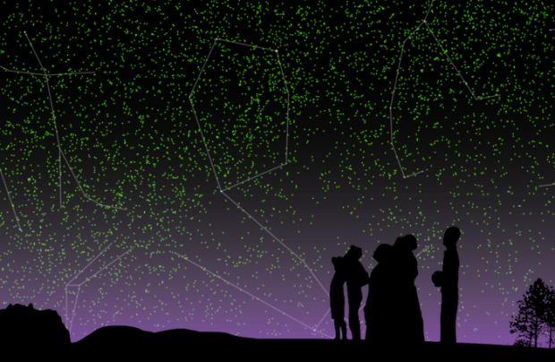
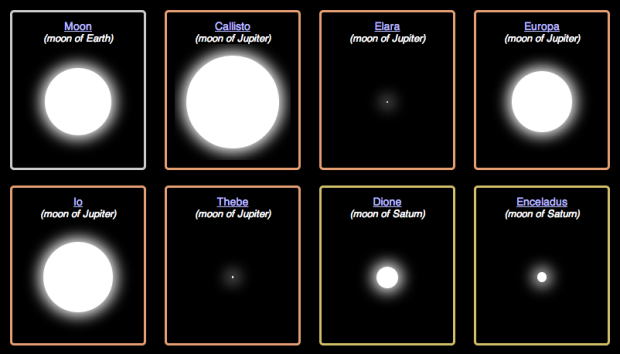
In a beautiful rendition of the galaxy, Google visualized 100,000 stars, starting at the sun and out to a view of the Milky Way. Start with the tour, which takes you through an overview of what there is to see, and then explore on your own. Specifically, once you zoom out over four light years away from the sun, you start to see other known stars. Click on the labels for information and a closer look at what looks like flaming balls of lava. [via @pitchinc]
-
-
-
-
Since 2000, the Hewlett Foundation has made over 7,000 grants summing $3.86 billion, to support communities around the world. Periscopic broke it down by area and amount. Each section is a heat map with years on the horizontal and amount on the vertical. The darker the shade of green, the more grants given that year for the corresponding amount. Click on a rectangle, and you can see the details of any individual grant. [Thanks, Kim]
-
-
-
RStudio, the folks behind the IDE for R released last year, continues to expand their offerings for current and future R users. Shiny is RStudio’s most recent release, and it aims to make R web applications easier to make and share.
The main advantage is that you can create user interfaces that show R output, without HTML and JavaScript. There are essentially two parts to each app that you write: the client and the server. You load the Shiny package, create a client and server, and you’re off to the races.
However, don’t get too excited about R on the Web yet. The apps are meant to run locally, so to share an application with someone, you have to send them the code for them to run on their own. RStudio is working on a paid service that lets you host your apps online. Or, because Shiny is open source, you can try running it on your own, if you like.
-
-
If you go to the Facebook page for Mitt Romney, note the number of likes, wait a few seconds, and then refresh the page. The number of likes is decreasing fast enough that you can see the change over a short period of time. Disappearing Romney charts the change in real-time.
Tick, tick, tick.
See also Who Likes Mitt, with the quick API hack on github. [via @moebio]
-
-
Meta. Is it people’s interest, or is it actually 50 percent of statistics in the news are worthless numbers that were plugged in to make a story sound more factual?
-
Members Only
When presented with a static graphic, it can be useful to see specific values after you see overall patterns. This tutorial shows you how to add simple interactions to a choropleth map so you can get specifics for regions.
-
I knew things were bad, but I didn’t know they were this bad. Obama has his work cut out for him. [Thanks, @adamsinger]
-
After seeing this post that highlights racist tweets after the election, Floating Sheep took a closer look at the geography. Using an estimate that takes into account number of tweets per state, the southeast came out green.
So, are these tweets relatively evenly distributed? Or do some states have higher specializations in racist tweets? The answer is shown in the map [above] (also available here in an interactive version) in which the location of individual tweets (indicated by red dots) are overlaid on color coded states. Yellow shading indicates states that have a relatively lower amount of post-election hate tweets (compared to their overall tweeting patterns) and all states shaded in green have a higher amount. The darker the green color the higher the location quotient measure for hate tweets.
I wondered about Asian remarks after seeing this, but a quick search was depressing and I stopped. [Thanks, Matt]
-
In 1979, Joy Division released their album Unknown Pleasures, and the cover was an image of readings from a pulsar. That image grew into a cultural phenomenon. With the kick off of the new Visualized conference in New York, this short video explores the growth of the icon. [Thanks, Eric]
-
Amanda Uren has a fun collection of map-like scans from the 11th century. Some of them are geographic, but most of them are more like rough sketches of how the individual saw the area the image represents. It’s like those stereotype maps that people like to make, except no one’s trying to be funny.
-
-
-
By way of Rafa Irizarry from Simply Statistics, a plot of Nate Silver’s probabilities for Barack Obama winning a state versus the percentage of vote in each state, as of midnight EST.
I guess that’s pretty (100%) good. Looks like the folks at Princeton didn’t do half bad either. It’s a win for Obama and a win for statistics. Well, good statistics, at least. (Looking at you, University of Colorado.)
Update: Drew Linzer at Emory and the Huffington Post Pollster also did well. All in all, it was a good night for statistics.