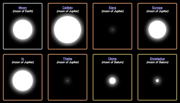
• Membership
  • Newsletter
  • Projects
  • Learning
  • About
  • Member Login
  • The Art of Data Visualization

    May 24, 2013

    Topic

    Visualization  /  Edward Tufte, Jer Thorp, PBS, video

    PBS Off Book’s recent episode is on “the art of data visualization.” It feels like a TED talk — kind of fluffy and warm — with several names and visualization examples that you’ll recognize. No clue who the first guy is though.

  • Sensory augmentation device

    May 23, 2013

    Topic

    Data Art  /  augmentation

    We’ve seen plenty of augmented reality where you put on some digitally-enabled glasses or point your camera phone on something and visuals are overlaid on reality. The augmentation is typically a layer on top.

    Eidos is a student project that tries taking this in a different direction. One piece applies an effect similar to long-exposure photography, and the other sends audio to your inner ear to focus on a subject and drown out ambient noise. See the devices in action in the video below.

    [via FastCo]

  • Meteorites seen falling since 2500BC visualized

    May 22, 2013

    Topic

    Visualization  /  animation, meteorites

    About 35,000 meteorites have been recorded since 2500 BC, and a little over 1,000 of them were seen while they fell, based on data from the Nomenclature Committee of the Meteoritical Society. Carlo Zapponi, a data visualization designer, visualized the latter in Bolides.

    We saw a mapped version of this data a while back, but Bolides takes a time-based approach. A bar chart shows the number and volume of meteorites that have been seen over time, and on the initial load, you get to watch the meteorites fall, one bright orange fireball at a time.

  • A quarter century of satellite imagery

    May 21, 2013

    Topic

    Maps  /  Google, USGS

    In collaboration between USGS, NASA and TIME, Google released a quarter century of satellite imagery to see how the world has changed over time.

    The images were collected as part of an ongoing joint mission between the USGS and NASA called Landsat. Their satellites have been observing earth from space since the 1970s—with all of the images sent back to Earth and archived on USGS tape drives that look something like this example (courtesy of the USGS).

    We started working with the USGS in 2009 to make this historic archive of earth imagery available online. Using Google Earth Engine technology, we sifted through 2,068,467 images—a total of 909 terabytes of data—to find the highest-quality pixels (e.g., those without clouds), for every year since 1984 and for every spot on Earth. We then compiled these into enormous planetary images, 1.78 terapixels each, one for each year.

    Be sure to check out the Timelapse feature on Time.

  • Convergence of Miss Korea faces

    May 20, 2013

    Topic

    Statistics  /  Korea, plastic surgery

    After seeing a Reddit post on the convergence of Miss Korea faces, supposedly due to high rates of plastic surgery, graduate student Jia-Bin Huang analyzed the faces of 20 contestants. Below is a short video of each face slowly transitioning to the other.

    From the video and pictures it’s pretty clear that the photos look similar, but Huang took it a step further with a handful of computer vision techniques to quantify the likeness between faces. And again, the analysis shows similarity between the photos, so the gut reaction is that the contestants are nearly identical.

    However, you have to assume that the pictures are accurate representations of the contestants, which doesn’t seem to pan out at all. It’s amazing what some makeup, hair, and photoshop can do.

    You gotta consider your data source before you make assumptions about what that data represents.

  • Coaches are highest paid public employees

    May 17, 2013

    Topic

    Maps  /  Deadspin

    Deadspin made a straightforward map that shows the highest paid public employee in each state.

    Based on data drawn from media reports and state salary databases, the ranks of the highest-paid active public employees include 27 football coaches, 13 basketball coaches, one hockey coach, and 10 dorks who aren’t even in charge of a team.

  • Ratings of TV shows over time

    May 16, 2013

    Topic

    Statistical Visualization  /  ggplot, Shiny, television

    The quality of television shows follow all kinds of patterns. Some shows stink in the beginning and slowly gain steam, whereas others are great at first and then lost momentum towards eventual cancellation. Using data from the Global Episode Opinion Survey, Andrew Clark visualized ratings over time for many popular shows in an interactive.
    Read More

  • An exploration of recurring jokes on Arrested Development

    May 15, 2013

    Topic

    Network Visualization  /  Arrested Development

    Watch Arrested Development enough and you start to realize there are a lot of recurring jokes in various episodes and seasons. In an interactive by Beutler Ink and Red Edge, Recurring Developments shows what episodes jokes, such as the awkwardness between George Michael and Maeby, happen. And like the visualization this is based on, you can also go the other way around and look at the recurring themes in each episode.

    The interaction is fairly straightforward. Jokes are on the left and a listing of episodes is on the right. Click a joke and orange lines extend to corresponding episodes. Click an episode and lines extend to corresponding jokes.

    Excuse me while I go on an Arrested Development binge on Netflix.

  • Map of live Wikipedia changes

    May 14, 2013

    Topic

    Maps  /  animation, Wikipedia

    On Wikipedia, there are constant edits by people around the world. You can poke your head in on the live recent edits via the IRC feed from Wikimedia. Stephen LaPorte and Mahmoud Hashemi are scraping the anonymous edits, which include IP addresses (which can be easily mapped to location), and naturally, you can see them pop up on a map.

  • Geography of hate against gays, races, and the disabled

    May 13, 2013

    Topic

    Maps  /  Floatingsheep, hate, Twitter

    In a follow-up to their map of racist tweets towards Barack Obama, the folks at Floating Sheep took a more rigorous route to get around the challenges of sentiment analysis. Over 150,000 geotagged tweets against races, sexuality, and disabled were manually classified and mapped.

    All together, the students determined over 150,000 geotagged tweets with a hateful slur to be negative. Hateful tweets were aggregated to the county level and then normalized by the total number of tweets in each county. This then shows a comparison of places with disproportionately high amounts of a particular hate word relative to all tweeting activity. For example, Orange County, California has the highest absolute number of tweets mentioning many of the slurs, but because of its significant overall Twitter activity, such hateful tweets are less prominent and therefore do not appear as prominently on our map. So when viewing the map at a broad scale, it’s best not to be covered with the blue smog of hate, as even the lower end of the scale includes the presence of hateful tweeting activity.

    Hard to believe this stuff is still around. It looks like I might want to stay clear of some parts of Virginia. (The aggregation at the national level seems a bit aggressive. When you zoom in on the map, the polarity between the east and west doesn’t seem so strong.)

    Update: Be sure to read the FAQ before making snap judgements.

  • Data Points: Sample chapter

    May 10, 2013

    Topic

    Data Points

    It’s hard to believe it’s been over a month since Data Points: Visualization That Means Something hit the shelves. Thanks to all of you for the tweets, emails, and pictures of the book in the wild. Every one make me smile, and I’m glad that people are finding it helpful.

    In case you’re still deciding, here’s a sample chapter from the book. It’s Chapter 3 on representing data and should give you a good idea of what to expect. And of course it’s way sexier in print.
    Read More

  • Cicada insects out to play after 17 years

    May 10, 2013

    Topic

    Maps  /  Cicada, New Scientist

    This is my first time hearing about this, probably because it only happens every 17 years. After 17 years of development in the ground (getting nourishment from tree roots), the Cicada insects are starting to swarm on the east coast. Hundreds of millions of them mate, make a lot of noise, and then die. Adam Becker and Peter Aldhous for New Scientist mapped data maintained by John Cooley and Chris Simon from the University of Connecticut to show the cycles of the Cicada.

    There are 17-year broods, which is what’s happening now, and there are 13-year broods, with the next one expected next year in Louisiana.

    Click the play button on the top right to see the various broods appear over time, and be sure to turn on the audio (in the left panel) for added flavor. [Thanks, Peter]

  • Exploration of how much geography is needed in metro maps

    May 9, 2013

    Topic

    Maps  /  Fathom, metro

    Terrence Fradet of Fathom Information Design ponders whether metro maps suffer or benefit by leaving out geography. Geographic accuracy is good, but sometimes it can confuse your audience.

    Just how important is it that metro maps represent geography? This piece came from an interest in how metro maps over the past century have tiptoed between geographic and topological representations—topological meaning to forgo all spatial integrity and instead represent the connectivity of a specific environment.

  • Putting today into perspective

    May 9, 2013

    Topic

    Data Art  /  interactive, perspective

    When you focus on all the small events and decisions that happen throughout a single day, those 24 hours can seem like an eternity. Graphic designer Luke Twyman turned that around in Here is Today. It’s a straightforward interactive that places one day in the context of all days ever.

    You start at today, and as you move forward, the days before this one appear, until today is reduced to a one-pixel sliver on the screen and doesn’t seem like much at all.

  • Page 239 of 392
  • <
  • 1
  • ...
  • 236
  • 237
  • 238
  • 239
  • 240
  • 241
  • ...
  • 392
  • >

Analyze, visualize, and communicate data usefully, beyond the defaults.

Become a member →

Recently for Members

May 8, 2025
When the data is not what it seems

May 1, 2025
Finding the Right Charts

April 24, 2025
Visualization Tools, Datasets, and Resources – April 2025 Roundup

April 17, 2025
Breaking Out of Chart Software Defaults

April 15, 2025
Line Chart with Decorative Neon Accents

Browse by Chart Type See All →

Streamgraph Beeswarm Word Cloud Donut Chart Dot Density Map Square Pie Chart Connected Scatter Plot Gantt Chart Grid Map Box Plot

Browse By Topic

  • Visualization

    Seeing data

  • Maps

    Seeing geographic data

  • Infographics

    Explaining data

  • Networks

    Connecting data

  • Statistics

    Analyzing data

  • Software

    Working with data

  • Sources

    Getting data

  • Design

    Making data readable

Get the Book

Visualize This: The FlowingData Guide to Design, Visualization, and Statistics

Available now.

Order: Amazon / Bookshop

Made by FlowingData

  • The Process

  • Data Underload

  • Chart Everything

  • Guides

  • Books

  • Shop

  • About
  • Contact
  • Newsletter
  • LinkedIn
  • Instagram
  • Bluesky
  • RSS
Copyright © 2007-Present FlowingData. All rights reserved.