
We heard a little bit about The Upshot last month. Now we get to see it. From editor David Leonhardt on what the site is about:
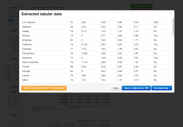
One of our highest priorities will be unearthing data sets — and analyzing existing ones — in ways that illuminate and explain the news. Our first day of material, both political and economic, should give you a sense of what we hope to do with data. As with our written articles, we aspire to present our data in the clearest, most engaging way possible. A graphic can often accomplish that goal better than prose. Luckily, we work alongside The Times’s graphics department, some of the most talented data-visualization specialists in the country. It’s no accident that the same people who created the interactive dialect quiz, the deficit puzzle and the rent-vs-buy calculator will be working on The Upshot.
Hey I’m on board with any site where Amanda Cox introduces statistical models.
FiveThirtyEight is still evolving, and I suspect The UpShot to do the same, so it should be fun to see which way each goes (and what other sites come out of it). For now though, I’m just happy that we get to see this statistics-ish thing happen.
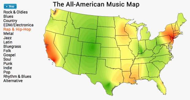
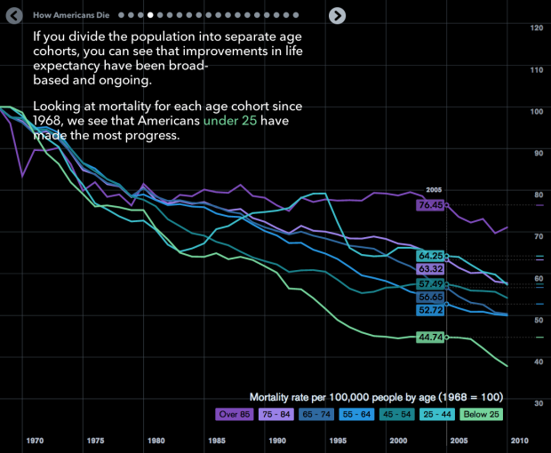


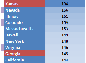 Pornhub continues their analysis of porn viewing demographics
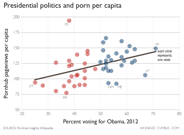
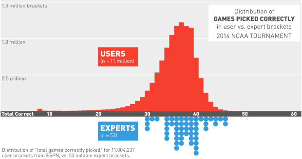


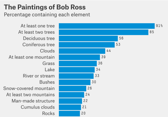
 Visualize This: The FlowingData Guide to Design, Visualization, and Statistics (2nd Edition)


