
Not sure where this is from, but feel that tingle in the back of your head? That’s the feeling of your mind blowing up.
Not sure where this is from, but feel that tingle in the back of your head? That’s the feeling of your mind blowing up.
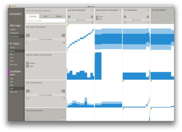
Mirador, a collaborative effort led by Andrés Colubri from Fathom Information Design, is a tool that helps you find correlative patterns in datasets with a lot of variables and observations. It’s in the early stages of development, but is available to use and test on Windows and Mac. Colubri explains the process, from its early stages to its current iteration.
Although fields like Machine Learning and Bayesian Statistics have grown enormously in the past decades and offer techniques that allows the computer to infer predictive models from data, these techniques require careful calibration and overall supervision from the expert users who run these learning and inference algorithms. A key consideration is what variables to include in the inference process, since too few variables might result in a highly-biased model, while too many of them would lead to overfitting and large variance on new data (what is called the bias-variance dilemma.)
Leaving aside model building, an exploratory overview of the correlations in a dataset is also important in situations where one needs to quickly survey association patterns in order to understand ongoing processes, for example, the spread of an infectious disease or the relationship between individual behaviors and health indicators.
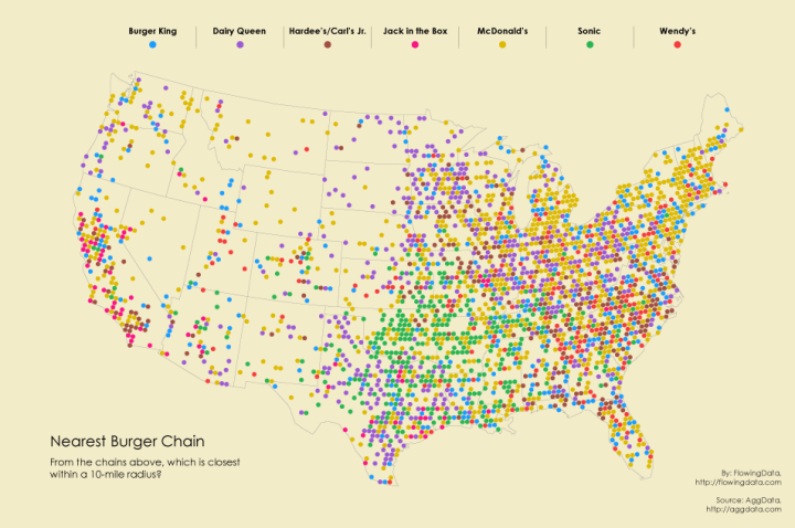
After looking at pizza places, coffee, and grocery stores, I had to look at burger chains across the country. The data was just sitting there.
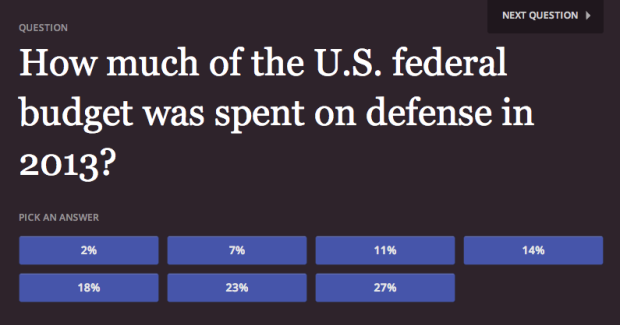
Many of us aren’t aware of how one country compares to others or public policy that has been around for decades. How Wrong You Are is a simple quiz game by Moiz Syed and Juliusz Gonera that tests such knowledge.
How Wrong You Are is a collection of important questions that people are sometimes misinformed about. We poll you to measure how right — or how wrong — the public is about these important questions.
Every week, we will add a new question. These are all questions that we hope you already know. But if you don’t, don’t worry! You learned something. Share your results, successful or not. Chances are, if you didn’t know this question, other people might not, either.
Play the game here. At the very least, you’ll learn something new.
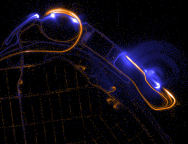
While we’re on the topic of NYC taxi data, Eric Fischer for Mapbox mapped all 187 million trips. Each observation contains the start and end location of a trip, so blue dots represent the former and orange represent the latter. My favorite bit is on the data collection artifacts, such as the map above.
The patterns at JFK and LaGuardia airports show interesting artifacts of the data collection process. Almost all of the trips there must have really begun or ended right at the terminals, but many of them are attributed to the roads leading to and from the airports, where the last good GPS fix must have occurred.
See also the New York Times animated map from several years ago that shows taxi activity during days of the week.
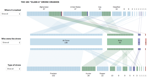
Based on data compiled from a combination of military records, Defense Department records, and drone manufacturers, Emily Chow, Alberto Cuadra and Craig Whitlock for the Washington Post provide a quick view into drone crashes.
More than 400 large U.S. military drones crashed in major accidents worldwide between Sept. 11, 2001, and December 2013. By reviewing military investigative reports and other records, The Washington Post was able to identify 194 drone crashes that fell into the most severe category: Class A accidents that destroyed the aircraft or caused (under current standards) at least $2 million in damage.
The top row represents where a drone crashed, the second row who owns it, and the third tells the type. Mouse over any of the tick marks, and you get details for the corresponding crash.
Through a Freedom of Information request Chris Whong received and eventually released NYC taxi logs starting in 2013 (about 173 million trips). Vijay Pandurangan looked at the data a little closer and deanonymized the logs to link hashed license numbers to the driver names. It didn’t take much to do it. Pandurangan described the process and lessons organizations can learn when they release data.
Someone on Reddit pointed out that one specific driver seemed to be doing an incredible amount of business. When faced with anomalous data like that, it’s good practice to weed out data error before jumping to conclusions about cheating taxi drivers. Also, I couldn’t shake the feeling that there was something about that encoded id number: “CFCD208495D565EF66E7DFF9F98764DA.” After a little bit of poking around, I realised that that code is actually the MD5 hash of the character ‘0’. This proved my suspicion that this was actually a data collection error, but also made me immediately realise that the entire anonymization process was flawed and could easily be reversed.
He also provided the code snippet he used to do it.
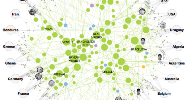
Gregor Aisch for the New York Times explored how the soccer clubs that play all year connect the national teams in this year’s World Cup.
The best national teams come together every four years, but the global tournament is mostly a remix of the professional leagues that are in season most of the time. Three out of every four World Cup players play in Europe, and the top clubs like Barcelona, Bayern Munich and Manchester United have players from one end of the globe to the other.
My browser buckled a few times as I scrolled, but even without smooth transitions, it’s an interesting dive into player connections.
Based on a column by Tim McEown, the animated video Modern Love by Freddy Arenas elegantly illustrates a relationship.
Read More
Sir Francis Galton, creator of the concept of correlation and regression toward the mean, wrote a letter to the editor of Nature in 1906 on the best way to cut a circular cake. The result is moist cake with every slice, even if you eat it days later. Alex Bellos for Numberphile demonstrates in the video below.
I don’t get it. I typically just eat a full cake in one sitting with a really big fork.
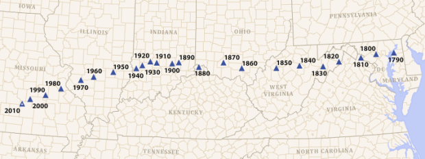
According to the U.S. census, the mean center of the population shifted west every decade since 1790. They show the change in a simple animation.
The mean center of population, traditionally referred to as simply the center of population, is provided for the 2010 Census and each census since 1790. In 2010, the mean center of population was located at 37°31’03” North latitude, 92°10’23” West longitude in Texas County, Missouri, 2.7 miles northeast of Plato, Missouri.
The inclination might be to read this as people moving west, which is partially true, but don’t forget immigration increasing the populations too.
I tracked steps and sleep for the past month wearing the Jawbone UP24 wristband. It works. It’s straightforward to use. It’s not perfect. I’m gonna keep wearing it.
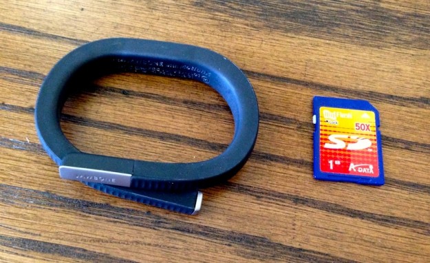
Jawbone UP24 with SD card for scale
Read More
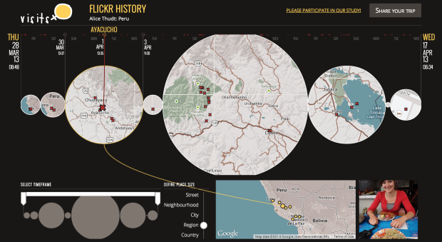
Visits, a research project by Alice Thudt, Dominikus Baur, and Sheelagh Carpendale from the University of Calgary, is an exploration of your personal location history.
With visits you can browse your location histories and explore your trips and travels. Our unique map timeline visualization shows the places you have visited and how long you have stayed there. Add photos from Flickr to your visits and share your journey with your family and friends!
Visits works with geo-tagged Flickr albums, data from Openpaths and Google Location Histories. It runs locally in your browser, so no sensitive data is uploaded to our servers. When you share your history, it is up to you how much detail visits reveals and what remains private.
Simply plug your data in and explore short trips or even better, look at long-term location memories. The focus is less on analytics and numbers and more on helping you remember where you’ve been. [Thanks, Dominikus]
Based on estimates from the National Center for Education Statistics, Randy Olson plotted the percentage of bachelor degrees conferred to men in the United States, by major. Start your eyes at the 50% line and work your way up (more men) or down (more women).
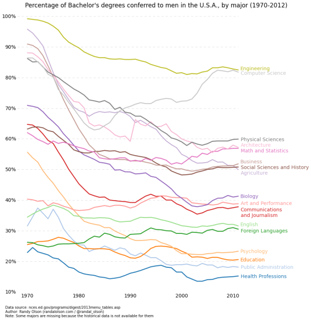
See also the inverted version that shows the percentage of degrees conferred to women.
Nobody asked for it, so you got it. The meme package for R by Thomas Leeper lets you create the web’s most popular memes in a line of code. Enjoy.

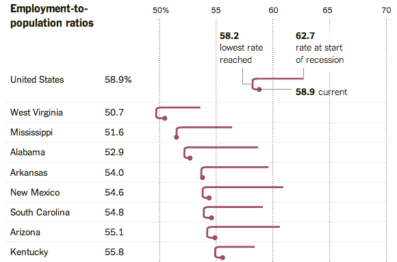
The Upshot posted an interesting chart that shows changing employment rate by state.
It shows that the economy is improving. Employment rates have climbed above the post-recession nadir in every state, although the improvements are often quite small. In Mississippi, the employment rate is just 0.1 percent above its recent low.
It also shows that the recovery has a long way to go. Employment rates have rebounded in some states with strong growth, like Utah, Nebraska and Montana. But only three states — Maine, Texas and Utah — have retraced more than half their losses.
You usually see this data presented as a time series chart, but this graphic focuses on three points of interest: employment rate at the start of the recession, the lowest rate, and the current. The rate is presented on the horizontal axis, so you see a cane-like shape that represents how far each state fell and how much farther they have to go.
I like this one. See the full graphic here.
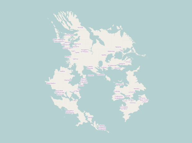
Sharing the same collaborative principles as OpenStreetMap, a wiki-based map for the real world, OpenGeofiction is an experiment in mapping an imaginary world.
Opengeofiction is a collaborative platform for the creation of fictional maps.
Opengeofiction is based on the Openstreetmap software platform. This implies that all map editors and other tools suitable for Openstreetmap can be applied to Opengeofiction as well.
The fictional world of Opengeofiction is thought to be in modern times. So it doesn’t have orcs or elves, but rather power plants, motorways and housing projects. But also picturesque old towns, beautiful national parks and lonely beaches.
As you zoom in to the map, you can see many details, from roads, bodies of water, to greenery, have already been added. Some areas look like densely inhabited cities connected by highway, whereas others are miles of forest and nature.
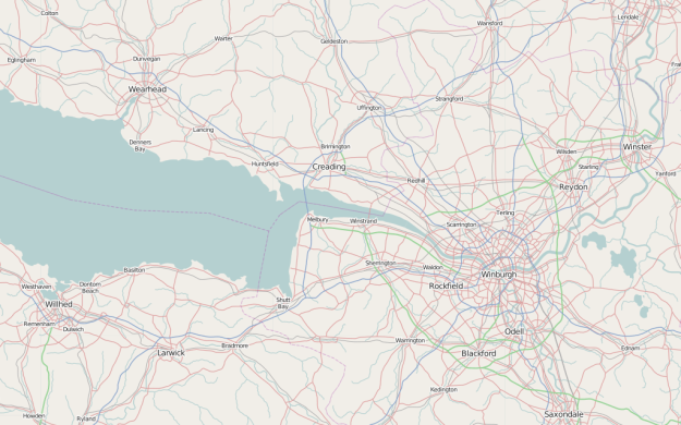
Browse long enough and you forget you’re looking at a fake world.
New Scientist quickly covers three theories of space and time in an informational video.
— When you deal with data, you can think like a statistician, even if you don’t know the math (although it will certainly help a lot). Jonathan Stray brings up fine points to draw conclusions from data, as does Jacob Harris in a detailed case study on distrusting your data.
— Learning data science still seems like a fuzzy, abstract idea. Trey Causey offers advice on getting started with the bubbling field.
— Is college still worth it? Yes.
— Coding isn’t easy. If it were, everyone would do it.
— R gotchas.

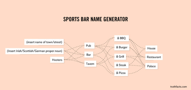
I’m not sure how I just came across this now, but the Truth Facts comic by New Creations is right up my alley. It’s essentially a collection of charts and illustrations that finds humor in mundane, everyday stuff. I’ve felt the above all too well.
I liked this sports bar name generator too.
Lots more in the archive.
 Visualize This: The FlowingData Guide to Design, Visualization, and Statistics (2nd Edition)
New tools, refined process.


