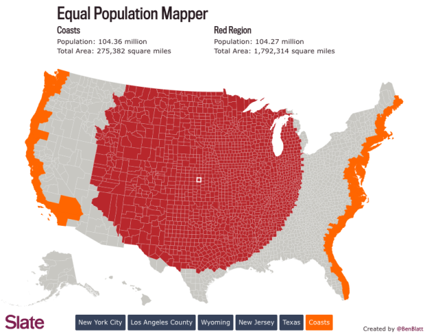
We know that there are more people per square mile in some places than others, but it can be a challenge to understand the magnitude of the differences. The same goes for the other way around. So Ben Blatt for Slate made the Equal Population Mapper, which lets you select an area of interest such as Los Angeles county or the state of Wyoming and see how many counties it takes to equal the population of said area.
For example, the above shows coastal counties as the point of reference, and you see the counties it takes to equal the coastal population in red. That’s a big section in the middle.
Might remind you of the Per Square Mile project from a while back which used cities around the world as point of reference and US states as the mode of comparison.
 Visualize This: The FlowingData Guide to Design, Visualization, and Statistics (2nd Edition)