• Sebastian Raschka offers a step-by-step tutorial for a principal component analysis in Python.

    The main purposes of a principal component analysis are the analysis of data to identify patterns and finding patterns to reduce the dimensions of the dataset with minimal loss of information.

    Here, our desired outcome of the principal component analysis is to project a feature space (our dataset consisting of n x d-dimensional samples) onto a smaller subspace that represents our data “well”. A possible application would be a pattern classification task, where we want to reduce the computational costs and the error of parameter estimation by reducing the number of dimensions of our feature space by extracting a subspace that describes our data “best”.

    That is, imagine you have a dataset with a lot of variables, some of them important and some of them not so much. A PCA helps you identify which is which, so the source doesn’t seem so unwieldy or to reduce overhead.

  • As a lesson on conditional probability for himself, Walt Hickey watched 403 episodes of “The Joy of Painting” with Bob Ross, tagged them with keywords on what Ross painted, and examined Ross’s tendencies.

    I analyzed the data to find out exactly what Ross, who died in 1995, painted for more than a decade on TV. The top-line results are to be expected — wouldn’t you know, he did paint a bunch of mountains, trees and lakes! — but then I put some numbers to Ross’s classic figures of speech. He didn’t paint oaks or spruces, he painted “happy trees.” He favored “almighty mountains” to peaks. Once he’d painted one tree, he didn’t paint another — he painted a “friend.”

    Other findings include cumulus and cirrus cloud breakdowns, hill frequency, and Steve Ross (son of Bob Ross) patterns.

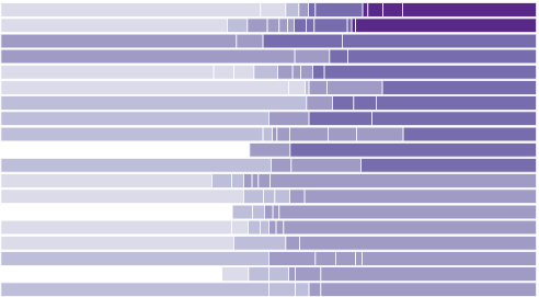
  • This chart-map-looking thing from Nightly News is making the rounds, and it’s not good. I’m opening the comments below for critique so that you can release your angst. Signed copy of Data Points goes to a randomly selected commenter the end of this week. Have at it.

    Changing face

  • Earthquakes are in the news a lot lately. A quick search shows a 7.6 off the coast of the Solomon Islands, a 6.6 in Nicaragua, and a 7.1 off the southwest coast of Papua New Guinea, and this was just last week. Not good news at all, but just how common are these earthquakes? Can we look back farther? Yes. In addition to a real-time feed of earthquakes, the United States Geological Survey maintains an ever growing archive of earthquakes detected around the world, and they make it easy to query and download.
    Read More

  • This year’s polar vortex churned up some global warming skeptics, but as we know, it’s more useful to look at trends over significant spans of time than isolated events. And, when you do look at a trend, it’s useful to have a proper baseline to compare against.

    To this end, Enigma.io compared warm weather anomalies against cold weather anomalies, from 1964 to 2013. That is, they counted the number of days per year that were warmer than expected and the days it was colder than expected.

    An animated map leads the post, but the meat is in the time series. There’s a clear trend towards more warm.

    Since 1964, the proportion of warm and strong warm anomalies has risen from about 42% of the total to almost 67% of the total – an average increase of 0.5% per year. This trend, fitted with a generalized linear model, accounts for 40% of the year-to-year variation in warm versus cold anomalies, and is highly significant with a p-value approaching 0.0. Though we remain cautious about making predictions based on this model, it suggests that this yearly proportion of warm anomalies will regularly fall above 70% in the 2030’s.

    Explore in full or download the data and analyze yourself. Nice work. [Thanks, Dan]

  • Top ten viewing statesPornhub continues their analysis of porn viewing demographics in their latest comparison of pageviews per capita between red and blue states (SFW for most, I think). The main question: Who watches more?

    Assuming the porn consumption per capita is normally distributed for each state and that different states have independent distribution of porn consumption per capita, we can say with 99% confidence the hypothesis that the per capita porn consumption of democratic states is higher than the republican states.

    Okay, the result statement sounds a little weird, but when you look at the rates, the conclusion seems clear. The states with the highest viewing per capita is shown above, and for some reason Kansas is significantly higher than everyone else. Way to go.

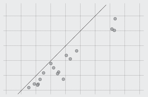
    For a clearer view, Christopher Ingraham charted the same data but incorporated the percent of Obama voters for each state. Interpret as you wish:

    Obama voting and porn

    Again, note Kansas high on the vertical axis.

    Update: Be sure to read this critique for a better picture of what you see here.

  • Looking for a job in data science, visualization, or statistics? There are openings on the board.

    Digital Designer, Editorial Content for Bauer Media in Central London.

    Research and Data Visualization Associate for National Journal in Washington, DC.

    Visual Journalist for Money.com in New York.

  • The American Community Survey, an ongoing survey that the Census administers to millions per year, provides detailed information about how Americans live now and decades ago. There are tons of data tables on topics such as housing situations, education, and commute. The natural thing to do is to download the data, take it at face value, and carry on with your analysis or visualization.

    However, as is usually the case with data, there’s more to it than that. Paul Overberg, a database editor at USA Today, explains in a practical guide on how to get the most out of the survey data (which can be generalized to other survey results).

    Journalists who use ACS a lot have a helpful slogan: “Don’t make a big deal out of small differences.” Journalists have all kinds of old-fashioned tools to deal with this kind of challenge, starting with adverbs: “about,” “nearly,” “almost,” etc. It’s also a good idea to round ACS numbers as a signal to users and to improve readability.

    In tables and visualizations, the job is tougher. These introduce ranking and cutpoints, which create potential pitfalls. For tables, it’s often better to avoid rankings and instead create groups—high, middle, low. In visualizations, one workaround is to adapt high-low-close stock charts to show a number and its error margins. Interactive data can provide important details on hover or click.

    If you do any kind of data reporting, whatever field it’s in, you should be familiar with most of what Overberg describes. If not, better get your learn on.

  • Stephen Pettigrew and Reuben Fischer-Baum, for Regressing, compared 11 million brackets on ESPN.com against those of pundits.

    To evaluate how much better (or worse) the experts were at predicting this year’s tournament, I considered three criteria: the number of games correctly predicted, the number of points earned for correct picks, and the number of Final Four teams correctly identified. Generally the experts’ brackets were slightly better than the non-expert ones, although the evidence isn’t especially overwhelming. The analysis suggests that next year you’ll have just as good a chance of winning your office pool if you make your own picks as if you follow the experts.

    Due to availability, the expert sample size is a small 53, but it does appear the expert brackets are somewhere in the area of the masses. Still too noisy to know for sure though.

    If anything, this speaks more to the randomness of the tournament than it does about people knowing what teams to pick. It’s the same reason why my mom, who knows nothing about basketball or any sports for that matter, often comes out ahead in the work pool. The expert picks are just a point of reference.

  • Open data consultancy Conveyal released Disser, a command-line tool to disaggregate geographic data to show more details. For example, we’ve seen data represented with uniformly distributed dots to represent populations, which is fine for a zoomed out view. However, when you get in close, it can be useful to see distributions more accurately represented.

    If the goal of disaggregation is to make a reasonable guess at the data in its pre-aggregated form, we’ve done an okay job. There’s an obvious flaw with this map, though. People aren’t evenly distributed over a block — they’re concentrated into residential buildings.

    So Disser combines datasets of different granularity, so that you can see spreads and concentrations that are closer to real life.

  • As part of the You Are Here project from the MIT Media Lab, an exploration of independent coffee shops in San Francisco:

    Independent coffee shops are positive markers of a living community. They function as social spaces, urban offices, and places to see the world go by. Communities are often formed by having spaces in which people can have casual interactions, and local and walkable coffee shops create those conditions, not only in the coffee shop themselves, but on the sidewalks around them. We use maps to know where these coffee shop communities exist and where, by placing new coffee shops, we can help form them.

    Each dot is a coffee shop, and the shaded spots around the dot represent the areas nearest each shop. It’s an interesting, more granular contrast to coffee chain geography and provides a better sense of a city’s layout.

    See also the same idea applied to Cambridge. I imagine there are more cities to come, as the data is gleaned from the Google Places and Google Distance Matrix APIs.

  • April 8, 2014

    Topic

    Software  /  ,

    Tabula, by Manuel Aristarán, came out months ago, but I’ve been poking at government data recently and came back to this useful piece of free software to get the data tables out of countless free-floating PDF files.

    If you’ve ever tried to do anything with data provided to you in PDFs, you know how painful this is — you can’t easily copy-and-paste rows of data out of PDF files. Tabula allows you to extract that data in CSV format, through a simple interface.

    It’s not the fastest software in the world, but it really is simple to use and it sure beats manual entry. You just load a PDF file into Tabula, which runs on your computer, highlight the table to extract, and the program does the rest. Save as a CSV and do what you want with it.

    Download Tabula here. Find out a little more about it on Source.

  • FloatingSheep pointed their Twitter geography towards beer (and wine).

    From Sam Adams in New England to Yuengling in Pennsylvania to Grain Belt and Schlitz in the upper Midwest, these beers are quite clearly associated with particular places. Other beers, like Hudepohl and Goose Island are interesting in that they stretch out from their places of origin — Cincinnati and Chicago, respectively — to encompass a much broader region where there tend to be fewer regionally-specific competitors, at least historically. On the other hand, beers like Lone Star, Corona and Dos Equis tend to have significant overlap in their regional preferences, with all three having some level of dominance along the US-Mexico border region, but with major competition between these brands in both Arizona and Texas.

    This of course excludes the increased appreciation for craft beer, as there isn’t enough data for significant microbrewery results.

  • Because Fox News. See also this, this, and this. [Thanks, Meron]

  • Tim Harford for Financial Times on big data and how the same problems for small data still apply:

    The multiple-comparisons problem arises when a researcher looks at many possible patterns. Consider a randomised trial in which vitamins are given to some primary schoolchildren and placebos are given to others. Do the vitamins work? That all depends on what we mean by “work”. The researchers could look at the children’s height, weight, prevalence of tooth decay, classroom behaviour, test scores, even (after waiting) prison record or earnings at the age of 25. Then there are combinations to check: do the vitamins have an effect on the poorer kids, the richer kids, the boys, the girls? Test enough different correlations and fluke results will drown out the real discoveries.

    You’re usually in for a fluffy article about drowning and social media when ‘big data’ is in the title. This one is worth the full read.

  • The New York Public Library announced open access to 20,000 maps, making them free to download and use.

    The Lionel Pincus & Princess Firyal Map Division is very proud to announce the release of more than 20,000 cartographic works as high resolution downloads. We believe these maps have no known US copyright restrictions.* To the extent that some jurisdictions grant NYPL an additional copyright in the digital reproductions of these maps, NYPL is distributing these images under a Creative Commons CC0 1.0 Universal Public Domain Dedication. The maps can be viewed through the New York Public Library’s Digital Collections page, and downloaded (!), through the Map Warper

    Begin your journey.

  • From Cakecrumbs, a product that helps you learn while you eat: planetary layer cakes. The graduate student slash baker hobbyist’s sister asked if she could make one, and at first she thought it couldn’t be done. But then she thought more about it.

    I spent the rest of the afternoon thinking about it. I don’t admit defeat. Ever. But especially not with cake. Nothing is impossible is pretty much my baking motto, so to say this cake was impossible left me feeling weird. There had to be a way. A way that didn’t involve carving or crumbing the cake. I kept mulling it over until I had a breakthrough.

    See how it was done.

  • Citi Bike, also known as NYC Bike Share, is releasing monthly data dumps for station check-outs and check-ins, which gives you a sense of where and when people move about the city. Jeff Ferzoco, Sarah Kaufman, and Juan Francisco Saldarriaga mapped 24 hours of activity in the video below.

    [Thanks, Jeff]

  • Remember the Million Dollar Homepage from 2005? It sold ad space to anyone who was interested for one dollar per pixel, and there were one million pixels available. All spots were filled, and it gave a burst of bunch of other million dollar homepages that turned out to be zero dollar homepages.

    David Yanofsky for Quartz returned to the homepage to look at link rot. 22 percent of links on the homepage are dead.

  • Hibai Unzueta, based on a paper by Albert Bartlett, demonstrates exponential growth with a simple animation. It depicts a man standing in a tank with finite capacity and water rising slowly, but at an exponential rate.

    Our brains are wired to predict future behaviour based on past behaviour (see here). But what happens when something growths exponentially? For a long time, the numbers are so little in relation to the scale that we hardly see the changes. But even at moderate growth rates exponential functions reach a point where the numbers grow too fast. Once we confirm that our predictions about the future have failed, very little time to react may be left.

    All looks safe at first, because the water rises so slowly, but it seems to rise all of a sudden. Oh, the suspense. What will happen to cartoon pixel man?