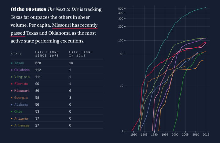
• Membership
  • Newsletter
  • Projects
  • Learning
  • About
  • Member Login
  • The big companies behind organic food brands

    May 12, 2015

    Topic

    Infographics  /  food, organic, Phil Howard, Washington Post

    When you walk down the aisles of the grocery store, there are probably shelves of organic foods with branding that looks small, local, and healthy. It’s almost like you’re buying products direct from the farmer. But probably not. The Washington Post highlights the ownership, based on work by Phil Howard, who has looked at similar ownership networks with beer, wine, and soda in years past.
    Read More

  • Illegal to collect environmental data in Wyoming

    May 11, 2015

    Topic

    Data Sharing  /  environment, law, Wyoming

    Wyoming just passed a law that makes it illegal to collect data about the environment, if you intend to send it to a federal or state government agency.

    The reason? The state wants to conceal the fact that many of its streams are contaminated by E. coli bacteria, strains of which can cause serious health problems, even death. A small organization called Western Watersheds Project (which I represent pro bono in an unrelated lawsuit) has found the bacteria in a number of streams crossing federal land in concentrations that violate water quality standards under the federal Clean Water Act. Rather than engaging in an honest public debate about the cause or extent of the problem, Wyoming prefers to pretend the problem doesn’t exist. And under the new law, the state threatens anyone who would challenge that belief by producing information to the contrary with a term in jail.

    Um, wut?

    The intent part confuses me most. So is it okay to collect environmental data that you don’t plan on sending to a government agency? If I were in Wyoming, I’d grab the nearest water kit, collect data water data like a fiend, and send it to my local paper, news outlet, or anywhere else that could publicize high concentrations of E. coli.

  • #DrunkTufte

    May 11, 2015

    Topic

    Miscellaneous  /  humor

    There were some blips on Twitter last week for the DrunkTufte hashtag for which people made some not so readable charts. I’m really hoping it becomes a thing. The entry below is by Matt Fogel. Makes sense to me.

    DrunkTufte

  • Problems with algorithmic policy-making

    May 11, 2015

    Topic

    Statistics  /  algorithm, policy

    Virginia Eubanks for Slate describes the dangers of relying too heavily on black-boxed algorithms to create and enforce policies.

    Policy algorithms promise increased efficiency, consistent application of rules, timelier decisions, and improved communication. But they also raise issues of equity and fairness, challenge existing due process rules, and can threaten Americans’ well-being. Predictive policing relies on data built upon a foundation of historical racial inequities in law enforcement. Remote eligibility systems run on the questionable assumption that lacking a single document—in a process that often requires dozens of pages of supporting material—is an affirmative refusal to cooperate with the welfare determination process.

  • Visualization is growing up

    May 8, 2015

    Topic

    Visualization

    For a while, somewhere in between 2007 and 2011, infographics — in the everyday person’s sense, not the statistician’s — were all the rage. They came in lots of shapes and sizes and covered a wide span of useful to useless topics. While these sort of graphics are still around, they’re dwarfed by a different brand of work these days. A more mature one.

    Mark Wilson for FastCompany describes the evolution. (Disregard the “What Killed The Infographic?” title of the article. Spammy embedded infographics are slowly dying, but the good stuff is a young whippersnapper discovering its powers.)
    Read More

  • Rising beef prices and cattle theft

    May 7, 2015

    Topic

    Statistical Visualization  /  economy, FiveThirtyEight, food

    Eric Benson for FiveThirtyEight delves into cattle theft, which can cost an owner millions of dollars overnight, and the link to rising beef prices.

    Most cuts of beef increased in cost since 1995, but brisket, while still not the most expensive cut, has really increased in value in the past couple of years. It peaked in January 2015 at $3.52 per pound wholesale. It was only $2.26 in January 2014. That’s kind of big deal considering you’re buying a 10-pound piece of meat at the grocery store, versus a couple of pounds of steak.

  • Upward mobility and the potential for a better life

    May 7, 2015

    Topic

    Maps  /  income, Upshot, upward mobility

    An analysis by Raj Chetty of Harvard University and Nathaniel Hendren of NBER estimates increased income and education for poverty-level households, based on where one lives. The results are based on tax data — 1040 and W-2 forms — from the IRS, and the focus of the analysis is on those who moved from one county to another.

    The main finding was that location matters. The Upshot mapped the results, with an article whose text changes based on the county you select.
    Read More

  • A Course for Visualization in R, Taking You From Beginner to Advanced

    Where to start? What to learn next? Here’s a course to help take you from beginner to advanced.

  • How to ask for datasets

    May 6, 2015

    Topic

    Data Sources

    There’s a lot of data readily available online. We know this. However, there’s also a lot of data available that’s offline, sitting on people’s hard drives. You just have to ask for it — in the right way. Christian Kreibich, a researcher for the International Computer Science Institute, provides a guide.
    Read More

  • Black and White America compared as if they were countries

    May 5, 2015

    Topic

    Statistical Visualization  /  Economist, race

    The Economist made a simple yet effective comparison of Black America and White America against metrics of countries that are part of the Human Development Index and the OECD. In incarcerations and homicides, you see Black America (red line) at and towards the bottom.
    Read More

  • Data Underload  /  race

    Mapping the Most Common Races

    Select one or more races for a quick comparison. Counties are colored by the most prevalent.

    Read More
  • Self-printing a wall-sized world map

    May 1, 2015

    Topic

    Maps

    Dominik Schwarz wanted a big world map. A really big one that covered his entire wall in high detail.

    You can get great world maps up to around 1,50m (~59 inches) width. However, this size seems to be a tipping point. From here on the bigger the maps get, the less detailed they are. And it makes sense. Such big maps are normally used in classrooms and even the people in the last row should see the large printed city names.

    But that’s not what I wanted. Not at all. I envisioned a gigantic poster that would show the smallest villages, the most detailed coast lines and the highest level of information density possible.

    He outlined his process from grabbing the data to printing to final mount.

  • Median home in America, over 40 years

    April 30, 2015

    Topic

    Infographics  /  CNNMoney, housing

    The median home in America has changed in a variety of ways. Square footage increased, number of bedrooms and bathrooms shifted, heating changed from electrical to gas, and cost went up. CNNMoney provides an animated graphic that shows these changes over the past four decades.
    Read More

  • Earthquake magnitude and the logarithmic scale

    April 29, 2015

    Topic

    Infographics  /  earthquake, logarithmic scale, Quartz

    The earthquake in Nepal was big, but there’s a discrepancy in just how big. The United States Geological Survey (USGS) measured the earthquake at 7.8 magnitude, whereas the China Earthquakes Network Center (CENC) measured it at 8.1. The three-tenths difference doesn’t seem like much, but the latter is actually an earthquake that exerts twice the energy of the former. Akshat Rathi and David Yanofsky for Quartz explain in a lesson of the logarithmic scale and earthquake magnitude.

  • Fashion trends seen through Google searches

    April 29, 2015

    Topic

    Maps  /  fashion, Google, New York Times

    Fashion trends, such as skinny jeans and Palazzo pants, can spike and fall quickly year over year, and it can be tough to keep up. Maybe trends in Google searches for specific fashions can help. Hiroko Tabuchi and Josh Katz for the New York Times mapped a handful of fashion searches over time so you can see some of the regional changes.
    Read More

  • Disaster risk indices estimate impact on people

    April 28, 2015

    Topic

    Statistical Visualization  /  earthquake, NPR

    An earthquake with a magnitude of 7.8 can affect countries differently, depending on the people’s ability to withstand and recover from such a disaster. INFORM attempts to assess this risk, so that organizations can make better-informed decisions about what relief to send. Greg Myre for NPR explains with a heatmap. [via @onyxfish]

  • Quick change of mind on social issues

    April 28, 2015

    Topic

    Statistical Visualization  /  Bloomberg, marriage

    As Supreme Court hearings for same-sex marriage start today, Alex Tribou and Keith Collins for Bloomberg look back at timelines for past social issues, such as interracial marriage and abortion.
    Read More

  • Recurring characters in film and the words used to describe them

    April 27, 2015

    Topic

    Infographics  /  text, tropes

    Stereotropes, made by the Bocoup Data Visualization Team, explores the many tropes in films and the the adjective used to describe them. Some are unique to a trope and some words span multiple tropes and genders.
    Read More

  • Why exploring big data is hard

    April 24, 2015

    Topic

    Statistical Visualization  /  big data, lunch talk

    The talks from OpenVisConf 2015 went up, so I’m slowly making my way through. In this one Danyel Fisher from Microsoft Research talks about the challenges of working with data that doesn’t quite fit into your standard CSV data model. The visualization has to account for the mess.
    Watch the talk

  • Page 200 of 392
  • <
  • 1
  • ...
  • 197
  • 198
  • 199
  • 200
  • 201
  • 202
  • ...
  • 392
  • >

Analyze, visualize, and communicate data usefully, beyond the defaults.

Become a member →

Recently for Members

May 15, 2025
Step Chart, Enhanced

May 8, 2025
When the data is not what it seems

May 1, 2025
Finding the Right Charts

April 24, 2025
Visualization Tools, Datasets, and Resources – April 2025 Roundup

April 17, 2025
Breaking Out of Chart Software Defaults

Browse by Chart Type See All →

Spike Map Gantt Chart Choropleth Map Bubble Chart Sankey Diagram Stacked Bar Chart Variable Width Bar Chart Line Map Stacked Area Chart Unit Chart

Browse By Topic

  • Visualization

    Seeing data

  • Maps

    Seeing geographic data

  • Infographics

    Explaining data

  • Networks

    Connecting data

  • Statistics

    Analyzing data

  • Software

    Working with data

  • Sources

    Getting data

  • Design

    Making data readable

Get the Book

Visualize This: The FlowingData Guide to Design, Visualization, and Statistics

Available now.

Order: Amazon / Bookshop

Made by FlowingData

  • The Process

  • Data Underload

  • Chart Everything

  • Guides

  • Books

  • Shop

  • About
  • Contact
  • Newsletter
  • LinkedIn
  • Instagram
  • Bluesky
  • RSS
Copyright © 2007-Present FlowingData. All rights reserved.