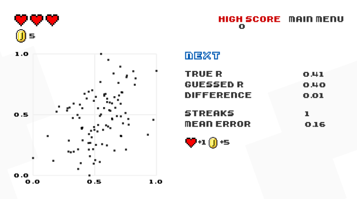
Guess the Correlation is a straightforward game where you do just that, and it’s surprisingly fun. You get a scatterplot and you guess the correlation coefficient. That’s it. If you’re off by too much, you lose a life, and if you’re almost spot on, you gain a life. If you’re somewhat right, you get a coin. Bonus points for streaks of correct guesses.
-
-
What if you relived life’s activities in big clumps? Thirty years of sleeping in one go. Five months sitting on the toilet. Based on David Eagleman’s Sum: Forty Tales from the Afterlives, this short film by Temujin Doran imagines such a life. Watch to the end.
[via Brain Pickings]
-
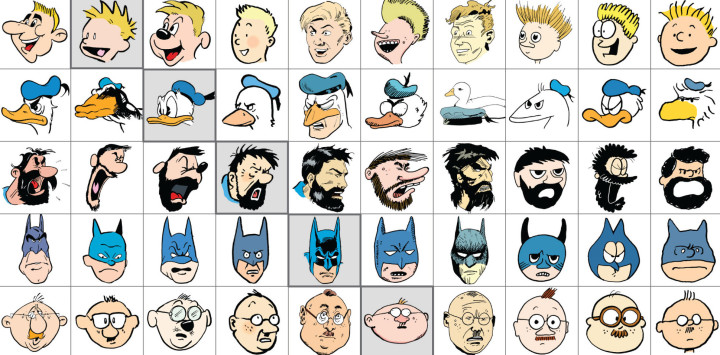
Jaakko Seppälä drew ten comic characters, each in its original style and in the style of the other nine. It’s like the same source material can be shown and seen in different ways, communicating different moods and themes. Imagine that.
-
Charlie Loyd, who works with satellite imagery at Mapbox, put together a 12-second time-lapse of Earth using a day of data from Japan’s weather satellite Himawari-8. The experiment is called Glittering Blue. Derek Watkins used the data to similar effect last year, but Glittering Blue is bigger and at high resolution making it all the more mesmerizing.
-
-
-
The Upshot, the data analysis-centric site from the New York Times, has a new editor, and her name is Amanda Cox.
I have asked Amanda to take on this job because she is the best person to lift The Upshot to new heights. But I also want to note an underlying message in her appointment. Visual journalism – graphics, interactives, photography, video, virtual reality – is a growing part of our report, and it’s an area where we excel. In the future, visual journalists, and those, like Amanda, whose background spans both words and visuals, are a crucial part of the future leadership of The Times.
So great and well-deserved.
If you read FlowingData, you’ve seen her work, but if not, here’s a refresher.
-
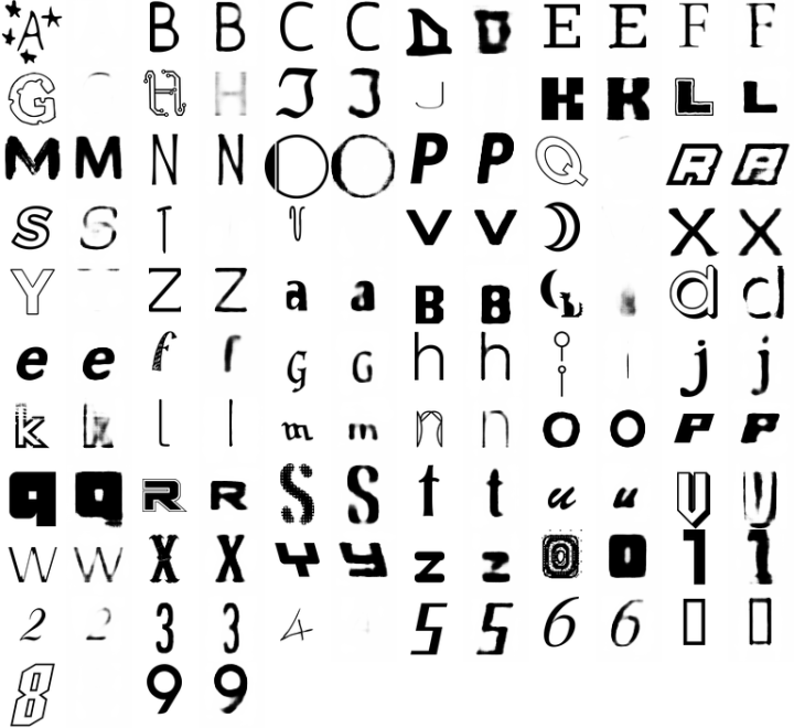
Erik Bernhardsson downloaded 50,000 fonts and then threw them to the neural networks to see what sort of letters a model might come up with.
These are all characters drawn from the test set, so the network hasn’t seen any of them during training. All we’re telling the network is (a) what font it is (b) what character it is. The model has seen other characters of the same font during training, so what it does is to infer from those training examples to the unseen test examples.
I especially like the part where you can see a spectrum of generated fonts through varying parameters.
-
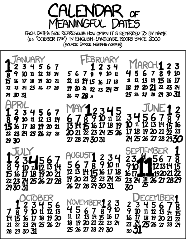
David Hagan looked closer at why the 11th of the month appeared to be missing in books. As with many modern curiosities, it began with an xkcd comic.
First I confirmed that the 11th is actually interesting. There are 31 days and one of them has to be smallest. Maybe the 11th isn’t an outlier; it’s just on the smaller end and our eyes are picking up on a pattern that doesn’t exist. To confirm this is real, I compared actual numbers, not text size. The Ngrams database returns the total number times a phrase is mentioned in a given year normalized by the total number of books published that year. The database only goes up to the year 2008, so it is presumably unchanged from when Randall queried it in 2012.
-
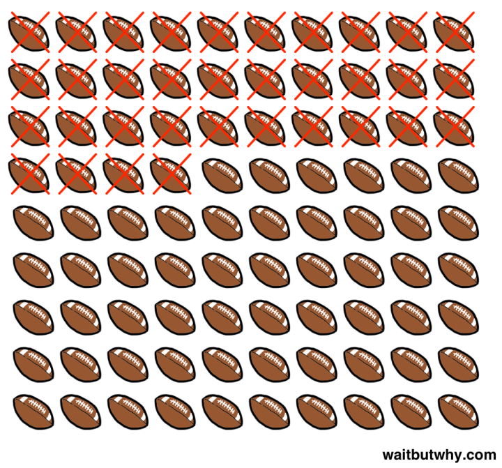
While we’re on the topic of life expectancy, Tim Urban of Wait But Why used a simplified estimate of average life span and then extrapolated for various events in one’s life.
For example, Urban is 34 years old, so that number of Super Bowls has passed. Then assume a 90-year life span, and you have the number of Super Bowls left in his lifetime. Other extrapolations include winters left set in snow flakes, dumplings to eat set in a dumpling emoji, and time left with parents set with stick figure icons.
The math is simple, and you can easily do it in your head, but somehow seeing it as icons has a more sensitive effect. [Thanks, David]
-
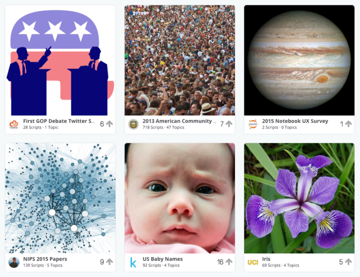
Kaggle just opened up a Datasets section to download and analyze public data.
At Kaggle, we want to help the world learn from data. This sounds bold and grandiose, but the biggest barriers to this are incredibly simple. It’s tough to access data. It’s tough to understand what’s in the data once you access it. We want to change this. That’s why we’ve created a home for high quality public datasets, Kaggle Datasets.
It’s still really new and only has a handful of datasets but it looks interesting. The key is that it’s not just a place to download data. Instead, they have analysis environments and make it easy to share code that makes use of the data. They also make it easy to share results.
Oftentimes, it’s the getting-started hurdle that gets in the way of working with a large-ish dataset. Maybe this will help set things on the right path.
-
It took forever and it’s way overdue, but the United States Census Bureau has committed to an open source policy, which seems pretty sweet.
- Foster a community around Census data and tools by encouraging and responding to real-time feedback on how our data products are used by researchers, non-profit, and for profit organizations.
- Increase our organizational capacity to do more open source by delivering more Free and Open Source Software (FOSS) to the community. FOSS is software that does not charge users a purchase or licensing fee for modifying or redistributing the source code, in our projects and contribute back to the open source community.
- Identify opportunities to publish existing code under an open source license that may benefit the public.
Identify opportunities to create new open source projects, and develop those projects in the open alongside community participation. - Adopt industry best practices for managing the lifecycle of our open source projects including standard release management and continuous integration approaches.
- Encourage “Issues” and accept “Pull Requests” (PRs) from the community.
- Ensure that new Code Releases and Community Contributions meet the specified guidelines, detailed in the sections below.
Where feasible to do so, we will automate and also open source any testing procedures and encourage contributors to execute their own tests.
Of course it all comes down to execution. The organization is not especially speedy, but it’s worth keeping an eye on this. See the current open source projects here.
-
So far we’ve seen when you will die and how other people tend to die. Now let’s put the two together to see how and when you will die, given your sex, race, and age.
-
The Powerball FAQ was most likely written by a slightly annoyed statistician. You’d think the FAQ would be full of legalese and vague statements, but it reads more like notes from the know-it-all in your Stat 101 class. The answer to, “Your odds and probabilities are wrong.”:
Are not. Sure, the odds of matching 1 red ball out of 26 are 1 in 26, but we are not giving the odds for matching a red ball. We give the odds for winning a prize for matching one red ball ALONE. If you match the red ball and one or more white balls, you win some other prize, but not this prize. The odds of matching one red ball ALONE are harder than 1 in 26 because there is some risk that you will also match one or more white ball numbers – and then win a different prize.
Some persons who enjoy statistics (they do really exist) will come up with odds of 1 in 17 billion for the jackpot prize. Remember that you don’t need to match the numbers in exact order – we use combinations to determine the probabilities for the first five white balls and not permutations.
-
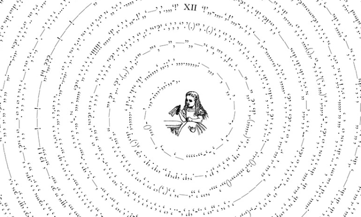
What do you get if you take famous literary works, strip out all the words, and only look at the punctuation? Between the Words by Nicholas Rougeux:
Between the Words is an exploration of visual rhythm of punctuation in well-known literary works. All letters, numbers, spaces, and line breaks were removed from entire texts of classic stories like Alice’s Adventures in Wonderland, Moby Dick, and Pride and Prejudice—leaving only the punctuation in one continuous line of symbols in the order they appear in texts.
[via @giorgialupi]
-
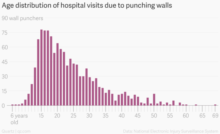
Keith Collins for Quartz ran some quick numbers for people who visited the hospital emergency room in 2014 for punching a wall, based on data from the US Consumer Product Safety Commission. Because, sure, why not.
More importantly, you can grab data directly from the CPSC, including and most recently for estimated injuries due to inflatable amusement rides.
-
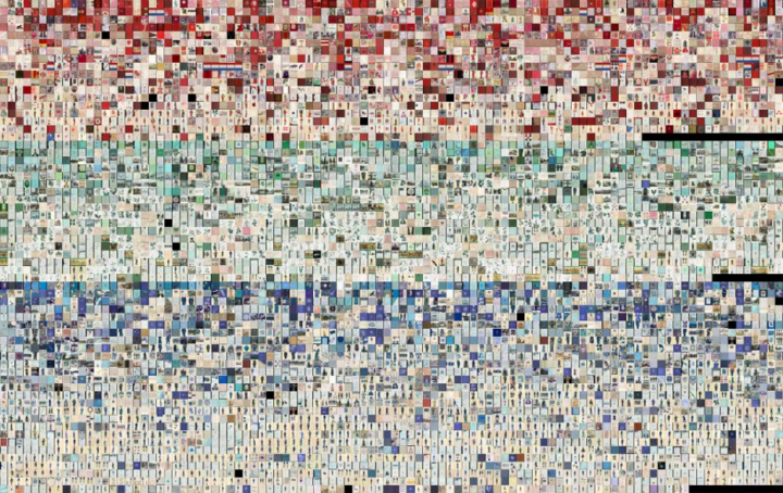
The New York Public Library just made over 180,000 digital items in the public domain available for high resolution download, and the data for those items is free to download too.
Did you know that nearly one-third of the items in our Digital Collections are in the public domain — that is, they have been designated as having no known U.S. copyright restrictions? This means that everyone has the freedom to enjoy and reuse these materials in almost limitless ways. To help you explore, visualize, and repurpose these items, we’ve gathered all of their metadata into a single data release.
You can also browse the items by century of creation, genre, and color with this explorer by Brian Foo of NYPL Labs.
-
American immigration history is chock full of policies and restrictions, and you can see the effects in the distribution of immigrants into this country over the years. Alvin Chang for Vox steps you through the major policy shifts since 1820.
The graphic above shows how these policies affect who enters the country. It shows 200 years of legal immigration into the United States — and how different policies and international dynamics affect the patterns of who gets let in. Migration into the United States has ebbed and flowed in tandem with who policymakers believe ought to be allowed refuge and who doesn’t qualify.
-
How to Customize Axes in R
For presentation purposes, it can be useful to adjust the style of your axes and reference lines for readability. It’s all about the details.





 Visualize This: The FlowingData Guide to Design, Visualization, and Statistics (2nd Edition)


