Take all the guesswork out of finding “love” on Tinder, and let the True Love Tinder Robot by Nicole He swipe for you. Sensors measure your palm sweat and the robotic hand acts accordingly.
The True Love Tinder Robot will find you love, guaranteed. With Tinder open, you put your phone down front of the robot hand. Then you place your own human hands on the sensors. As you are looking at each Tinder profile, the robot will read your true heart’s desire through the sensors and decide whether or not you are a good match with that person based on how your body reacts. If it determines that you’re attracted to that person, it will swipe right. If not, it will swipe left. Throughout the process, it will make commentary on your involuntary decisions.

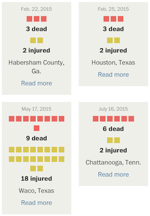 With recent events, you’ve likely seen the articles and graphics that get into the number of mass shootings this year and further into the past. You might have noticed that the numbers seem to vary depending on where you look, and the difference likely stems from how “mass shooting” is defined by the author.


 Visualize This: The FlowingData Guide to Design, Visualization, and Statistics (2nd Edition)


