In 1999, the Department of Agriculture published a Natural Amenities Scale that took into account “six measures of climate, topography, and water area” to help identify desirable places to live for most people.
More recently, Christopher Ingraham for the Washington Post took a quick look at the data, and declared Red Lake County the “worst” place to live in America. That’s when it got interesting. Life in a metro area started to wear.
Read More


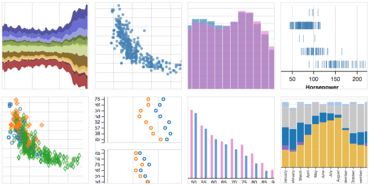

 Visualize This: The FlowingData Guide to Design, Visualization, and Statistics (2nd Edition)


