
Here’s the good stuff for the month: things to use, things to poke at, and things to learn from.
Here’s the good stuff for the month: things to use, things to poke at, and things to learn from.
Our World in Data is a hub for research and reliable data to measure the progress of the world. You’ve always been able to download data from the site, but they just made it easier with more detailed exports and an API:
For users who work with automated workflows, computational notebooks, or custom applications, we now offer direct URLs to access data in CSV format and comprehensive metadata in JSON format. This is the same data and metadata included in the zip file download package described above.
Just like with the download package, you can fetch the complete data or only the subset of the data currently displayed in the chart. You can also choose between longer column names that are easier to read for humans or shorter column names that are often more convenient to use in code.
Great news.

We like to imagine a world of autonomous robots that take care of tedious tasks so that we don’t have to. Chris Fenton likes to imagine robots made of garbage that roam around his backyard, and Grasso was born:
Who says AGI has to be super intelligent just to be A, G and I? Grasso is driven by a kind of python ‘madlib’ wrapped around two LLMs (one multi-modal, one text-only). The outer loop takes a photo with its webcam and feeds it into a multi-modal LLM to generate a scene description. That scene description is then inserted into a prompt (“This is what you currently see with your robot eyes…”) that ends with “Choose your next action” and presents a list of actions the robot can take, some of which are ‘direct’ commands, and others that are ‘open ended’ and let Grasso finish the action prompt however it chooses.
Foursquare, which I thought was still a location sharing app but is a data platform now, open sourced a layer of 100 million points of interest in an effort to build and maintain a global database:
[L]et’s now consider the challenge of creating and maintaining a real-world-synced place database. As our CTO Vikram Gundeti detailed in a recent blog on our newly re-launched Place Engine, to do this well requires an operating system powered by human-in-the-loop confirmations harmoniously orchestrated with cutting edge digital discovery systems to actively curate a database representative of the current world. In short, building an accurate global database of POI is an extraordinarily difficult task both from a technical perspective and from a capital resource perspective.
This leads to our belief that, absent a global proprietary distribution platform like Google Maps, building a comprehensive and accurate base layer of place data is indeed a problem best solved by an open source community.
You can access the dataset now.
![]() Speaking of data blankets, the knitting club in the area I live has an annual tradition of making sweaters for trees in their downtown. One of the trees was wrapped with a temperature blanket.
Speaking of data blankets, the knitting club in the area I live has an annual tradition of making sweaters for trees in their downtown. One of the trees was wrapped with a temperature blanket.
Each color corresponds to a temperature range. Each knitted row reflects the high temperature for each day throughout the past year. The bottom starts with September 1, 2023.
Let’s get more data into the physical world.
Jesse Gwinn, from NOAA, was at sea on a mapping expedition and to pass the downtime between tasks, she crocheted a bathymetry blanket:
I assigned 11 colors to different depth ranges: reds and yellows for shallower waters (~2,000-4,000 meters/1.2-2.5 miles), blues and purples for deeper areas (~4,000-6,000 meters/2.5-3.7 miles). Each vertical row contains two colors, illustrating the deepest and shallowest points recorded in a 6-hour period. The relative location of the color change is positioned to represent the average depth of the seafloor for that timeframe. […] The finished blanket contains 97 rows, representing 582 hours (a little more than 24 days) worth of bathymetry data collected using multibeam sonar.
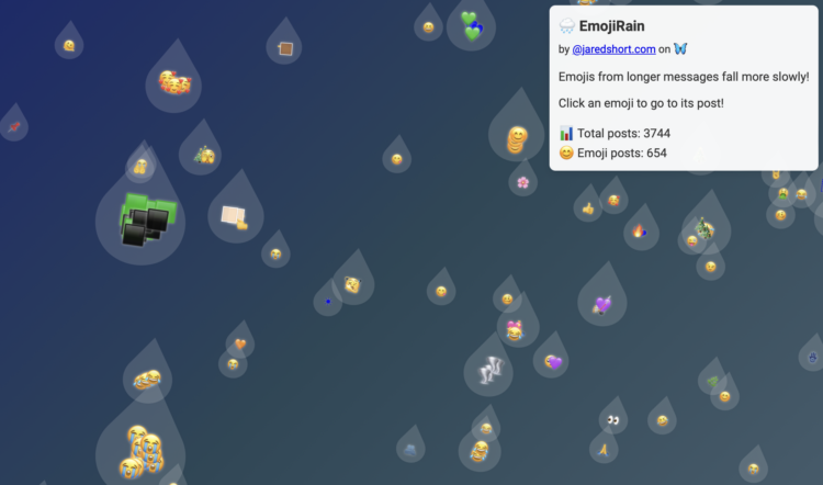
Bluesky firehose fun continues. Jared Short shows emoji usage as rain drops that fall down the screen. Larger drops represent longer posts.
Or, if the Matrix aesthetic is your thing, Short did that too:


To demonstrate how easy and cheap it is to access the Bluesky firehose, Final Words listens for deletion events and lets them fly and vanish from existence.

Bluesky has a relatively easy-to-use firehose that lets you dip into the stream of events through the platform. Theo Sanderson made this tunnel view to immerse yourself in the stream of consciousness composed by Bluesky users.
This is feeling a lot like early Twitter, which makes me think we should enjoy it while it lasts.
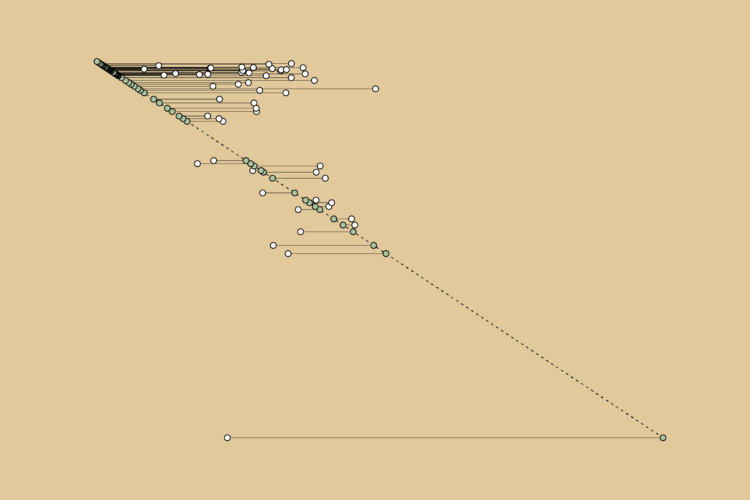
The 58-year-old Mike Tyson fought the 27-year-old Jake Paul, likely wrapping up Tyson’s boxing career that started in 1985 when he was 18. Given the big age difference in the final fight, I wondered the age of past Tyson opponents. This is the timeline.
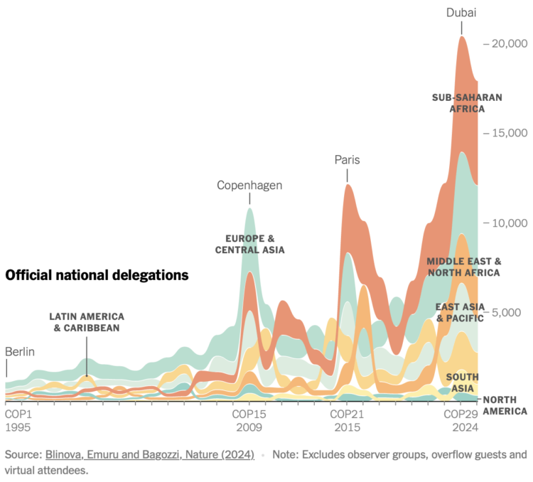
For the New York Times, Mira Rojanasakul visualized annual participation in the United Nations Climate Change Conference, which has been running every year since 1995.
If you think of the numbers as a proxy for the nations that care about climate change, things don’t look great for North America, but the shifts also provide a window into the politics of caring.
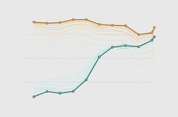
Using faded lines to show the overall changes in a time series and to provide a point of reference for the present.
The New York Times used swooping arrows to show vote swings left and right for the 2016, 2020, and 2024 elections. A shift left makes the section of an arrow blue, and a shift right makes a section of the arrow red. They show these arrows for demographic groups, too, which have static sizes, but the map above scales the arrows for electoral votes.
I was trying to figure out where I saw this method before. Then I saw it:
![]()
More specifically, the wordless version:
![]()
Then I had to eat lunch.
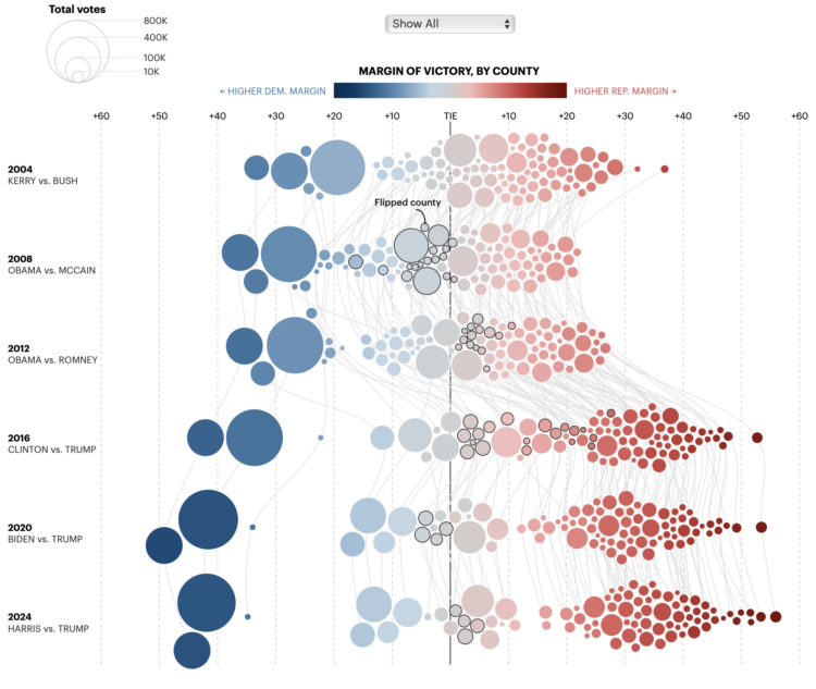
For the Minnesota Star Tribune, Yuqing Liu and C.J. Sinner show how the margin of victory changed each presidential election in Minnesota. Each bubble represents a county, size shows total votes, and diverging color scale represents the margin of victory for Democrat and Republican.
My affinity for force-directed bubbles contractually requires that I share this.
This week we look at connecting multiple charts explicitly and implicitly to provide a cohesive narrative or visual metaphor around a dataset.
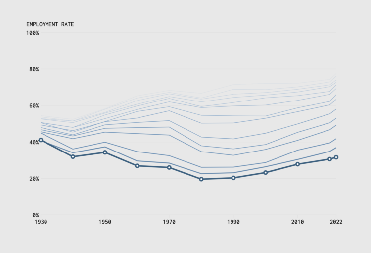
In 1935, the United States Congress passed the Social Security Act to provide financial support to those 65 years and older. Full retirement age would slowly rise to 67 by 2022. We can see how this changed the scales of who works and for how long through employment rates by age and time.
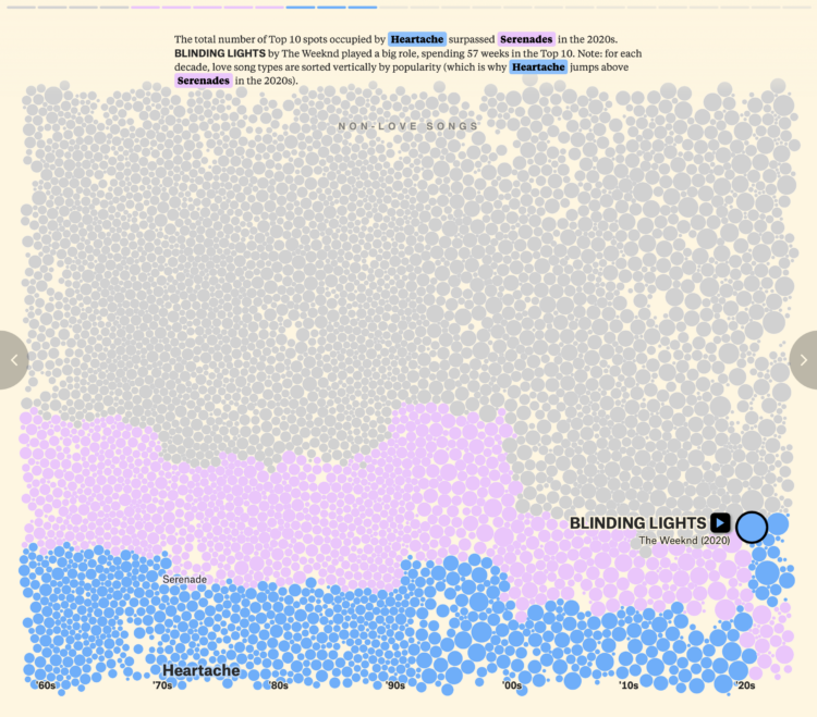
For The Pudding, David Mora and Michelle Jia examine the death of the love song, or rather, the evolution of the love song to include other types alongside the sappy and puppy dog types.
Each bubble represents a song, and bubble size represents the number of weeks each song spent in the Billboard Top 10. Then they go back and forth between the bubble view above, beeswarm charts, and an alluvial diagram below.
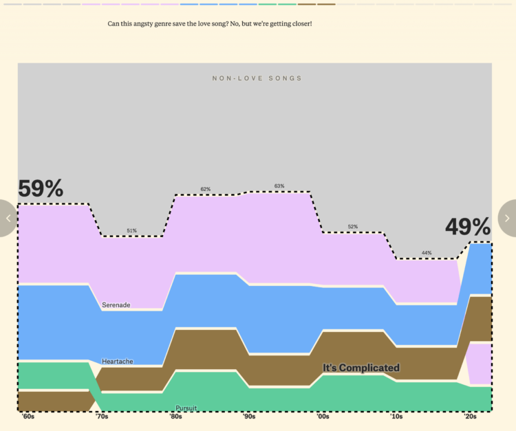
FD readers will likely be interested in the footnotes at the end of the piece. There are notes on methodology, song classification, and a link to download the data.
The Pudding has been publishing at a rapid pace these past couple months. It’s quite a treat.
Bluesky, maybe best pitched as a place for those who liked Twitter and Google Reader more than a decade ago, is having a moment right now. You can find me there.
It’s always hard for these things to maintain momentum, but we’ll see. The shift feels real this time. A good portion of the visualization community is over there, and some, like me, are rediscovering social media.
Sky Follower Bridge is a useful plugin for Chrome and Firefox to find the people you used to follow on X.
Hope to see you there.
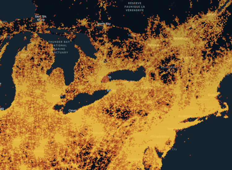
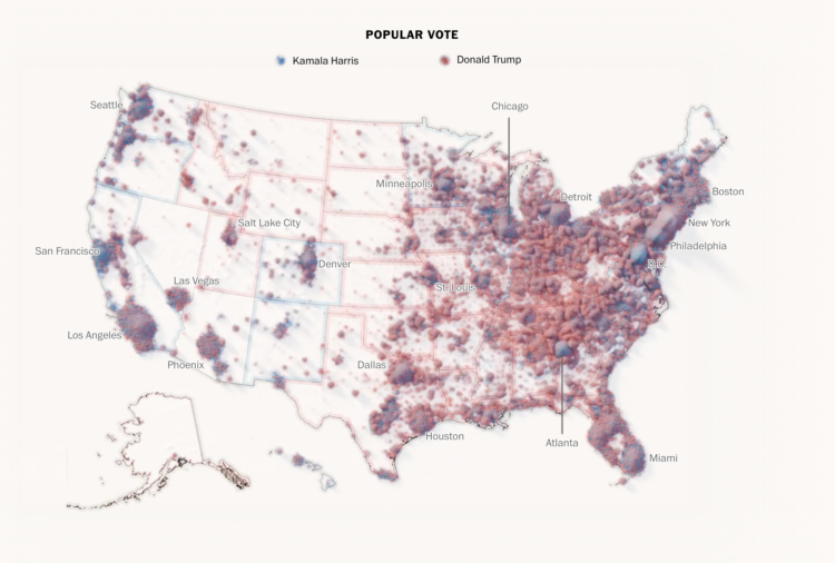
With what is now a common mapping method, The Economist used a dot density map to show election results by county. The dot counts are scaled to population density.
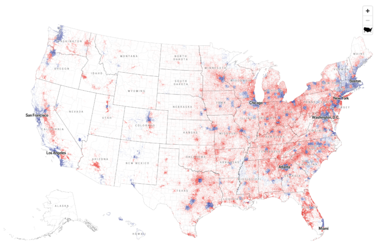
At first glance, I thought it was a 2024 version of this 2020 election map that shows the mix of voting within regions. A two-dimensional angle for grains of sand. But the map above shows just the winner of each county, which caught me off guard, because I associate the method with mixing demographic groups.
To show the mix of votes across the country, the Washington Post used a sand pile metaphor. Each grain of sand represents a vote for red or blue, and more votes create larger piles. Some piles are more red and some are more blue, but overall, you get a lot of mixed piles.
This is in contrast to a choropleth map that shows the winner in each region. One is not necessarily better than the other. Instead, this sand map shows a different angle to the data.
 Visualize This: The FlowingData Guide to Design, Visualization, and Statistics (2nd Edition)
New tools, refined process.


