For The Verge, Justine Calma reports on the recent takedowns. Some groups have been preparing for this:
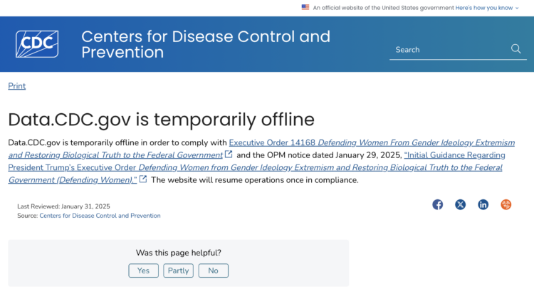
The End of Term Web Archive project has saved content on federal government websites during every presidential transition since 2008. The Environmental Data and Governance Initiative (EDGI) that formed after Trump was first elected also documents changes to government websites and works to make archived datasets available elsewhere. It has backed up data from the CDC’s Social Vulnerability Index and Environmental Justice Index and shared it on a webpage for The Public Environmental Data Project.
Yet even if these datasets have been archived, they aren’t as helpful when they aren’t updated. “Any dataset has a lifespan of utility,” says Dan Pisut, senior principal engineer at GIS software company Esri.
Of course, this is just the beginning. Remember: marathon, not sprint.


 Visualize This: The FlowingData Guide to Design, Visualization, and Statistics (2nd Edition)


