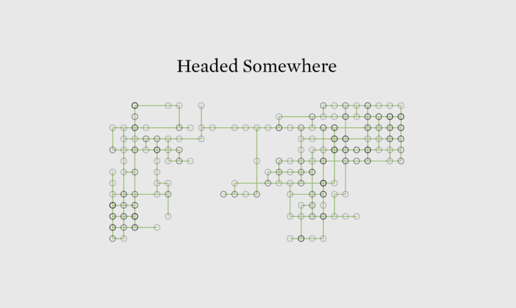
To demonstrate how easy and cheap it is to access the Bluesky firehose, Final Words listens for deletion events and lets them fly and vanish from existence.
To demonstrate how easy and cheap it is to access the Bluesky firehose, Final Words listens for deletion events and lets them fly and vanish from existence.
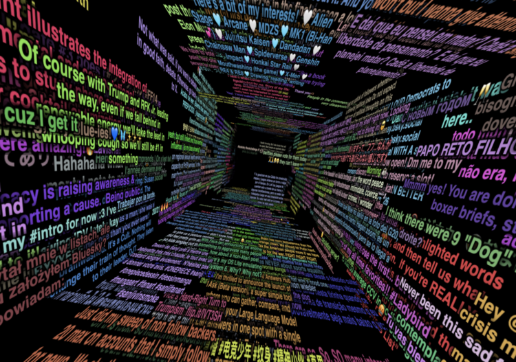
Bluesky has a relatively easy-to-use firehose that lets you dip into the stream of events through the platform. Theo Sanderson made this tunnel view to immerse yourself in the stream of consciousness composed by Bluesky users.
This is feeling a lot like early Twitter, which makes me think we should enjoy it while it lasts.
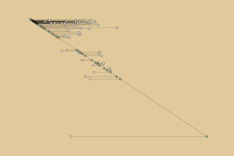
The 58-year-old Mike Tyson fought the 27-year-old Jake Paul, likely wrapping up Tyson’s boxing career that started in 1985 when he was 18. Given the big age difference in the final fight, I wondered the age of past Tyson opponents. This is the timeline.
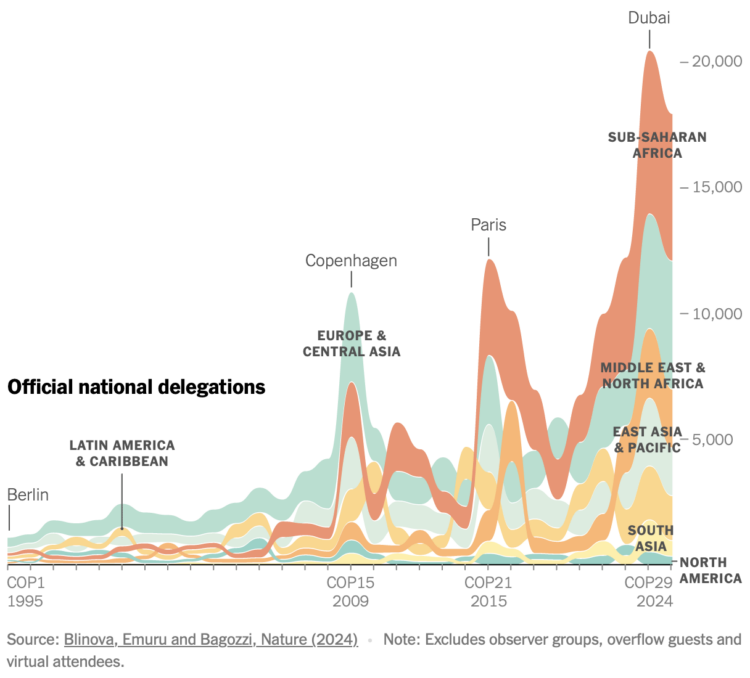
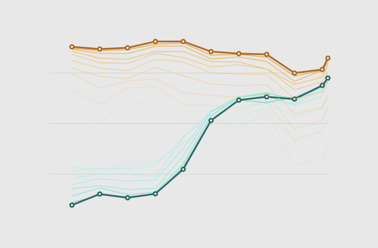
For the New York Times, Mira Rojanasakul visualized annual participation in the United Nations Climate Change Conference, which has been running every year since 1995.
If you think of the numbers as a proxy for the nations that care about climate change, things don’t look great for North America, but the shifts also provide a window into the politics of caring.
Using faded lines to show the overall changes in a time series and to provide a point of reference for the present.
The New York Times used swooping arrows to show vote swings left and right for the 2016, 2020, and 2024 elections. A shift left makes the section of an arrow blue, and a shift right makes a section of the arrow red. They show these arrows for demographic groups, too, which have static sizes, but the map above scales the arrows for electoral votes.
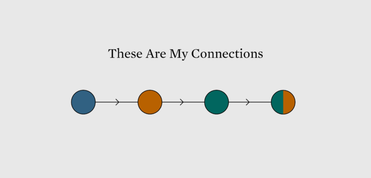
I was trying to figure out where I saw this method before. Then I saw it:
![]()
More specifically, the wordless version:
![]()
Then I had to eat lunch.
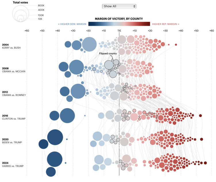
For the Minnesota Star Tribune, Yuqing Liu and C.J. Sinner show how the margin of victory changed each presidential election in Minnesota. Each bubble represents a county, size shows total votes, and diverging color scale represents the margin of victory for Democrat and Republican.
My affinity for force-directed bubbles contractually requires that I share this.
This week we look at connecting multiple charts explicitly and implicitly to provide a cohesive narrative or visual metaphor around a dataset.
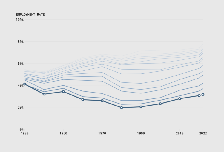
In 1935, the United States Congress passed the Social Security Act to provide financial support to those 65 years and older. Full retirement age would slowly rise to 67 by 2022. We can see how this changed the scales of who works and for how long through employment rates by age and time.
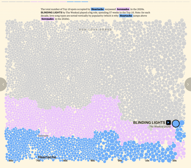
For The Pudding, David Mora and Michelle Jia examine the death of the love song, or rather, the evolution of the love song to include other types alongside the sappy and puppy dog types.
Each bubble represents a song, and bubble size represents the number of weeks each song spent in the Billboard Top 10. Then they go back and forth between the bubble view above, beeswarm charts, and an alluvial diagram below.
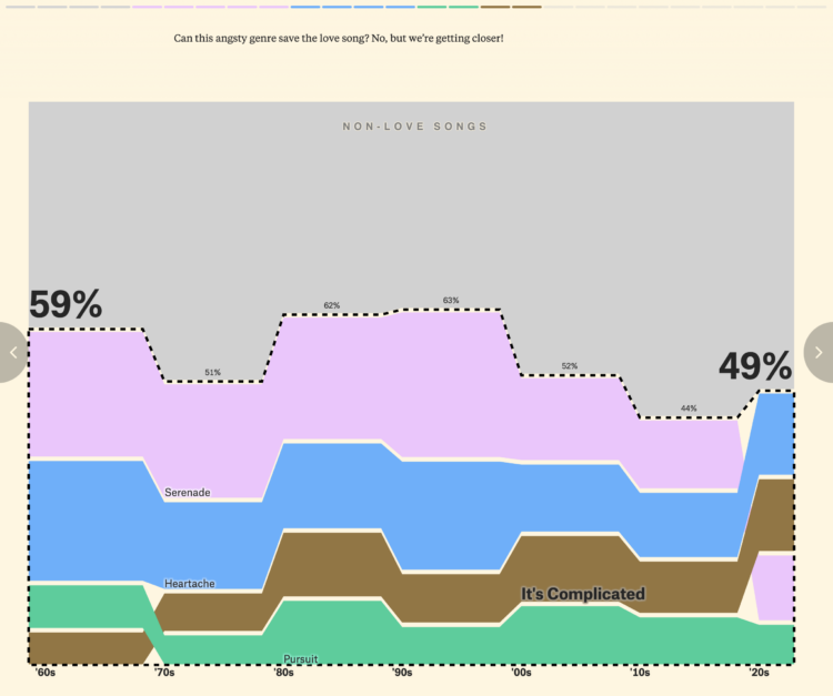
FD readers will likely be interested in the footnotes at the end of the piece. There are notes on methodology, song classification, and a link to download the data.
The Pudding has been publishing at a rapid pace these past couple months. It’s quite a treat.
Bluesky, maybe best pitched as a place for those who liked Twitter and Google Reader more than a decade ago, is having a moment right now. You can find me there.
It’s always hard for these things to maintain momentum, but we’ll see. The shift feels real this time. A good portion of the visualization community is over there, and some, like me, are rediscovering social media.
Sky Follower Bridge is a useful plugin for Chrome and Firefox to find the people you used to follow on X.
Hope to see you there.
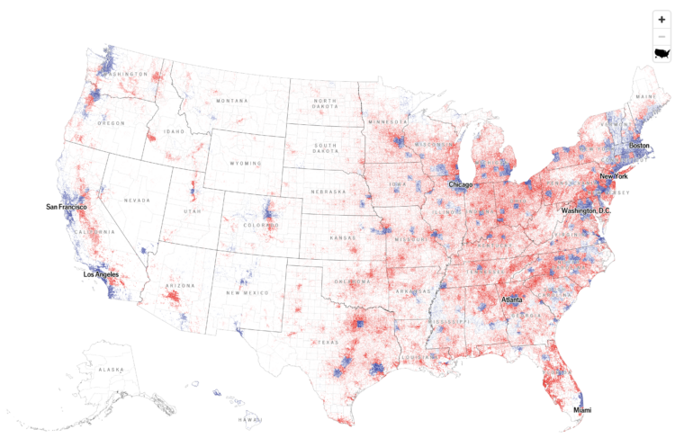
With what is now a common mapping method, The Economist used a dot density map to show election results by county. The dot counts are scaled to population density.
At first glance, I thought it was a 2024 version of this 2020 election map that shows the mix of voting within regions. A two-dimensional angle for grains of sand. But the map above shows just the winner of each county, which caught me off guard, because I associate the method with mixing demographic groups.
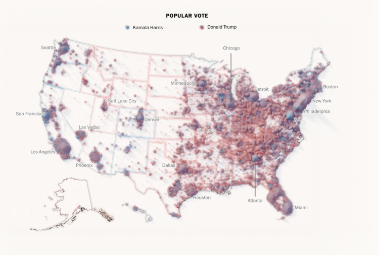
To show the mix of votes across the country, the Washington Post used a sand pile metaphor. Each grain of sand represents a vote for red or blue, and more votes create larger piles. Some piles are more red and some are more blue, but overall, you get a lot of mixed piles.
This is in contrast to a choropleth map that shows the winner in each region. One is not necessarily better than the other. Instead, this sand map shows a different angle to the data.
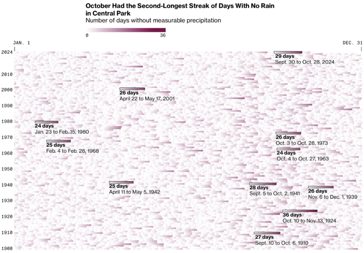
New York City recently issued a drought warning because of an abnormally dry fall. For Bloomberg, Denise Lu used a heatmap to highlight day streaks without rain via precipitation measurements in Central Park.
It’s more of an event-driven graphic than a pattern-driven one. I wonder if reversing the color scale would be useful here. Would it make the longer streaks appear “dryer” with empty space?
For BBC, Zoe Kleinman reports:
Not so long ago, 23andMe was in the public eye for all the right reasons.
Its famous customers included Snoop Dogg, Oprah Winfrey, Eva Longoria and Warren Buffet – and millions of users were getting unexpected and life-changing results.
Some people discovered that their parents were not who they thought they were, or that they had a genetic pre-disposition to serious health conditions. Its share price rocketed to $321.
Fast forward three years and that price has slumped to just under $5 – and the company is worth 2% of what it once was.
What went wrong?
It’s mostly wishful thinking on my part, but maybe people started to feel strange about sending their DNA to a company they didn’t know that much about.

A $40 million superyacht called the Bayesian sank off the coast of Sicily, but the exact cause is unknown. The New York Times illustrated the possibilities:
Reports immediately after the disaster raised the possibility that the Bayesian had been hit by a tornado-like disturbance called a waterspout, but the authorities don’t think that happened. Still, the wind was doing something dangerous: It was changing direction.
According to a nearby weather station, it was blowing west-southwest then southwest, then north-northwest. This increased the chances of getting ambushed by a random gust that could slam into the side of a boat, which can tilt even a big vessel.

I made a chart about Halloween candy. Even dumb charts need attention and require that choices are made.
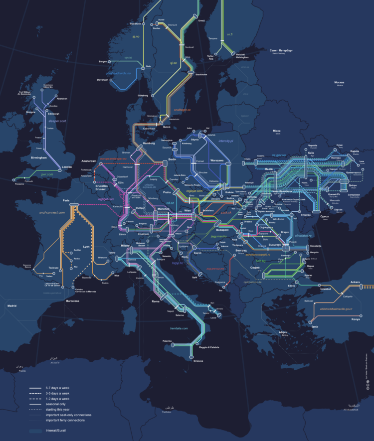
The Night Train Map is for Europeans who want to travel at night:
Have you ever wondered to which destinations you can travel by night train? Are you looking for inspiration for your next holiday? Then we got you covered: This is a map of all night train lines currently running in Europe, based on our night train database. The database and map are updated regularly to reflect time table changes and announcements of new night train services.
The emotion I am feeling is envy.

In the early 1800s, botanist and painter Pierre-Joseph Redouté painted hundreds of lily and rose species. Nicholas Rougeux restored the illustrations by hand for an accurate and browsable catalog of flowers. Rougeux documented the tedious process.
The illustrations organized by color are available as posters.
(In case you need something nice to look at after a long night.)
 Visualize This: The FlowingData Guide to Design, Visualization, and Statistics (2nd Edition)
New tools, refined process.