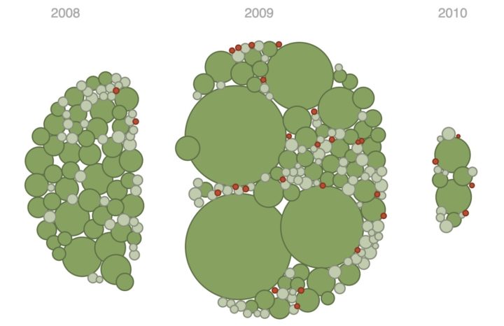
We’ve seen maps for global shipping routes before, but this project — Ship Map — by Kiln and the UCL Energy Institute makes the exploration more interactive and explanatory.
Read More
-
-
Our daily lives are full of bias. We make assumptions about how the world works, why complex systems do what they do, and how precise measurements really are. That leads to a skewed view and sometimes misinformed decisions. Lena Groeger for Propublica describes how information graphics might play a role in providing a more accurate picture, in the particular the ones that engage readers with data.
You may have noticed by now that in some of these graphics, what we realize is not just something about ourselves (wow, I’m terrible at the stock market) but something about others (wow, it’s pretty hard to live on minimum wage). In a way these “you do it” graphics are like digital empathy tools. When we’re forced to make a decision or do something we don’t normally have to do, we get a glimpse into what it might be like to be another person. I believe we can take the idea much farther.
This is one of my fascinations with data these days. “Overall” comes to mind a lot when I think of statistics. Overall trend. Overall pattern. Aggregation. That’s hard for the everyday person or casual reader to grasp onto sometimes. But, if they see where they’re positioned in some amalgamation of data, that’s a good baseline to riff off of.
-
Drawing Circles and Ellipses in R
Whether you use circles as visual encodings or as a way to highlight areas of a plot, there are functions at your disposal.
-
Mapping slavery from a historical perspective is a challenge, because many old maps and estimates are at the county level. Boundaries changed and counting methods changed, which provides for variation over time and geography. Cartographer Bill Rankin tries to find balance between accuracy and readability in a set of maps that show slavery in a grid layout from 1790 to 1870.
Read More -
Daniel Smilkov and Shan Carter at Google put together this interactive learner for how a neural network works. In case you’re unfamiliar with the method:
It’s a technique for building a computer program that learns from data. It is based very loosely on how we think the human brain works. First, a collection of software “neurons” are created and connected together, allowing them to send messages to each other. Next, the network is asked to solve a problem, which it attempts to do over and over, each time strengthening the connections that lead to success and diminishing those that lead to failure.
I took one course on neural networks in college and poked around at those parameters for hours for various homework assignments and projects. I was basically a monkey pushing at buttons to see what images I could produce. I wish I had something like this to mess around with, so I could actually see the process.
-
This is the trend line from Google Trends for “Well that escalated quickly.” I know there’s a perfectly good reason for the sudden rise, but I prefer not to know. [via @HPS_Vanessa]
Read More -
NPR is running a series on spending and school districts and all its complexities with government funding and whether or not more money even helps. They start with a map that shows the differences in spending per student in primary and unified school districts. Dollars are “adjusted for regional differences in cost of living, using the NCES Comparable Wage Index 2013.”
As you scroll down the story, an interactive map pans to the geographic area you’re most likely located in. It’s a small thing that we’ve been seeing more of lately. Since users are most likely to zoom in to their own area to compare, might as well try to do it for them. I like it.
-
Articles about stay-at-home dads and parents with even work loads might make it seem like dads are putting in a lot of hours in the household these days. Are they? How do they compare to moms’ work hours?
-
A group of researchers are studying how all the galaxies in the universe are connected, network-style.
Read More -
Visualization of time is usually about compression so that you can see more in less minutes. This animation, however, shows the Titanic sinking in near real-time, over 2 hours and 40 minutes.
My knee-jerk reaction was, wow, that’s a long time for everyone to get to safety, but let’s not forget this was in the freakin’ ocean in 1912. So you know, there’s that. [via kottke]
-
Stephen Curry made 402 three-pointers this regular season, which is ridiculous. Gregor Aisch and Kevin Quealy put the record into context showing just how much far ahead of others Curry was. No one has even made at least 300 three-pointers.
-
Online comments are an odd entity that can get out of hand quickly, and it only takes one or two sour comments to sully an entire thread. To shed some light on the dark side of online commenting, the Guardian commissioned research for their own archive of 70 million comments.
Although the majority of our regular opinion writers are white men, we found that those who experienced the highest levels of abuse and dismissive trolling were not. The 10 regular writers who got the most abuse were eight women (four white and four non-white) and two black men. Two of the women and one of the men were gay. And of the eight women in the “top 10”, one was Muslim and one Jewish.
This is why I closed comments a couple of years ago. I wasn’t get any abuse, but at some point it was like every comment was either really negative, self-promotion, or just straight-up spam. I don’t even want to imagine what comments look like for mainstream sites.
-
In celebration of Kobe Bryant’s final game, the Los Angeles Times charted all 30,699 field goals threw up over his twenty-year career. A tour feature takes you through some of Bryant’s most significant shots, and an exploration mode lets you filter down to the shots you’re interested in, like buzzer beaters, jump shots, or just makes.
-
Eleanor Lutz made some trading cards — for viruses.
To make the 3D animations I used UCSF Chimera, a free molecular modeling program. When scientists discover a new protein structure they upload it to the worldwide Protein Data Bank. Each entry is assigned a unique ID number, which you can use to call up the structure in programs like Chimera or PyMol.
-
The tax plans of Ted Cruz and Donald Trump might seem fine if you don’t think about the actual values. Tax cuts. Less government spending. But then it gets tricky when you look at what they’re actually proposing. Alvin Chang for Vox provides a simple interactive to show what the Cruz and Trump and budgets require.
They want to cut so much government spending that it’s virtually impossible to figure out how they’d do it. Cruz wants to cut spending by $8.6 trillion over the next decade, according to a Tax Policy Center analysis, and Trump wants to cut it by $9.5 trillion. To put this in perspective, the entire budget for this fiscal year is $3.9 trillion.
Be sure to go to the bottom to try to balance the the budgets yourself.
-
Drawing Squares and Rectangles in R
R makes it easy to add squares and rectangles to your plots, but it gets a little tricky when you have a bunch to draw at once. The key is to break it down to the elements.
-
Voronoi Diagram and Delaunay Triangulation in R
The
deldir
package by Rolf Turner makes the calculations and plotting straightforward, with a few lines of code. -
Michael VanDaniker found that his energy provider, Baltimore Gas and Electric, provides customers with an easy-to-use tool to export their home’s energy usage by the hour. So he downloaded the CSV and had a look back at 2015, through the eyes of heating and cooling. Fun.
Read More -
Overall life expectancy continues to increase, but looking at it from the other end — mortality rates — show different trends for different groups, especially women who live in rural areas. Dan Keating and Kennedy Elliott for the Washington Post explain with a collection of time series charts.
For younger age groups, drug overdose and suicide account for virtually all of the increases in death rate. For older groups, additional causes of death are also increasing, particularly heart and lung diseases for rural women, and cirrhosis for people over 45.
Rather than show mortality rates over time, the charts focus on the actual percentage change from 1990. A line that trends upwards is bad.
-
Peter Aldhous and Charles Seife dug into flight path data, specifically looking for flights manned by the FBI and the Department of Homeland Security.
The government’s airborne surveillance has received little public scrutiny — until now. BuzzFeed News has assembled an unprecedented picture of the operation’s scale and sweep by analyzing aircraft location data collected by the flight-tracking website Flightradar24 from mid-August to the end of December last year, identifying about 200 federal aircraft. Day after day, dozens of these planes circled above cities across the nation.
BuzzFeed’s searchable, animated map shows these circular paths, red for FBI and blue for DHS. There was no definite answer for what those planes are doing. Maybe routine surveillance or maybe lookouts for specific people or events. But still, so interesting.