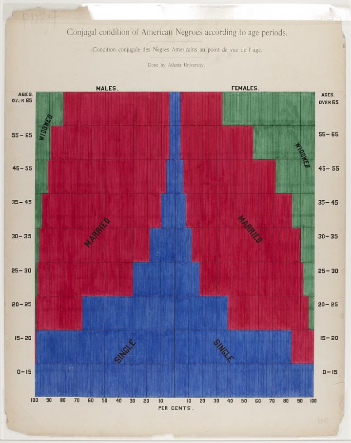
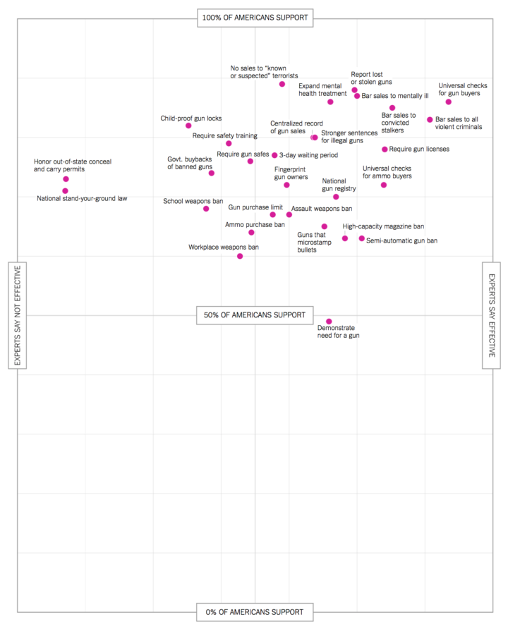
• Membership
  • Newsletter
  • Projects
  • Learning
  • About
  • Member Login
  • Oceans absorbing heat

    September 13, 2016

    Topic

    Maps  /  environment, New York Times, temperature, Tim Wallace

    It keeps getting hotter on this planet, and the oceans are absorbing most of the heat. Tim Wallace for the New York Times shows several decades of changes.

  • xkcd: Earth temperature timeline

    September 13, 2016

    Topic

    Infographics  /  environment, temperature, xkcd

    In classic xkcd-fashion, Randall Munroe timelines the Earth’s temperature, dating back to 20,000 BCE up to present. Slow changes, slow changes, history, slow changes, still slow changes, and then, oh shoot.

  • Innovation by Design Awards

    September 12, 2016

    Topic

    Site News  /  award, Fast Company

    Co.Design picked the winners for their annual Innovation by Design Awards. My series on mortality and causes of death won for the graphic design and data visualization category. Very cool.

    This year’s entries represented an astonishingly strong survey of innovation around the globe—over 1,700 designs. In the eyes of our esteemed judges, the projects you’ll find below were the best of the best. There were only 15 winners anointed in the entire competition; we also crowned about 231 finalists. Each of those projects represent what’s best about design today: Big ideas, meticulously thought-out details, and a clear viewpoint about how we live now—and how it could be better. We hope that you’ll dig in and be inspired.

    Here’s the series.

  • Watch bacteria evolve resistance to antibiotic

    September 12, 2016

    Topic

    Visualization  /  bacteria, biology, evolution, physical

    Scientists at Harvard University setup the MEGA-plate, essentially a giant petri dish, with varying levels of antibiotic. Then they let the bacteria have a go, and you can see the bacteria actually evolve. Ed Yong for the Atlantic:

    What you’re seeing in the movie is a vivid depiction of a very real problem. Disease-causing bacteria and other microbes are increasingly evolving to resist our drugs; by 2050, these impervious infections could potentially kill ten million people a year. The problem of drug-resistant infections is terrifying but also abstract; by their nature, microbes are invisible to the naked eye, and the process by which they defy our drugs is even harder to visualise.

    Until you watch the video, that is.

  • Swing states are a relatively new thing

    September 9, 2016

    Topic

    Maps  /  election, Guardian

    Here’s a fun one from the Guardian. They go over the change in political landscape, leading in with a map that shows states flip around like cards each election cycle.

    Relying on the same handful of states to decide the outcome of presidential elections is a fairly recent phenomenon. Just three decades ago, when politics weren’t yet so polarized, all 50 states were up for grabs, swinging between parties from one election to the next.

  • Election DataBot provides a feed of the interesting data stories

    September 9, 2016

    Topic

    Data Sources  /  election, Google, ProPublica

    There is a ton of election-related data pushed out every day, so much it’s hard to keep track. ProPublica provides the Election DataBot to help bubble up the more interesting data points.

    Today ProPublica is launching a new tool, created in partnership with the Google News Lab, that makes it easier for journalists, researchers and citizens to quickly find newsworthy information about the presidential race and congressional campaigns in their states. We’re calling it the Election DataBot because it collects huge amounts of data and reports the most interesting details, in real time — details about campaign finance filings, congressional votes, polls and Google Trends data, among other things.

    Probably the best part is that you can quickly filter down to your state and election race. See what your representatives are doing and what’s trending.

  • Serena Williams, greatest of all time

    September 8, 2016

    Topic

    Infographics  /  Los Angeles Times, Serena Williams, sports, tennis

    Serena Williams, who plays tonight in the U.S. Open semifinal, might be the greatest tennis player of all time. Kyle Kim for the Los Angeles Times provides a numbers rundown to make the case.

  • How to Make Beeswarm Plots in R to Show Distributions

    Try the more element-based approach instead of your traditional histogram or boxplot.

  • Comma Chameleon, a stripped-down CSV editor

    September 8, 2016

    Topic

    Software  /  csv, editor

    CSV files are great, but every now and then you have to edit them for errors or format them for the next step. You could use Excel. I’ve been using Google Sheets. However, these applications are designed for general purposes to fulfill a lot of use cases. Comma Chameleon on the other hand is made specifically to get you in and out fast, so that you can use your CSV file elsewhere.

    Next CSV I get is going in here.

  • Radio station frequencies, by genre

    September 7, 2016

    Topic

    Statistical Visualization  /  radio

    In most areas in the United States, lower FM frequencies are reserved for non-commercial educational broadcasting, and the rest is for commercial broadcasting. (And suddenly, radio music availability during long drives makes sense to me.) Upon this trivia nugget, Bob Baxley wondered what the distribution of frequencies looked like across various genres. With a quick scrape and a plot, here’s what he got. [Thanks, Bob]

  • More global warming, more flooding

    September 6, 2016

    Topic

    Infographics  /  global warming, New York Times

    Water levels are rising, and naturally, the coasts are feeling it. Jonathan Corum for the New York Times shows the rise in tidal flooding along the Atlantic and Gulf Coasts. Scientists think it’s going to get a lot worse fast.

    The time series charts are an interesting use of dual axes. The background is mean sea level rise, and the bars are days of flooding. Most of the time, mixed units don’t work so well, but I think it works here, with labeling and varying color gradient to differentiate the two chart types placed one on top of the other.

  • Oil fires in Iraq seen from above

    September 2, 2016

    Topic

    Maps  /  Iraq, NASA, oil, satellite

    Though far away, there’s still a lot you can see, as the NASA Earth Observatory notes:

    On August 17, 2016, the Operational Land Imager (OLI) on Landsat 8 acquired an image (above) of dense smoke plumes roughly 50 kilometers (30 miles) south of Mosul. There appear to be multiple sources of fire, most likely oil wells from the Qayyarah oil field. The images in the grid below show the plumes changing direction and thickness since they were first spotted by Landsat 8 on June 14.

  • Dear Data, the book

    September 1, 2016

    Topic

    Data Art  /  book, Giorgia Lupi, postcards, Stefanie Posavec

    For a year, Stefanie Posavec and Giorgia Lupi drew data postcards and sent them to each other once a week between New York and London. Each postcard was based on data each collected during the week about their daily lives. The project is called Dear Data. Now it’s a book.

    Amazon link. Get the paperback version.

  • Invention

    August 31, 2016

    Topic

    Chart Everything

    R.I.P.

  • Data Underload  /  alcohol

    What Alcohol People Around the World Drink

    Americans get most of their alcohol from beer, but it’s not like that everywhere.

    Read More
  • Sans human, Facebook’s Trending Topics algorithm faired poorly

    August 30, 2016

    Topic

    Mistaken Data  /  algorithm, facebook

    Last week, Facebook announced that it was making the Trending Topics section more automated. More algorithm-based. Less person-based. On Monday, the section showed a fake news story at the top of the list for several hours.

    Nick Statt for the Verge on the human element:

    The changes instituted on Friday didn’t throw all of that away; Facebook has been slowly stripping away the human element of Trending Topics for months now. Rather, it marked the moment Facebook decided its algorithmic approach was more favorable, or perhaps more cost-effective and less damaging. But in shifting the reins to engineers, the company has minimized the kind of news judgment typically exercised by journalists and editors. Now, just a few days later, we’re realizing just how important that human element was.

    Data. Always open for interpretation.

  • Out of state, public education

    August 30, 2016

    Topic

    Maps  /  education, New York Times

    Nick Strayer for the New York Times shows the flow of college freshman to other states for public education:

    Students have long traveled across state lines to go to selective private colleges. But at public colleges, which have historically served local residents, the number of out-of-state freshmen has nearly doubled since 1986, according to data from the Department of Education.

    See the full piece for in- and out-of-state numbers for your own state.

  • D3 in Depth

    August 29, 2016

    Topic

    Coding  /  d3js

    D3 is the most commonly used JavaScript library for visualization on the web, but there’s a bit of learning curve, especially for those new to programming. Peter Cook hopes to make this beginning step easier with his newly started online resource D3 in Depth.

    Pair this with many, many examples and you’re set.

  • Chart Everything  /  parenthood

    This is Parenthood

    Raising kids is hard to explain. I’ll try anyways. With some charts.

    Read More
  • Page 174 of 392
  • <
  • 1
  • ...
  • 171
  • 172
  • 173
  • 174
  • 175
  • 176
  • ...
  • 392
  • >

Analyze, visualize, and communicate data usefully, beyond the defaults.

Become a member →

Recently for Members

May 8, 2025
When the data is not what it seems

May 1, 2025
Finding the Right Charts

April 24, 2025
Visualization Tools, Datasets, and Resources – April 2025 Roundup

April 17, 2025
Breaking Out of Chart Software Defaults

April 15, 2025
Line Chart with Decorative Neon Accents

Browse by Chart Type See All →

Packed Bubble Chart Mosaic Plot Choropleth Map Stacked Bar Chart Dot Density Map Baseline Chart Radar Chart Treemap Horizon Graph

Browse By Topic

  • Visualization

    Seeing data

  • Maps

    Seeing geographic data

  • Infographics

    Explaining data

  • Networks

    Connecting data

  • Statistics

    Analyzing data

  • Software

    Working with data

  • Sources

    Getting data

  • Design

    Making data readable

Get the Book

Visualize This: The FlowingData Guide to Design, Visualization, and Statistics

Available now.

Order: Amazon / Bookshop

Made by FlowingData

  • The Process

  • Data Underload

  • Chart Everything

  • Guides

  • Books

  • Shop

  • About
  • Contact
  • Newsletter
  • LinkedIn
  • Instagram
  • Bluesky
  • RSS
Copyright © 2007-Present FlowingData. All rights reserved.