We all get a lot of emails, and there’s a large subset of them that almost instantly end up in the archive or the trash bin. In the past year, this subset seems to have really grown for me. They tend to follow a similar pattern to “submit infographic” probably 90 percent of the time. At this point, the patterns seem so regular that I can archive without ever opening the email. Here’s my deletion process.
Read More
-
-
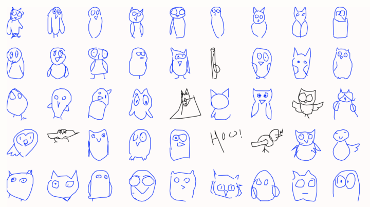
Google released the Quick, Draw! dataset, so the closer looks at the collection of 100,000 sketches are coming in. This fun piece by Yannick Assogba uses principal components to arrange doodles in some organized way.
Reminiscent of Aaron Koblin’s classic The Sheep Market.
-
Open Up: A Guide to Using Open Data to Combat Corruption is free for download.
A broad understanding of corruption recognises that it is not just about isolated acts between two different agents: the one who offers a bribe, and the one who receives it. Instead, corruption is a complex crime. It is driven by networks of officials, professional intermediaries and companies. So in order to tackle corruption effectively, you need to understand and dismantle these networks. This requires information and the ability to spot patterns.
The more people who can find truth in the data, the better we all come out in the end.
-
I had the honor to deliver the commencement speech at the UCLA Statistics graduation this past weekend. I’m going to put this here for posterity before my memory tucks it away never to be uttered again. I truncated the speech last minute, so these notes are a little more coherent than my delivery.
Read More -
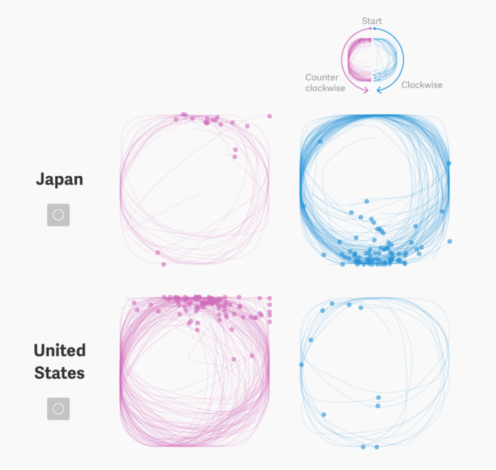
Thu-Huong Ha and Nikhil Sonnad for Quartz looked at the doodling dataset from Google, in search of cultural differences hidden in how we draw circles around the world.
We used the public database from Quick, Draw! to compare how people draw basic shapes around the world. Our analysis suggests that the way you draw a simple circle is linked to geography and cultural upbringing, deep-rooted in hundreds of years of written language, and significant in developmental psychology and trends in education today.
Love the added context showing character strokes in different languages.
-
Nerd humor:
Asked for a normal coffee ☕ pic.twitter.com/JoakebV9xN
— Matt Moores (@MooresMt) June 14, 2017
That barista deserves a tip.
-
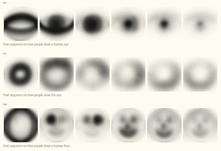
Using Google’s Quick Draw dataset, a collection of 50 million drawings across 345 categories, Mauro Martino looked for visual differences and similarities across countries in how people doodle. The result is his project Forma Fluens.
Read More -
How to Make a Multi-line Step Chart in R
For the times your data represents immediate changes in value.
-
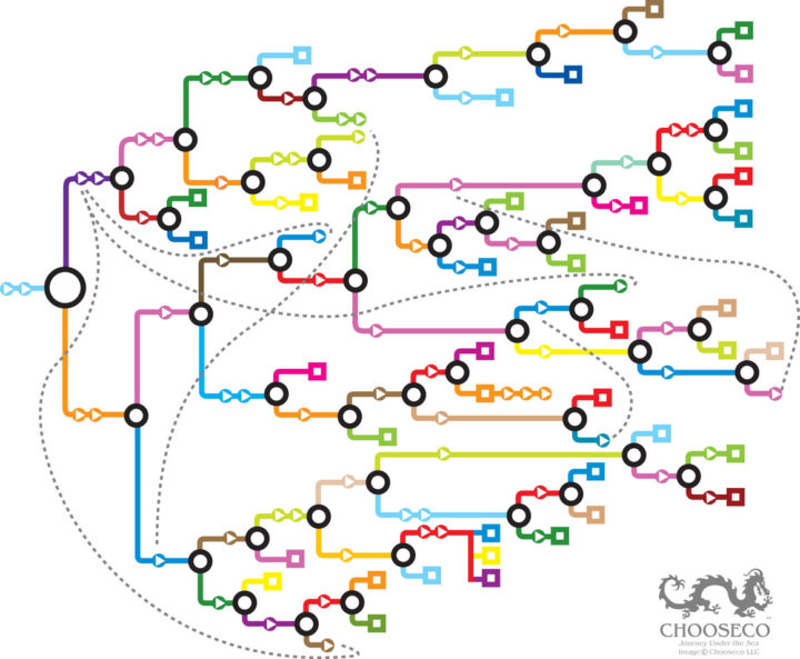
Every now and then there’s a visual exploration of the Choose Your Own Adventure series. It seems that each gets a bit more complex, so I appreciate the simplicity of these official maps from Chooseco, which shows the structure of each book. Atlas Obscura provides the details.
On the official maps, however, the endings aren’t coded in any way that reveals their nature. Instead, they operate according to a simple key: each arrow represents a page, each circle a choice, and each square an ending. Dotted lines show where branches link to one another.
The one above is for Journey Under the Sea. I need to dig up my CYOA collection.
-
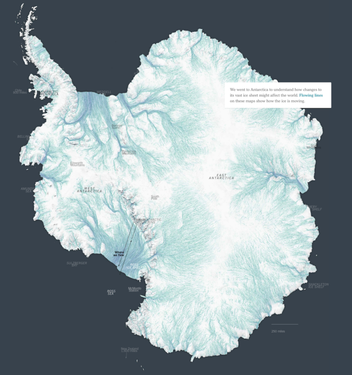
Ice in Antartica is in constant (very slow) motion, and as ocean waters warm, the flow of ice accelerates. The New York Times mapped the flows, showing where the ice is headed.
And, if you’re interested in how they did this, NYT graphics editor Derek Watkins provides the rundown.
-
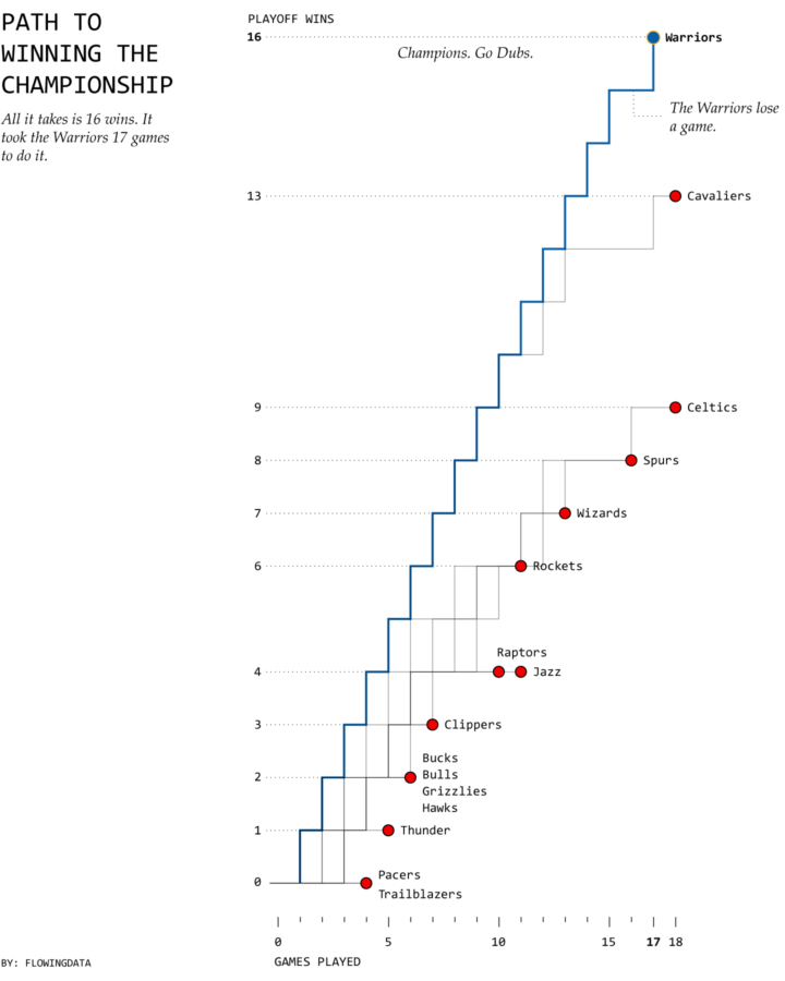
As expected, this time, the Golden State Warriors won the championship last night.…
-
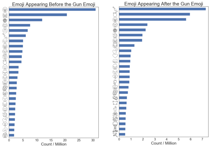
Jane Solomon collected tweets that used the gun emoji, and looked at what emojis were used before and after as a way to see how people used the gun.
It seems that the sarcastic and reflexive gun emoji pairings are extremely popular, which matches my expectations and the knowledge I brought into this exercise. One result that surprised me was the high collocation with the gun and various heart emoji. I had never personally associated the gun emoji as a means to express heartbreak, but it’s there in the data.
[via Waxy]
-
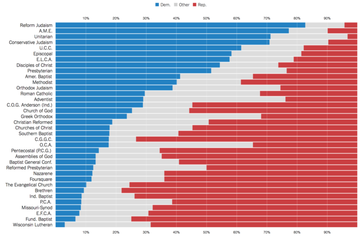
Kevin Quealy for The Upshot looks at political party registration of religious leaders, along with their demographics. Some groups like Reform Judaism and Fundamental Baptist are predictable, whereas others (most) are mixed.
-
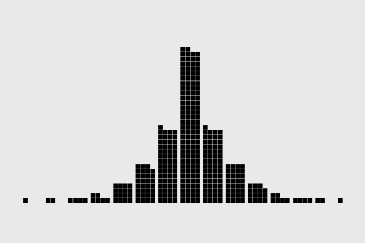
Symbols-based Unit Charts to Show Counts in R
Add visual weight by using individual items to show counts.
-
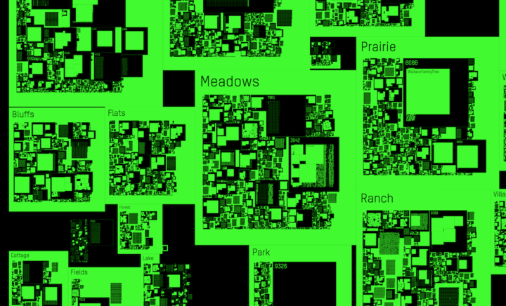
Geocities was a place on the web you could create your own space of blinking lights and MIDI tunes. There were millions of spaces modeled after a city. In an update to his 2011 piece, Richard Vijgen visualized the 2009 backup as a digital map.
This website is an interactive visualisation of the 650 gigabyte Geocities backup made by the Archive Team on October 27, 2009. It depicts the file system as a city map, spatially arranging the different neighbourhoods and individual lots based on the number of files they contain. In full view, the map is a data-visualisation showing the relative sizes of the different neighbourhoods. While zooming in, more and more detail becomes visible, eventually showing individual html pages and the images they contain.
Does it make me an old coot for liking the Geocities days better than the social media ones we’re in now? [via Waxy]
-
Students at the National Taiwan University of Arts made popsicles using sewage runoff to highlight pollution problems in their area. Then they replicated the popsicles and made stylish wrappers for a longer-lasting display. Mmm, sewage. [via Mashable]
-
The new R package miner is an interface to Minecraft via some simple R commands.
The miner package provides just a few simple functions to manipulate the game world: find or move a player’s position; add or remove blocks in the world; send a message to all players in the world. The functions are deliberately simple, designed to be used to build more complex tasks.
I’m thinking walkable data worlds in Minecraft.
I bought Minecraft for my three-year-old, but he didn’t understand the point when his LEGO bricks were within arm’s reach and there weren’t any funny noises or songs. Maybe the purchase wasn’t a total bust after all.
Here’s the full miner package guide.
-
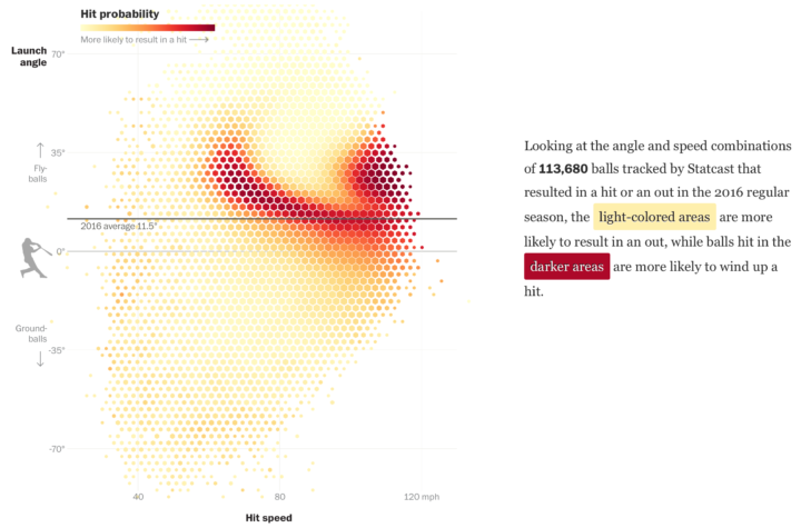
After the crackdown on performance-enhancing drugs, home runs in professional baseball dipped the past few years. They seem to be back up though, and new metrics on hitting angle might have something to do with it. Dave Sheinin and Armand Emamdjomeh for The Washington Post delve into the angles, along with hit speed, and how they lead to more home runs.
-
If it seems like every day you log in to Facebook, it’s someone’s birthday, you’re probably not that far off.




 Visualize This: The FlowingData Guide to Design, Visualization, and Statistics (2nd Edition)


