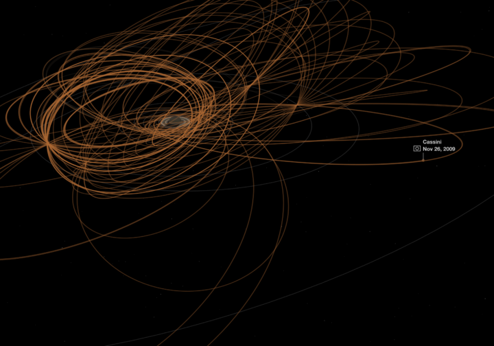
Map who “likes” television shows on Facebook, by ZIP code, and you get a good idea of cultural boundaries. This is what Josh Katz for the Upshot did for 50 of the most liked shows in the United States, finding three distinct regions: “cities and their suburbs; rural areas; and what we’re calling the extended Black Belt.”
-
Nikhil Sonnad for Quartz mapped the top 100,000 words used in tweets. Search to your heart’s content.
The data for these maps are drawn from billions of tweets collected by geographer Diansheng Guo in 2014. Jack Grieve, a forensic linguist at Aston University in the United Kingdom, along with Andrea Nini of the University of Manchester, identified the top 100,000 words used in these tweets and how often they are used in every county in the continental United States, based on location data from Twitter.
See also the dialect quiz and maps by Josh Katz from a few years back.
-
You might remember Bayes mentioned a few times in your introduction to statistics course. Or maybe you hear it every now and then in the news, and maybe you’re not quite sure what people are talking about. Here’s an introduction video to Bayesian statistics by Brandon Rohrer.
[arve url=”https://www.youtube.com/watch?v=5NMxiOGL39M”/]
There’s also a text version, if you prefer that over video. [via Revolutions]
-
The tweenr package in R, by Thomas Lin Pedersen, helps you interpolate data for easier animated transitions.
tweenr is a small package that makes it easy to interpolate your data between different states, specifying the length of each change, the easing of the transition and how many intermediary steps should be generated. tweenr works particularly well with gganimate but can be used for any case where interpolation of data is needed.
Why I’m just now learning about this, I have no clue. I thought we were friends.
-
From Google Research, a look at how discrimination in machine learning can lead to poor results and what might be done to combat:
Here we discuss “threshold classifiers,” a part of some machine learning systems that is critical to issues of discrimination. A threshold classifier essentially makes a yes/no decision, putting things in one category or another. We look at how these classifiers work, ways they can potentially be unfair, and how you might turn an unfair classifier into a fairer one.
-
Shadows cast by buildings affect the feel and flow of a city, and lack of sunlight can change aspects of daily living, such as rent. In a place like New York City, where there are tall buildings aplenty, the effects are obvious. Quoctrung Bui and Jeremy White for The New York Times mapped the darkness.
Read More -
It’s been quite the year of randomness and things we never would have imagined at any other time before they occurred. So in the spirit of this year, here’s A Christmas Story for you.
Read More -
This animated visualization from NASA Goddard Space Flight Center shows a model of carbon dioxide swirl around the planet, “using observations from NASA’s Orbiting Carbon Observatory (OCO-2) satellite.”
-
Here’s a fun piece called Radio Garden. It’s exactly what the title says. Pan the globe and listen to live radio at all the green dots.
-
The Beer Judge Certification Program lists 100 styles of beer. Here’s a chart for all of them.
-
Climate change is doing some weird stuff. What were once rare weather events could grow more common. ProPublica and The Texas Tribune zoom in on Houston, where there’s likely to be much more flooding than usual and not enough residents prepared for the rise.
scientists say climate change is causing torrential rainfall to happen more often, meaning storms that used to be considered “once-in-a-lifetime” events are happening with greater frequency. Rare storms that have only a miniscule chance of occurring in any given year have repeatedly battered the city in the past 15 years. And a significant portion of buildings that flooded in the same time frame were not located in the “100-year” floodplain — the area considered to have a 1 percent chance of flooding in any given year — catching residents who are not required to carry flood insurance off guard.
It’s a scroller with detailed maps of what’s happened in terms of flooding over the past decade or so. “I’m not a scientist” but this seems serious.
-
By design, the electoral college and population don’t quite match up state-by-state. This results in a lower ratio of electoral seats to people for the higher populated states and a higher ratio for the lower populated states. Denise Lu for The Washington Post provides a small multiples state grid to show the differences.
These charts show the difference between each state’s share of the national population and its share of votes in the electoral college since 1960. If the bars are above the line, the state has a greater share of electoral votes than it does population, meaning it is overrepresented. If the bars are below the line, the state is underrepresented.
-
Geography and state borders play a big part in how elections play out and where candidates campaign. Neil Freeman demonstrates with a map that generates random state boundaries.
This interactive map creates randomly-generated state boundaries for the United States, and see who would recent presidential elections under the map. Under different combinations of states, different regions become the deciding factor, and even broad popular support can be overturned by the specific state boundaries.
I think to really drive the point home, Freeman could highlight the elections that shift in final result instead of relying on just the 270 mark.
Update: Freeman applied the method to boundaries formed by various aspects of our lives.
-
Continuing the neural network explorations, Shan Carter and team of Google Brain and Cloud, look at how a network deals with handwriting by placing them in the same space.
The black box reputation of machine learning models is well deserved, but we believe part of that reputation has been born from the programming context into which they have been locked into. The experience of having an easily inspectable model available in the same programming context as the interactive visualization environment (here, javascript) proved to be very productive for prototyping and exploring new ideas for this post.
Side note: Been seeing a lot of Google experiments the past couple of weeks. I like it. Is it because it’s December, or are they just feeling more experimental these days?
-
Geographers Alasdair Rae and Garrett Nelson used commuting data from the American Community Survey to identify “megaregions” in the United States:
The emergence in the United States of large-scale “megaregions” centered on major metropolitan areas is a phenomenon often taken for granted in both scholarly studies and popular accounts of contemporary economic geography. This paper uses a data set of more than 4,000,000 commuter flows as the basis for an empirical approach to the identification of such megaregions.
-
How does the distribution of calories vary by fast food restaurant? Here’s a chart that shows all the menu items for ten of the biggest national fast food chains.
-
BuzzFeed used interpretive dance to describe the average age of the milestones in our lives, from birth, losing the first tooth, marriage, and death. The data points serve more as background, as a way to provide a timeline of events, and the dancing is the primary focus.
[arve url=”https://www.youtube.com/watch?v=9bvOHZ0NWig”/]
I found myself drawn to the comments on YouTube. Typically a cesspool of idiocy and more idiocy, the comment section in this case might be a good representation for how a (younger) general audience interprets averages. All of the top comments are basically, “I guess I’m not average” and “There’s no way that’s the average. [Insert comparison to self.]”
This of course is because averages are just that. They’re the sum of all individuals divided by the total population, and average values represent one aspect of a range or distribution of things.
So in the case of these average ages, most people either fall below or above instead of right in the middle.
But I digress.
-
Separately, we looked at marrying age, divorce rates, and those who never married. Now let’s look at marital status all together, with the addition of the widowed status.
-
[arve url=”https://www.youtube.com/watch?v=kIID5FDi2JQ”]
We’ve seen many one-off projects that show the distortions you get when you project a map. There’s just no avoiding them, when you convert a 3-D object onto a two-dimensional plane. Vox demonstrates and explains with an inflatable globe.