Michael Wines, reporting for The New York Times:
“The politicization of the census would erode what is already fragile trust and confidence in the integrity of the count,” said Vanita Gupta, the president of the Leadership Conference on Civil and Human Rights, which has worked for years on census issues.
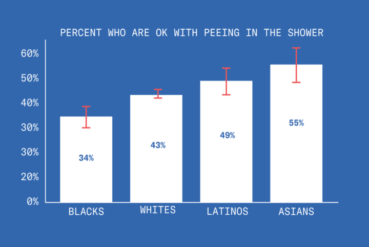
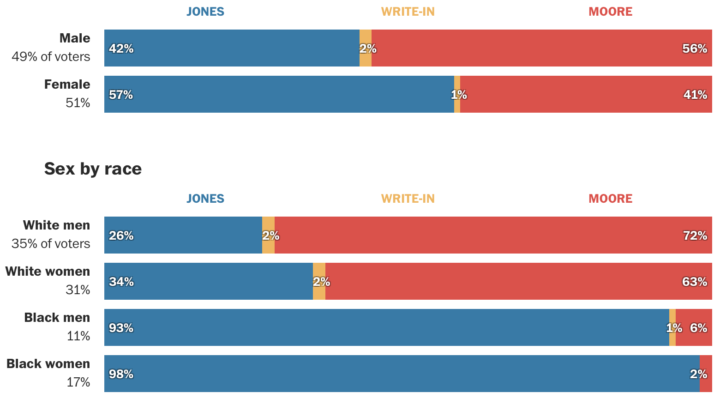
The Trump administration’s heated rhetoric on immigration, race and the trustworthiness of government is fueling fears that minorities, legal and undocumented immigrants and others — from asylum-seekers to victims of the opioid crisis — will be even harder to locate and count. The 2010 census actually overcounted non-Hispanic whites by 0.8 percent and undercounted African-Americans by 2.1 percent and Hispanics by 1.5 percent.
For context, the overcount and undercount numbers aren’t statistically different from that of the 2000 Census. The Census has always had to account for some groups reporting more than others.
But much of this comes from a general distrust of government — more so among some than others — and that trust level isn’t exactly on the rise these days. With that, in tandem with an administration not above swaying the numbers, the upcoming census could get messy. As the census approaches, I hope everyone assumes their right to be counted in this country.


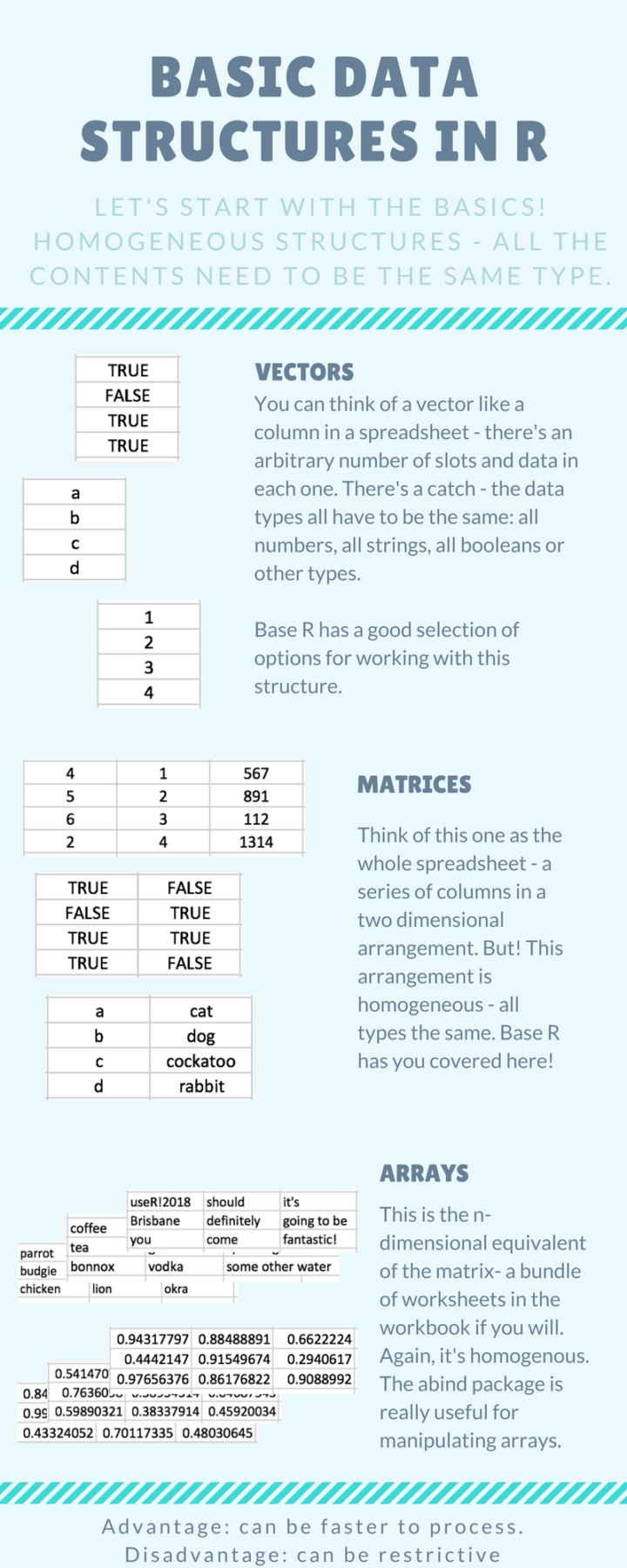 Introducing yourself to R as an Excel user can be tricky, especially when you don’t have much programming experience. It requires that you switch from one mental model of the data that exists in an interactive spreadsheet to one that exists in vectors and lists. Steph de Silva provides a
 Visualize This: The FlowingData Guide to Design, Visualization, and Statistics (2nd Edition)


