If you want to analyze bodies of text, it’s a good to know how to use regular expressions. That way you can programmatically extract complex text patterns instead of marking and encoding items manually. Thomas Nield for O’Reilly provides an introduction:
Many data science, analyst, and technology professionals have encountered regular expressions at some point. This esoteric, miniature language is used for matching complex text patterns, and looks mysterious and intimidating at first. However, regular expressions (also called “regex”) are a powerful tool that only require a small time investment to learn. They are almost ubiquitously supported wherever there is data.
Nield says it isn’t a steep learning curve, which I agree with, but I would suggest not trying to learn every part of the syntax. Learn it piecewise, and it’ll seem like less of a jumble of brackets, periods, and question marks.
See also the RegExr. It’s an interactive tool that lets you paste a body of text and then enter regular expressions to see what matches your given pattern in real-time.
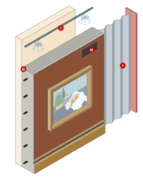 Fire spread over Los Angeles, but the famous art works in the Getty Center stayed put. John Schwartz and Guilbert Gates


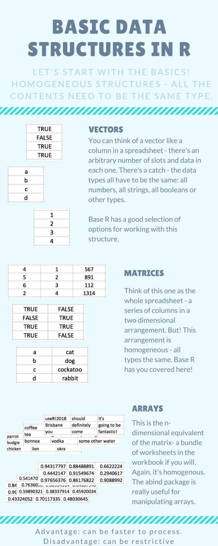 Introducing yourself to R as an Excel user can be tricky, especially when you don’t have much programming experience. It requires that you switch from one mental model of the data that exists in an interactive spreadsheet to one that exists in vectors and lists. Steph de Silva provides a
 Visualize This: The FlowingData Guide to Design, Visualization, and Statistics (2nd Edition)


