-
Members Only
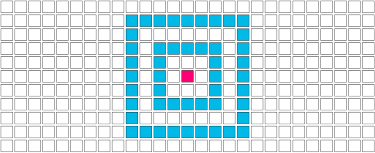
Break the visualization into its basic pieces to make it easier to make, edit, and reuse.
-
How to Make a Tiled Bar Chart with D3.js
Show individual data points by splitting bars into smaller cells.
-
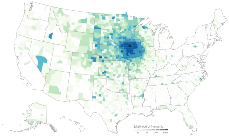
We talk about geographic bubbles a lot these days. Some areas are isolated, in their own bubble. Other areas seem more connected. Emily Badger and Quoctrung Bui for The Upshot looked at this geographic connectedness through the lens of Facebook friendships.
In the millions of ties on Facebook that connect relatives, co-workers, classmates and friends, Americans are far more likely to know people nearby than in distant communities that share their politics or mirror their demographics. The dominant picture in data analyzed by economists at Facebook, Harvard, Princeton and New York University is not that like-minded places are linked; rather, people in counties close to one another are.
There are two main parts to the piece. The first one is a county map that you can mouse over to see the likelihood of friendship with those in other counties. The second part imagines a country split up into regions based on Facebook connections. Be sure to catch them both.
-
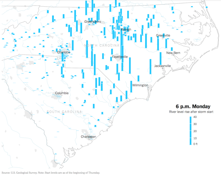
Hurricane Florence brought a lot of rain, which in turn made river levels rise. The New York Times animated the rise over a five-day period. The height of the bars represents the rise of the river level, as compared to levels on Thursday.
I like the visual metaphor of bars going up with river levels. I’m not sure the sudden rise and falls in such short periods of time would appear as surprising.
-

What are the ingredients that make each cuisine? I looked at 40,000 recipes spanning 20 cuisines and 6,714 ingredients to see what makes food taste different.
-
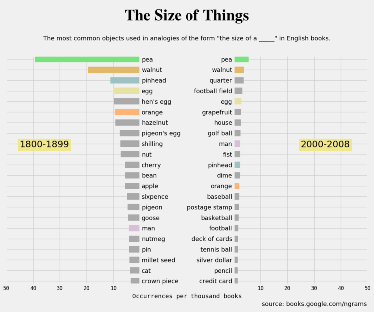
When you try to describe the size of something but don’t have an exact measurement, you probably compare it to an everyday object that others can relate to. Using the Google Books Ngram dataset, Colin Morris looked for how such comparisons changed over the past few centuries.
I especially like the bits of history to explain why some words fell into and out of fashion.
-
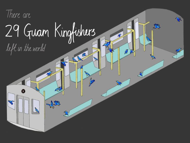
There are endangered species where the remaining few in the world could fit on a single car train. Mona Chalabi for The Guardian imagined such a scenario.
Usually when we talk about scale and putting numbers into perspective, it’s about imagining the large ones. What does a million look like? A billion? Chalabi’s illustrations take it the other direction.
-
Typhoon Mangkhut went through the northern end of the Phillipines a few days ago. At least 25 people died. The New York Times provides a scrolling 3-dimensional view using data collected by NASA satellites.
-
I talked with Moritz and Enrico on Data Stories, my favorite visualization podcast. They’ve been providing a healthy balance of practice and research since 2012.
I don’t dare listen to myself, but based on the show notes we talked about FlowingData over the years, some of the changes in visualization, and answered listener questions. You can listen here.
-
The Weather Channel is using a realistic 3-D depiction surrounding a reporter to show what a storm surge might bring. Here, just watch it:
-
Waffle House activated their storm center in preparation for Hurricane Florence. Their restaurants are open 24/7, so they need to keep track of which ones need to close or limit their menus. This might also have to do with an informal Waffle House Index that FEMA described last year:
If a Waffle House can serve a full menu, they’ve likely got power (or are running on a generator). A limited menu means an area may not have running water or electricity, but there’s gas for the stove to make bacon, eggs, and coffee: exactly what hungry, weary people need.
It’s more than just a Waffle House though.
Businesses in communities are often some of the biggest drivers of recovery. If stores can open, people can go back to work. If people can go back to work, they can return to at least one piece of a normal life—and that little piece of normalcy can make a big difference.
Hold up. I think I got it. If we just keep all the businesses open, we can avoid all disaster. That’s how causation-correlation works, right? Nailed it.
(Stay safe, Carolinians.)
-
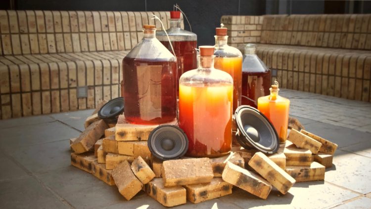
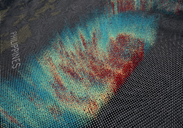
Brian House collected polluted water with acid mine drainage in the Tshimologong Precinct, Johannesburg and translated pollution levels to sound:
Acid Love comprises vessels of AMD gathered from a mine on the outskirts of the city. These are connected in an electrical circuit that measures the conductivity from the metals of the water and coverts it into sound. The sound is further modulated by data gathered from remediation efforts at the mine. The installation itself also performs a remediation process—over time the metals will precipitate to the bottom of the vessels, and both the sound and the color of the water will change as it is purified.
[via @blprnt]
-
Members Only
Google Dataset Search Impressions, the Challenges of Looking for Data, and Other Places to Find Data
Google released Dataset Search to the world last week. Here are my first impressions.
-
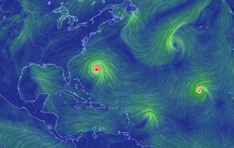
Hurricane Florence is forecast to touch down Thursday night or Friday, and what’s become the norm, there are several ways to see where the hurricane is and where it might go. Here are a handful of views. Each focuses on different aspects of potential storm.
Read More -
Wikipedia is human-edited, so naturally there are biases towards certain groups of people. Primer, an artificial intelligence startup, is working on a system that looks for people who should have an article. It’s called Quicksilver.
We trained Quicksilver’s models on 30,000 English Wikipedia articles about scientists, their Wikidata entries, and over 3 million sentences from news documents describing them and their work. Then we fed in the names and affiliations of 200,000 authors of scientific papers.
In the morning we found 40,000 people missing from Wikipedia who have a similar distribution of news coverage as those who do have articles. Quicksilver doubled the number of scientists potentially eligible for a Wikipedia article overnight.
Then, after it finds people, it generates sample articles to get things started.
-
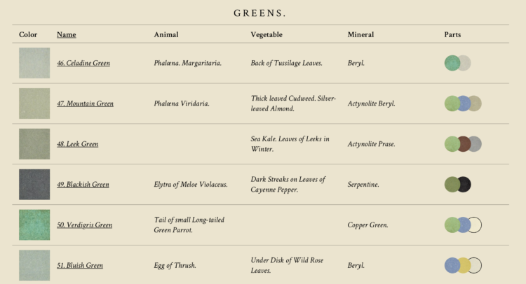
I’m always down for faux vintage, online recreations of actual vintage visualization-related things. Using scans from the real thing, Nicholas Rougeux recreated Werner’s Nomenclature of Colours, supplementing with interaction and photo references.
-
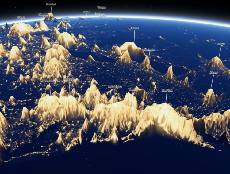
You’ve probably seen the maps of Earth at night. It gives you a good idea of activity around the world, through the eyes of light. As an experiment and a shift in view, Jacob Wasilkowski mapped the light as terrain.
-
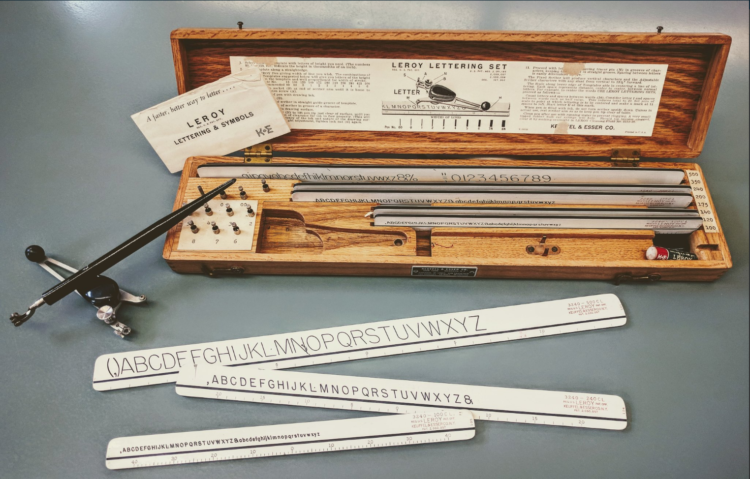
Graham Douglas, a data journalist at The Economist, looks back on the days when getting data and visualizing it was tedious from start to finish:
But even these seemingly simple charts had their challenges and took a lot of time to make. Data were found in books by a research department skilled in the art of extracting obscure economic figures and statistics, which were copied to scraps of paper. We would use rulers, dividers, protractors and geometry (Thales’s theorem) to divide axis lines into equal parts to draw the scale ticks. We would plot the data manually in pencil on a special drawing board and sketch out the wording and title for approval before we inked the whole thing in. Text was added last using stencilling, or later, Letraset dry-transfer lettering. Making a spelling mistake was distressing. Areas were filled with sticky-back plastic pre-printed film cut out with a scalpel.
Maybe grabbing data out of PDF files isn’t so bad.
No. Still horrible.
This reminds me of my dad’s work though. He’s a retired civil engineer. When I was young, he brought home these giant blueprints. He’d roll them out after dinner, and armed with a protractor, a scaled ruler, and a calculator I could never figure out, he’d mark up building plans. Towards the end of his career, he kept everything on a flash drive.
-
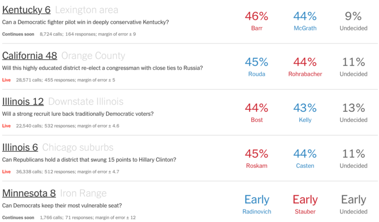
In a collaboration with Siena College, The Upshot is showing live polling results. The ticker moves in real-time for every phone call.
For the first time, we’ll publish our poll results and display them in real time, from start to finish, respondent by respondent. No media organization has ever tried something like this, and we hope to set a new standard of transparency. You’ll see the poll results at the same time we do. You’ll see our exact assumptions about who will turn out, where we’re calling and whether someone is picking up. You’ll see what the results might have been had we made different choices.
Gulp.
Recently for Members
Second Edition
 Visualize This: The FlowingData Guide to Design, Visualization, and Statistics (2nd Edition)
 Visualize This: The FlowingData Guide to Design, Visualization, and Statistics (2nd Edition)
New tools, refined process.
Browse by Chart Type See All →


