• Membership
  • Newsletter
  • Projects
  • Learning
  • About
  • Member Login
  • A visual analysis of jean pockets and their lack of practicality

    August 16, 2018

    Topic

    Infographics  /  pants, pockets, The Pudding

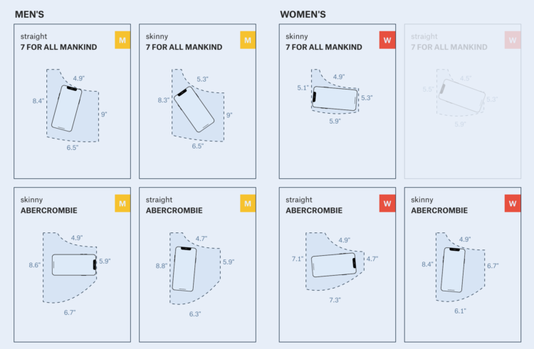
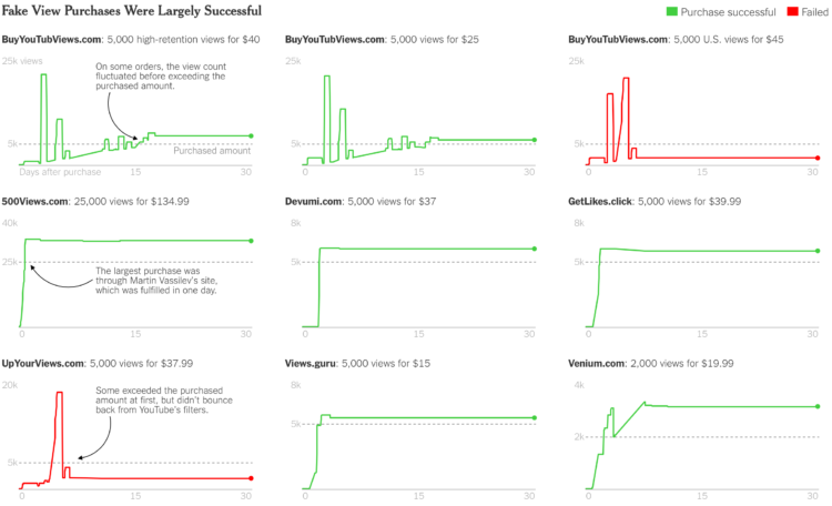
    Frustrated with the size of pockets on women’s pants, Jan Diehm and Amber Thomas for The Pudding, measured pocket sizes in 20 popular jean brands. They compared men’s and women’s pockets and calculated what actually fits in the mix of sizes.

    [W]e programmatically determined whether various everyday items could fit in an otherwise empty pocket in jeans that aren’t being worn. (If an object won’t fit in the pocket of a pair of jeans on the hanger, it certainly won’t fit when you’re wearing them.) Only 40 percent of women’s front pockets can completely fit one of the three leading smartphone brands. Less than half of women’s front pockets can fit a wallet specifically designed to fit in front pockets. And you can’t even cram an average woman’s hand beyond the knuckles into the majority of women’s front pockets.

    Impressive and informative work.

    It reminds me of the Amanda Cox graphic that compared women’s dress sizes for different brands in 2011. There’s also the broken waistline measurement.

    Let’s just all wear sweats from now on.
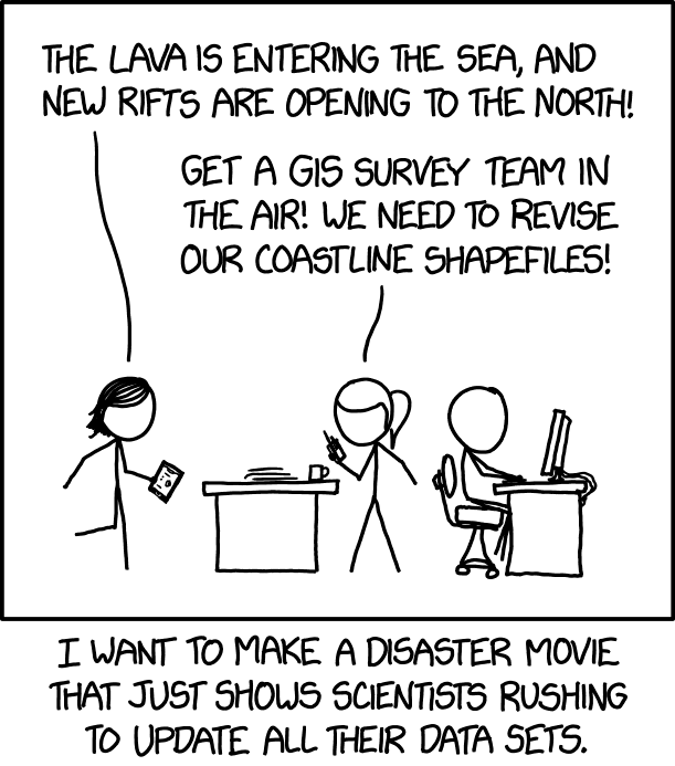
  • Members Only

    Visualization Away from the Computer, Developing Ideas, Bring in the Constraints

    August 16, 2018

    Topic

    The Process  /  brainstorm, ideas, manual

    Made-by-hand visualization has been making a mini comeback as of late, and it’s been fun to see what people do with data away from the computer.

    Of course, we don’t have the time to draw every chart and map by hand, but there are some parts of the practice we can use in our own work.

  • More wildfires than ever

    August 16, 2018

    Topic

    Statistical Visualization  /  BuzzFeed, California, fire

    Peter Aldhous for BuzzFeed News delves into the increasing number of wildfires in California:

    Most of California’s rain and snow falls in between October and March, which means that fire season peaks in the summer, as vegetation dies and dries out. In Southern California, the season extends into the fall, when Santa Ana winds, which blow from the dry interior toward the coast, whip up small fires into major conflagrations.

    As the state has dried and warmed, the fire season has started earlier and larger areas have burned. Similar changes have occurred across the western US.

    Grab the data and code to look for yourself.

  • Scale of the California wildfires

    August 16, 2018

    Topic

    Maps  /  Axios, California, fire, Lazaro Gamio, scale

    The Mendocino Complex Fire, now the largest in California ever, continues to burn. I live a couple of hundred miles away, but the sky is yellow and orange at times, and it was smokey a few days ago. It’s a bit crazy. Lazaro Gamio for Axios provides a quick view to show scale with an animated graphic compared against Washington, D.C. and Manhattan.

  • Cartography Playground

    August 15, 2018

    Topic

    Apps  /  algorithms, cartography

    Map-making is a tricky business with many variables to consider that can directly change how someone interprets the land and people in a location. The Cartography Playground is a simple site to test these variables interactively. Learn about algorithms, mess with appearance, and toggle through representations.

  • Optical illusion shows our messed up lightness perception

    August 15, 2018

    Topic

    Design  /  illusion, perception

    A gray piece of paper moves along a gradient. You won’t believe your eyes.

    A demo of lightness perception pic.twitter.com/BSVpgcuIw1

    — Akiyoshi Kitaoka (@AkiyoshiKitaoka) August 12, 2018

  • A transforming river seen from above

    August 14, 2018

    Topic

    Maps  /  environment, NASA, satellite imagery, water

    The Padma River in Bangladesh is constantly shifting its 75-mile path. Joshua Stevens for the NASA Earth Observatory shows what the shifting looked like through satellite imagery, over a 30-year span.

    Kasha Patel:

    The upper section of the Padma—the Harirampur region— has experienced the most erosion and shows the most notable changes. The river has become wider at this section by eroding along both banks, although most activity occurred on the left bank. Using topographic, aerial, and satellite imagery, scientists found that the left bank shifted 12 kilometers towards the north from 1860 to 2009 and developed a meandering bend. The river left a scar where the water once flowed, as you can see in the 2018 image.

    See also the dramatic shifts of the Ucayali River in Peru.

  • Robot arm seeks out Waldo, using machine learning

    August 14, 2018

    Topic

    Statistics  /  machine learning, robot, vision, Waldo

    The camera on the slightly creepy arm takes a picture of the pages in the book, the software uses OpenCV to extract faces, and the faces are passed to Google Auto ML Vision comparing the faces to a Waldo model. The result: There’s Waldo.

  • Analysis of fake YouTube views

    August 13, 2018

    Topic

    Statistics  /  fake, New York Times, YouTube

    Wherever more attention or the appearance of it equates to more money, there are those who try to game the system. Michael H. Keller for The New York Times examines the business of fake YouTube views:

    YouTube’s engineers, statisticians and data scientists are constantly improving in their ability to fight what Ms. O’Connor calls a “very hard problem,” but the attacks have “continually gotten stronger and more sophisticated,” she said.

    After the Times reporter presented YouTube with the videos for which he had bought views, the company said sellers had exploited two vulnerabilities that had already been fixed. Later that day, the reporter bought more views from six of the same vendors. The view count rose again, though more slowly. A week later, all but two of the vendors had delivered the full amount.

  • Aerial view of sheepdogs herding sheep

    August 13, 2018

    Topic

    Misc. Visualization  /  drone, flow, herd, sheep

    Sometimes the visualization takes care of itself. Photographer Tim Whittaker filmed sheepdogs herding thousands of sheep, and the flows one place to another are like organized randomness.

    [arve url=”https://www.youtube.com/watch?v=2BSI3aKtvXk” /]

  • Charting the similarity of summer songs

    August 10, 2018

    Topic

    Infographics  /  music, New York Times, summer

    Popular summer songs have had a bubbly, generic feel to them the past several years, but it wasn’t always like that. Styles used to be more diverse, and things might be headed back in that direction. Sahil Chinoy and Jessia Ma charted song fingerprints over the years for a musical comparison.

    Turn up your speakers or put on your headphones for the full experience. The song and music video snippets provide a much better idea of what the charts represent.

  • Members Only

    Detailed Intentions of a Map, When Everything Leads to Nothing, Designing for Misinterpretations

    August 9, 2018

    Topic

    The Process  /  election, New York Times, purpose

    The New York Times published an election map. A lot of people did not like the map, arguing that it was an inaccurate representation. Those who did like the map argued that one must consider intent before throwing a map to the flames.

    What happens when intended use and actual use do not match up?

  • Visualizations using Play-Doh

    August 9, 2018

    Topic

    Data Art  /  medium, physical, Play-Doh

    We usually visualize data on computers, because it’s where the data exists and it’s a more efficient process. But as long as you can make shapes and use colors, you can use just about any material. Amy Cesal, as part of a 100-day creative project called Day Doh Viz, is using Play-Doh.

    Ever since my son shifted his art station to my office, I’ve been drawn to his crayons, markers, and masking tape. The manual labor of it forces a shifted thought process that’s less technical and more about what you want to show. It also feels more like playing. Recommended. [via Visualising Data]

  • Collection of data visualization pitfalls

    August 8, 2018

    Topic

    Design  /  pitfalls

    There are many mistakes you can make when you first get into visualization. Yan Holtz and Conor Healy catalog the common pitfalls as part of their project From Data to Viz. While there are a lot, keep in mind that you’ll learn these as you go. But it’s good to at least be aware of them from the start.

  • xkcd: Disaster Movie

    August 7, 2018

    Topic

    Miscellaneous  /  humor, xkcd

    From xkcd, a blockbuster idea right here.

  • Scale model shows how levees increase flooding

    August 7, 2018

    Topic

    Visualization  /  flood, levees, physical, ProPublica, Reveal

    Levees are intended to prevent flooding in the areas they are built, but they change the direction and speed of flowing water, which can cause unintended flooding in areas upstream. ProPublica and Reveal collaborated with the St. Anthony Falls Laboratory to build a scale model to show how this can happen.

    An interactive graphic lets you shift flow rate up and down to see the changes yourself. The video coupled with the illustration makes the effects super clear.

  • “Optimized” floor plan with genetic algorithms

    August 6, 2018

    Topic

    Statistics  /  algorithm, floor plan

    Genetic algorithms are inspired by natural selection, where the system is given a set of inputs and the “best” iteration is chosen until there’s some kind of convergence to a solution. Joel Simon applied this process to floor plan design.

    The creative goal is to approach floor plan design solely from the perspective of optimization and without regard for convention, constructability, etc. The research goal is to see how a combination of explicit, implicit and emergent methods allow floor plans of high complexity to evolve. The floorplan is ‘grown’ from its genetic encoding using indirect methods such as graph contraction and emergent ones such as growing hallways using an ant-colony inspired algorithm.

    The results were biological in appearance, intriguing in character and wildly irrational in practice. It was a fun learning experience and I plan to re-use methods in other projects.

    [via kottke]

  • Bucket o’ companies compared to Apple $1 trillion value

    August 3, 2018

    Topic

    Infographics  /  Apple, business, New York Times, stocks

    Apple’s value passed $1 trillion on Thursday, and as tradition requires, we must consider the scale of such a large number. We must compare the value of Apple against the sum value of a surprising number of small and medium companies. The New York Times has you covered with a bucket of blobs metaphor.

    So blobby. So bucket-y.

  • Why the city is hotter than the suburb

    August 3, 2018

    Topic

    Statistical Visualization  /  city, heat, NPR

    NPR used video from a thermographic camera to explain why cities tend to be hotter than their surrounding areas. Straightforward and a good complement to the video.

    [arve url=”https://www.npr.org/templates/event/embeddedVideo.php?storyId=631560598&mediaId=633050850″ /]

  • Members Only

    Wrong Tool, Right Tool, More Tools for Visualization

    August 2, 2018

    Topic

    The Process  /  Edward Tufte, R, tools

    Welcome to the new members-only newsletter: The Process. In this first update, a certain data graphics expert seems to really dislike R, which prompts a look into the visualization tools we use and what one might get out of a bigger toolbox.

  • Page 139 of 392
  • <
  • 1
  • ...
  • 136
  • 137
  • 138
  • 139
  • 140
  • 141
  • ...
  • 392
  • >

Analyze, visualize, and communicate data usefully, beyond the defaults.

Become a member →

Recently for Members

May 8, 2025
When the data is not what it seems

May 1, 2025
Finding the Right Charts

April 24, 2025
Visualization Tools, Datasets, and Resources – April 2025 Roundup

April 17, 2025
Breaking Out of Chart Software Defaults

April 15, 2025
Line Chart with Decorative Neon Accents

Browse by Chart Type See All →

Density Plot Venn Diagram Stacked Area Chart Radar Chart Pie Chart Packed Bubble Chart Scatter Plot Treemap Streamgraph Pyramid Chart

Browse By Topic

  • Visualization

    Seeing data

  • Maps

    Seeing geographic data

  • Infographics

    Explaining data

  • Networks

    Connecting data

  • Statistics

    Analyzing data

  • Software

    Working with data

  • Sources

    Getting data

  • Design

    Making data readable

Get the Book

Visualize This: The FlowingData Guide to Design, Visualization, and Statistics

Available now.

Order: Amazon / Bookshop

Made by FlowingData

  • The Process

  • Data Underload

  • Chart Everything

  • Guides

  • Books

  • Shop

  • About
  • Contact
  • Newsletter
  • LinkedIn
  • Instagram
  • Bluesky
  • RSS
Copyright © 2007-Present FlowingData. All rights reserved.