
Nicholas Rougeux, who has a knack and the patience to recreate vintage works in a modern context, reproduced Elizabeth Twining’s Illustrations of the Natural Orders of Plants:
If someone told me when I was young that I would spend three months of my time tracing nineteenth century botanical illustrations and enjoy it, I would have scoffed, but that’s what I did to reproduce Elizabeth Twining’s Illustrations of the Natural Orders of Plants and I loved every minute.
The best part is that you can select flowers in the text or on the illustrations to focus on a specific parts, which makes descriptions easier to interpret.
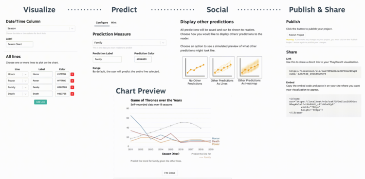


 Visualize This: The FlowingData Guide to Design, Visualization, and Statistics (2nd Edition)


