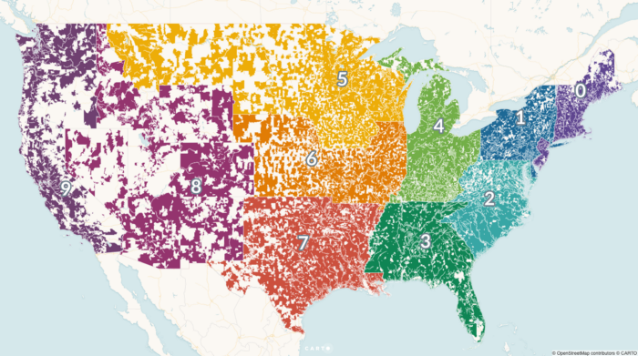
• Membership
  • Newsletter
  • Projects
  • Learning
  • About
  • Member Login
  • Light installation shows future water lines against existing structures

    March 7, 2019

    Topic

    Data Art  /  climate change, water

    Timo Aho and Pekka Niittyvirta used sensors, LED lights, and timers to display future water lines:

    By use of sensors, the installation interacts with the rising tidal changes; activating on high tide. The work provides a visual reference of future sea level rise.

    The installation explores the catastrophic impact of our relationship with nature and its long term effects. The work provokes a dialogue on how the rising sea levels will affect coastal areas, its inhabitants and land usage in the future.

    Love that a single line of light can represent so much.

  • Data Underload  /  gender, time use

    A Day in the Life: Women and Men

    Using the past couple of years of data from the American Time Use Survey, I simulated a working day for men and women to see how schedules differ. Watch it play out in this animation.

    Read More
  • Charting cholera, beyond John Snow

    March 5, 2019

    Topic

    Statistical Visualization  /  cholera, John Snow, vintage

    John Snow, who often gets the credit for showing the geographical patterns of a cholera outbreak in London in 1854, wasn’t the only one visualizing data at the time. James Cheshire put together a collection of other charts made at the time.

    [I]t wasn’t just Snow producing innovative maps and charts to support his cause. Snow was part of an arms race to get the best data communicated by the most compelling maps/ charts, to evidence his side of the debate against his contemporaries – people like William Farr who was also a master data visualiser.

  • Hatching image effect in R

    March 4, 2019

    Topic

    Coding  /  hatching, R

    Here’s a fun thing to try in R. Jean Fan posted some code snippets where you can load an image file and the result uses a hatching technique to recreate the image with shapes.

    See also: Using the traveling salesman problem to re-sketch images.

  • Celebrity name spelling test

    March 1, 2019

    Topic

    Infographics  /  Pudding, Reddit, spelling

    Colin Morris culled common misspellings on Reddit and made the data available on GitHub. For The Pudding, Russell Goldenberg and Matt Daniels took it a step further so that you too can see how bad you are at spelling celebrity names.

  • Members Only

    Visualization Tools, Datasets, and Resources – February 2019 Roundup

    February 28, 2019

    Topic

    The Process  /  roundup, tools

    Throughout the month I collect new tools for data and visualization and additional resources on designing data graphics. Here’s the new stuff for February.

  • Names in movies vs. real life

    February 28, 2019

    Topic

    Statistical Visualization  /  movies, names

    Here’s a fun spin on the name analysis genre by Mary Zam. She compared the distribution of names used in movies against names used in real life:

    Thousands of babies are called Sophia or Abigail, Mason or Dylan every year. But writers do not rush to call the main characters with such names. According to the statistic, almost all of the top names are much less common in the film industry rather than in real life. Seems that they just don’t want to use too ordinary names in their scenarios.

    However, there are always some exceptions from this rule such as Jack (up to x3), Maria (x3), Peter (x2) or Sarah (x4.5). But such names makes only about 5-10% of top each decade. On the other hand, there is a bunch of “cinematic” names such as Simon (20 times more often in movies & tv than in real life) and Kate (20 times more often) which you won’t find in the real life top lists.

  • How to Make Dot Timelines in R

    For when you want to show the occurrence of events over time.

  • Data Underload  /  jobs, work

    Where Your Job is Most Popular

    Some jobs are common nationwide, because they are needed everywhere. Others are more specific to geography. See where job falls on the spectrum.

    Read More
  • Probability you will break up with your partner

    February 26, 2019

    Topic

    Statistics  /  breakup, probability, relationships

    Rosenfeld, et al. from Stanford University ran a survey in 2009 for a study on How Couples Meet and Stay Together. Dan Kopf and Youyou Zhou for Quartz used this dataset to estimate the probability that you will break up with your partner, given a few bits of information about your current relationship.

    The Stanford data page says a 2017 release is on the way. I’m curious how, if anything, has changed in relationships between 2009 and now.

  • Stacked bus routes on a map

    February 25, 2019

    Topic

    Maps  /  bus, directions

    Speaking of 3-D usage on maps, here’s a map of bus routes in Singapore stacked one on top of the other. I’m not sure it’s especially useful to find individual routes as intended, but the overall distribution of routes seems like it might be interesting to someone familiar with the area. Or, maybe it’s world’s greatest roller coaster.

  • Segregation compared during work and at home

    February 25, 2019

    Topic

    Maps  /  3-d, segregation, Vox

    Based on commuting data from the Census Bureau, researchers Matthew Hall, John Iceland, and Youngmin Yi tracked segregation during the day and night. Alvin Chang for Vox mapped their results:

    They found that when white people go to work, they are around only slightly more people of color than when they’re in their home neighborhoods. But for everyone else, going to work means being exposed to many more white people — and far fewer people of their own race.

    Browse the map to see the results for your own city.

    It appears that the 3-D map is making a small comeback (Thanks, Matt Daniels), to the delight of some and perhaps to the chagrin of others. I’m ready for it. I wonder when data graphic résumés are coming.

  • Data Underload  /  jobs, work

    Most Uniquely Popular Job in Each State

    These are the jobs in each state that are most specific to the place.

    Read More
  • Searching for the saddest punt ever, with statistics

    February 22, 2019

    Topic

    Infographics  /  football, punt, SB Nation

    [arve url=”https://www.youtube.com/watch?v=F9H9LwGmc-0″ /]

    For SB Nation, Jon Bois takes a statistical deep dive in the search for the saddest punt in football. It’s an hour long. It’s a surprisingly fun watch. At the very least, even if you don’t like football, you can glean some analysis and storytelling lessons from it.

  • Members Only

    Making Data “Come Alive”, Needs More Cowbell

    February 21, 2019

    Topic

    The Process  /  cowbell, whizbang

    “How do I make my data come alive? I want it to sing. I want it to dance.” Here are some ways to achieve that.

  • From text to paint

    February 21, 2019

    Topic

    Data Art  /  paint, text

    Leslie Roberts uses paint to encode text as colors and geometry:

    My paintings translate words into visual language. These panels with texts and accompanying abstract structures might be called illuminated manuscripts of the everyday.

    Written in these recent paintings are collections of ambient found language: fragments from street signs, junk mail, end user licensing agreements, email, labels, subway ads, receipts, newspapers, and instruction manuals. Transcripts of fine print from the relentless flow of information surrounding us are used to derive a personal abstract vernacular.

  • Data Underload  /  box office, franchise, movies

    Billions at the Franchise Box Office

    There’s big money in wizarding worlds, galaxies far away, and various time-shifted universes. Let’s take a stroll through the billions of dollars earned by franchises over the years.

    Read More
  • How fast emissions would reduce if other plans were adopted

    February 19, 2019

    Topic

    Statistical Visualization  /  climate change, global warming, New York Times

    The United States is doing pretty poorly in reducing emissions. For The New York Times, Brad Plumer and Blacki Migloiozzi, show the current status and what could happen if the U.S. adopted more drastic plans already in place around the world.

    The moving particles underneath the trend line is a nice touch to bring the abstract closer to what the data represents. Contrast this piece with Plumer’s piece from a couple of years ago to see the shift in focus.

  • French fry power rankings

    February 15, 2019

    Topic

    Infographics  /  fast food, french fries, Los Angeles Times

    Lucas Kwan Peterson for the Los Angeles Times ranked fast food french fries. That is all.

  • Opportunity rover’s path on Mars

    February 14, 2019

    Topic

    Maps  /  Jonathan Corum, Mars, NASA, New York Times, opportunity

    After a most unforgiving dust storm on Mars, NASA ended the 14-year mission with the Opportunity rover. It was originally only planned to last 90 days. Jonathan Corum, for The New York Times, mapped the little guy’s journey over the years.

  • Page 128 of 391
  • <
  • 1
  • ...
  • 125
  • 126
  • 127
  • 128
  • 129
  • 130
  • ...
  • 391
  • >

Analyze, visualize, and communicate data usefully, beyond the defaults.

Become a member →

Recently for Members

May 8, 2025
When the data is not what it seems

May 1, 2025
Finding the Right Charts

April 24, 2025
Visualization Tools, Datasets, and Resources – April 2025 Roundup

April 17, 2025
Breaking Out of Chart Software Defaults

April 15, 2025
Line Chart with Decorative Neon Accents

Browse by Chart Type See All →

Treemap Heatmap Spiral Chart Stacked Area Chart Baseline Chart Step Chart Donut Chart Dot Map Packed Bubble Chart Timeline

Browse By Topic

  • Visualization

    Seeing data

  • Maps

    Seeing geographic data

  • Infographics

    Explaining data

  • Networks

    Connecting data

  • Statistics

    Analyzing data

  • Software

    Working with data

  • Sources

    Getting data

  • Design

    Making data readable

Get the Book

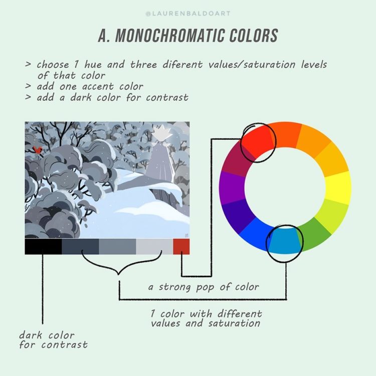
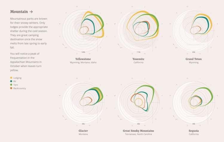
Visualize This: The FlowingData Guide to Design, Visualization, and Statistics

Available now.

Order: Amazon / Bookshop

Made by FlowingData

  • The Process

  • Data Underload

  • Chart Everything

  • Guides

  • Books

  • Shop

  • About
  • Contact
  • Newsletter
  • LinkedIn
  • Instagram
  • Bluesky
  • RSS
Copyright © 2007-Present FlowingData. All rights reserved.