Microsoft just open sourced their data exploration tool known as SandDance:
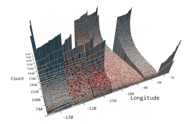
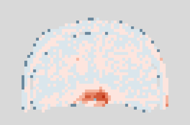
For those unfamiliar with SandDance, it was introduced nearly four years ago as a system for exploring and presenting data using “unit visualizations.” Instead of aggregating data and showing the resulting sums as bar charts, SandDance shows every single row of a dataset (for datasets up to ~500K rows). It represents each of these rows as a mark that can be colored and organized into different areas on the screen. Thus, bar charts are made of their constituent units, stacked, or sorted.
Nice. I hadn’t heard about SandDance until now, but I’m saving for later. You can grab the source on GitHub.
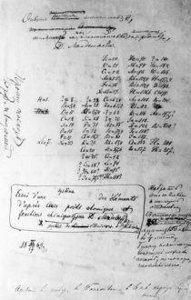 Visualization is a relatively new field. Sort of. The increased availability of data has pushed visualization forward in more recent years, but its roots go back centuries. Michael Friendly and Howard Wainer rewind back to the second half of the 1800s,

 Visualize This: The FlowingData Guide to Design, Visualization, and Statistics (2nd Edition)


