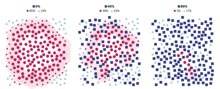
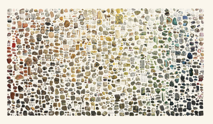
• Membership
  • Newsletter
  • Projects
  • Learning
  • About
  • Member Login
  • Search trends during the pandemic

    April 27, 2020

    Topic

    Statistical Visualization  /  coronavirus, Google, search

    As you would imagine, what we search for online shifted over the past few months. The unknowns push information gathering. Schema Design, in collaboration with the Google News Initiative and Axios, broke down the main changes in search since January.

    Using a beeswarm chart, each circle represents a query and the size of a circle represents the rank in a query. I really wanted to mouse over the circles to see specifics, but maybe that would’ve been too much information in one view.

  • Visualization helping us during the pandemic

    April 24, 2020

    Topic

    Visualization  /  coronavirus, impact

    Hayleigh Moore for the College of Information Studies at the University of Maryland on visualization and the pandemic:

    With new updates developing by the hour amidst the evolving COVID-19 pandemic, trying to grapple at the most relevant information can be overwhelming. Data visualization has helped to synthesize this complex phenomena and shape the timeline of the Coronavirus pandemic that has drastically changed how we go about our daily lives. While commonly used to communicate data to the general population, visualization is now having quite a real-world impact in the face of this crisis.

    Visualization the field often struggles with real-world examples for how its work plays a role in people’s lives. There should be no questions about that now.

  • Testing the infinite monkey theorem

    April 23, 2020

    Topic

    Statistics  /  infinite monkey, music, Pudding

    If you have a room of monkeys hitting keys on typewriters for an infinite amount of time, do you eventually end up with a Shakespeare play? For The Pudding, Russell Goldenberg and Amber Thomas put the infinite monkey theorem to the test directing the computer to randomly generate musical note patterns to match classic songs.

    All said and done, the point here isn’t the real numbers, but the faith that given enough time, randomness will prevail. Will our experiment eventually play even the simple Nokia ringtone in our lifetime? Almost certainly not. Given enough time would it? Almost surely.

    The experiment has been running for 10 days so far, currently working on “Another One Bites the Dust” by Queen.

  • Members Only

    Charting for Others (The Process 086)

    April 23, 2020

    Topic

    The Process  /  audience, clarity, course

    There’s a new tool-agnostic course now available for members. Check it out now.

  • How We Reopen

    April 23, 2020

    Topic

    Infographics  /  coronavirus, reopen, Vi Hart

    Vi Hart, along with a group of experts from different political backgrounds and fields, proposes a plan for how we reopen:

  • People of the Pandemic, a game that simulates social distancing in your ZIP Code

    April 22, 2020

    Topic

    Infographics  /  coronavirus, game, social distancing

    People of the Pandemic is a game that lets you choose how many times you leave the house to get food or go for a walk. Using data for population and hospital beds in your ZIP code, the game then simulates infection, death, and recovery for a hypothetical virus, based on your choices and 19 others’ choices who played before you.

    The infection rate felt aggressive no matter what choices I made in my ZIP code, so it’s probably worth emphasizing again that the game uses a simplified model. See the methodology here. But I like the effort to localize our individual decisions.

  • Missing deaths

    April 21, 2020

    Topic

    Statistical Visualization  /  baseline, coronavirus, New York Times

    The daily counts for coronavirus deaths rely on reporting, testing, and available estimates, which means the numbers we see are probably lower than the real counts. So, for The New York Times, Jin Wu and Allison McCann plotted overall deaths against historical averages for a better sense of what’s really happening.

    The contrasting red lines provide an obvious figure against the “would have died anyways” argument.

  • Change in Google searches since the virus

    April 20, 2020

    Topic

    Infographics  /  Alyssa Fowers, coronavirus, Google, search, Washington Post

    The coronavirus changed what information we search for. Has anyone been more interested in making masks or hand sanitizer in the history of the world? For The Washington Post, Alyssa Fowers compares search rankings for how, where, what, and how the week of April 5 to 11, for 2019 against 2020.

  • Data Underload  /  perception, time, waiting

    Game of Distraction

    They say a watched pot never boils. So here’s a game where you try to make the pot boiling by looking somewhere else.

    Read More
  • Sheltering in small places

    April 17, 2020

    Topic

    Infographics  /  coronavirus, Reuters, shelter-in-place, Tokyo

    For many, sheltering in place means sheltering in relatively small places. Reuters zoomed in on the tight quarters in Tokyo, Japan. Not much room for movement.

  • Members Only

    Wide View (The Process 085)

    April 16, 2020

    Topic

    The Process  /  context, distraction, tip

    The data might exist on a single page or in a single file, but there’s always more to it. Take a step outside for a better view.

  • Historical data visualization panel

    April 16, 2020

    Topic

    Statistical Visualization  /  history, Manuel Lima, Michael Friendly, Sandra Rendgen

    Manuel Lima hosted a free online panel with Michale Friendly and Sandra Rendgen historical data visualization. It already happened, but you can listen to the archived version:

    Human beings have been involved in the visual representation of information for thousands of years. While some books on Data Visualization go as far back as the 18th century, to what’s considered to be the golden age of information graphics, the history of the practice is much deeper. The participants on this panel have spent years exploring key characters and major contributions to the field of Data Visualization over many centuries. We will be discussing ancient visual metaphors, the challenges of doing research in this area, what we can learn from the past, and many other topics.

  • How to Visualize Anomalies in Time Series Data in R, with ggplot

    Quickly see what’s below and above average through the noise and seasonal trends.

  • BTS dance formations

    April 16, 2020

    Topic

    Statistical Visualization  /  BTS, dance, Ketchup Duck

    BTS, the South Korean boy band, is apparently really good at dancing. Ketchup Duck breaks down a routine into individual formations to show the precision:

    There are a lot of impressive things about their dance routine, but the most impressive thing, to me, is how seamlessly they move around each other. As Lainey put it, it is art “the way they move so quickly, shifting from position to position, always aware of where they all are, taking space for themselves and creating space for each other.”

    There’s a rabbit hole begging to be explored here. [via @Caged]

  • Curves for the 1918 flu pandemic

    April 15, 2020

    Topic

    Statistical Visualization  /  coronavirus, curve, flu, National Geographic, pandemic

    For National Geographic, Nina Strochlic and Riley D. Champine look back at the 1918 pandemic for clues about the future:

    The 1918 flu, also known as the Spanish Flu, lasted until 1920 and is considered the deadliest pandemic in modern history. Today, as the world grinds to a halt in response to the coronavirus, scientists and historians are studying the 1918 outbreak for clues to the most effective way to stop a global pandemic. The efforts implemented then to stem the flu’s spread in cities across America—and the outcomes—may offer lessons for battling today’s crisis.

  • Simulation of droplets while social distancing

    April 14, 2020

    Topic

    Infographics  /  coronavirus, droplets, New York Times, simulation, social distancing

    Using 3-D simulation data from the Kyoto Institute of Technology, The New York Times shows how droplets from a sneeze or a cough can spread in a space. In a nutshell, six feet is the recommendation while in public areas, but the farther you away you can stay away the better. Go to the end, and there’s also an augmented reality segment that puts a six-foot range around you.

    I may never set foot in a crowded place again.

    See also: how different cough coverings can change the spread of droplets.

  • Social distancing demonstrated with balls and mousetraps

    April 14, 2020

    Topic

    Data Art  /  balls, commercial, coronavirus, mousetrap, Ohio

    The Ohio Department of Health released this video to show the advantages of social distancing:

    That’s a lot of balls and mousetraps to setup.

  • Change in consumer spending since the virus

    April 12, 2020

    Topic

    Statistical Visualization  /  coronavirus, New York Times, spending

    Consumer spending has shifted dramatically since most people have to stay at home. For The New York Times, Lauren Leatherby and David Gelles show by how much:

    All of the charts in this article are based on a New York Times analysis of data from Earnest Research, which tracks and analyzes credit card and debit card purchases of nearly six million people in the United States. While the data does not include cash transactions, and therefore does not reflect all sales, it provides a strong snapshot of the impact of the virus on the economy.

    The article also includes breakdowns for the main categories above. The only reason restaurants and entertainment aren’t down more is because delivery services and at-home streaming slightly offset the dip.

  • Stay-at-home orders seen through decreased seismic activity

    April 10, 2020

    Topic

    Statistical Visualization  /  coronavirus, National Geographic, seismic

    The pandemic has affected all parts of life, which can be seen from many points of view. For National Geographic, Taylor Maggiacomo and Maya Wei-Haas on the decrease in average ground displacement:

    Lulls in seismic activity have occurred in the past, generally in short spurts. But COVID-19—the disease caused by the novel coronavirus—has imposed a lengthy hush in populated regions across the planet. And seismometers on multiple continents are recording the shift.

    Measured in nanometers.

  • Flow of prison population

    April 10, 2020

    Topic

    Maps  /  Anna Flagg, coronavirus, Joseph Neff, Marshall Project, prisons, Upshot

    In a collaboration between The Marshall Project and The Upshot, Anna Flagg and Joseph Neff look at the flow in and out of jails and what that means during these times of social distancing:

    Preventing the spread of the virus in jails is challenging. Social distancing is crucial, but it’s virtually impossible in dormitories with rows of beds in a common room. The same is true of two people in a single cell, or group showers or bathrooms that serve dozens. All these dangers escalate when jails are overcrowded, filthy or understaffed.

  • Page 106 of 392
  • <
  • 1
  • ...
  • 103
  • 104
  • 105
  • 106
  • 107
  • 108
  • ...
  • 392
  • >

Analyze, visualize, and communicate data usefully, beyond the defaults.

Become a member →

Recently for Members

May 8, 2025
When the data is not what it seems

May 1, 2025
Finding the Right Charts

April 24, 2025
Visualization Tools, Datasets, and Resources – April 2025 Roundup

April 17, 2025
Breaking Out of Chart Software Defaults

April 15, 2025
Line Chart with Decorative Neon Accents

Browse by Chart Type See All →

Strip Plot Pyramid Chart Choropleth Map Sankey Diagram Gantt Chart Slope Chart Density Plot Parallel Sets Chord Diagram

Browse By Topic

  • Visualization

    Seeing data

  • Maps

    Seeing geographic data

  • Infographics

    Explaining data

  • Networks

    Connecting data

  • Statistics

    Analyzing data

  • Software

    Working with data

  • Sources

    Getting data

  • Design

    Making data readable

Get the Book

Visualize This: The FlowingData Guide to Design, Visualization, and Statistics

Available now.

Order: Amazon / Bookshop

Made by FlowingData

  • The Process

  • Data Underload

  • Chart Everything

  • Guides

  • Books

  • Shop

  • About
  • Contact
  • Newsletter
  • LinkedIn
  • Instagram
  • Bluesky
  • RSS
Copyright © 2007-Present FlowingData. All rights reserved.