Bubble Chart
Points are placed like in a scatter plot, but they are sized based on the square root of data values.

History of wars and power in Europe, animated from 1500 to present
Agar.io is a multiplayer game where people control cells in a Petri dish-type…

Pizza Exchange Rate
This is a story about pizza, geometry, and making sure you get what you paid for.
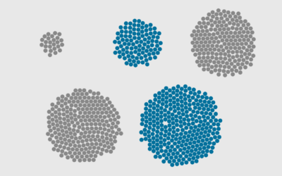
How to Make Bubble Clusters in R
Represent individual counts with grouped units to make data feel less abstract.
Stuck in a Form
When you choose visual encodings before considering the data, you usually end up with results that aren't so great.
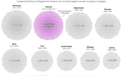
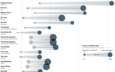
Total refugees from Ukraine, compared to other countries
Millions of Ukrainians (over three million as of this writing) have left their…
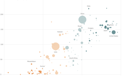
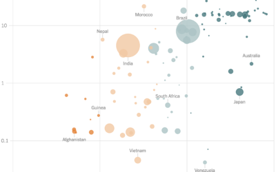
Vaccination rates compared against country wealth
Vaccine supply is only part of the equation. For The New York Times,…
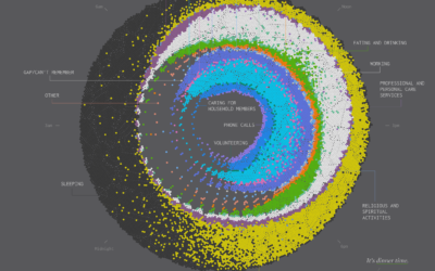
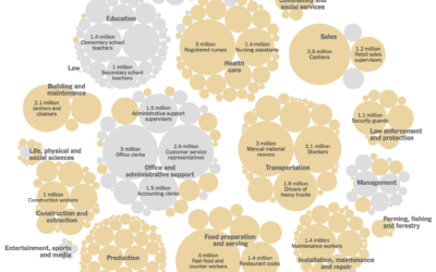
Cycle of Many, a 24-hour snapshot for a day in the life of Americans
This is a 24-hour snapshot for a day in the life of Americans.
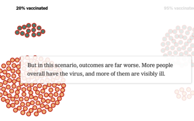
How vaccines can make a difference with the Delta variant
We see percentages for the vaccinated and unvaccinated, and people can easily misinterpret…
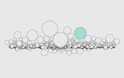
How to Use Packed Circles in R
Adjust coordinates, geometries, and encodings with packed circles to make various types of charts.
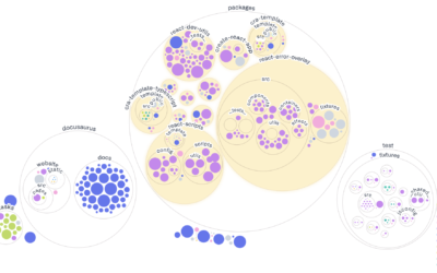
Visualizing GitHub repos
Most people are familiar with the file-and-folder view. Sort alphabetically, date, or file…
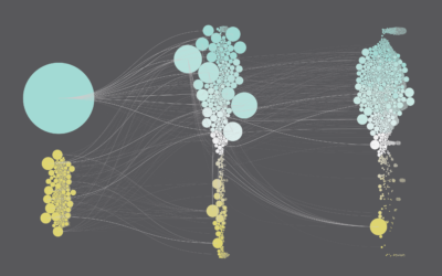
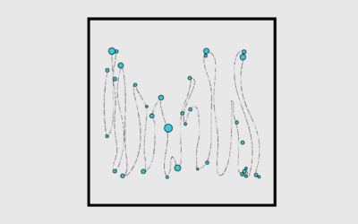
Counting Happiness and Where it Comes From
Researchers asked 10,000 participants to list ten things that recently made them happy. I counted and connected the dots.
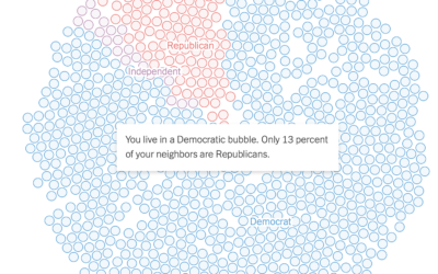
See if you live in a political bubble
Gus Wezerek, Ryan D. Enos, and Jacob Brown for NYT Opinion use neighborhood-level…
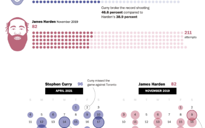
Stephen Curry’s record-setting month for shooting threes
Steph Curry has been on a tear as of late. In April he…
Defining “essential worker” to distribute vaccine
Matthew Conlen, in an article by Abby Goodnough and Jan Hoffman for NYT,…
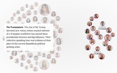
Minutes spoken at the Republican Convention
The New York Times provides a breakdown of minutes spoken at the Republican…
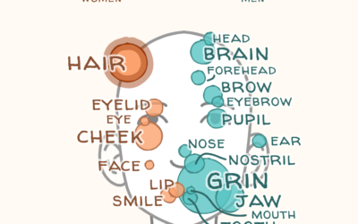
Words used to describe men and women’s bodies in literature
Authors tend to focus on different body parts for men and women, and…
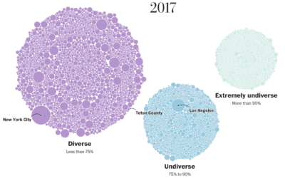
School diversity visualized with moving bubbles
The Washington Post visualized 13,000 school districts to show the change in diversity…