Bubble Chart
Points are placed like in a scatter plot, but they are sized based on the square root of data values.

Getting Started with D3.js
Learn how to build a custom visualization using D3.js and get acquainted with the popular JavaScript library.
How to Make a Moving Bubble Chart, Based on a Dataset
Ooo, bubbles... It's not the most visually efficient method, but it's one of the more visually satisfying ones.
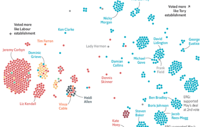
Brexit voting divisions
The Economist charted the divisions within political parties using Brexit votes as proxy.…
After Marriage, How Long People Wait to Have Kids
First comes love, then comes marriage, then comes baby in the baby carriage. Sometimes.
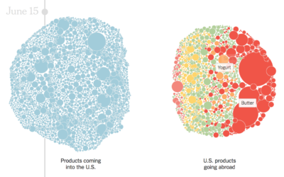
Products with tariffs in the trade war
The trade war started in January of this year when the administration imposed…
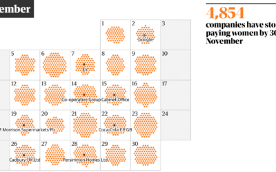
Day of the year companies stop paying women
One way to think about gender pay gap is to imagine women receive…
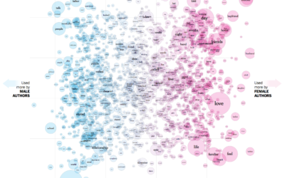
The words used by men and women to write about love
Josh Katz, Claire Cain Miller, and Kathleen A. Flynn for The Upshot plotted…
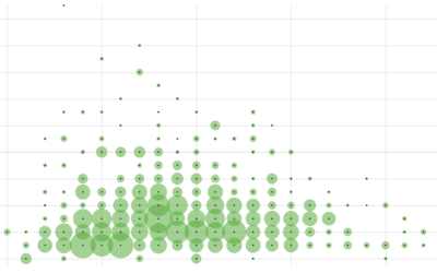
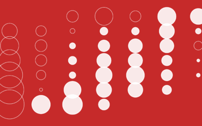
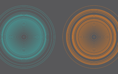
How to Make a Semicircle Plot in R
It's the half cousin of the bubble plot with less overlap and more straight edges.
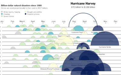
Cost of Hurricane Harvey
Kevin Quealy for The Upshot charted the estimated cost of Hurricane Harvey, along…
Married People Have More Sex
The relationship and dynamics change. Less lust, more companionship. Is that really how it works?
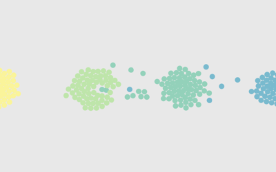
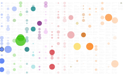
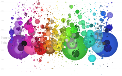
Floaty bubble charts with d3.js
D3.js, or Data-Driven Documents, version 4.0 was released a few months ago, so…

Explorations of People Movements
A new data source gave rise to a different set of visualization projects. We see people.
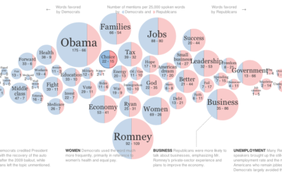
Words used at the National Conventions
The elections season is in full swing, and the New York Times graphics…
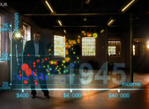
The Joy of Stats with Hans Rosling
The Joy of Stats, a one-hour documentary, hosted by none other than the…
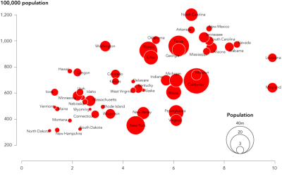
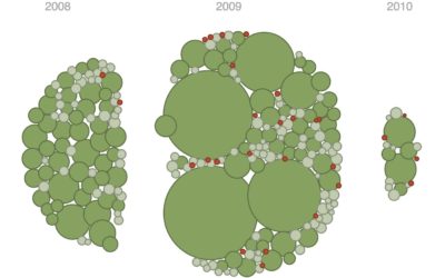
How to Make Bubble Charts
Ever since Hans Rosling presented a motion chart to tell his story of the wealth and health of nations, there has been an affinity for proportional bubbles on an x-y axis. This tutorial is for the static version of the motion chart: the bubble chart.
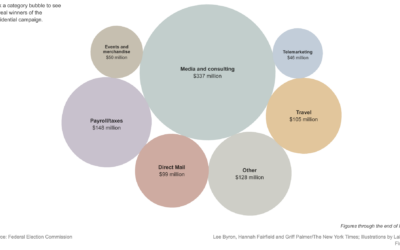
Playful Infographics Triumph Over Pure Analytics (Sometimes)
The New York Times shows how presidential candidates have spent more than $900…