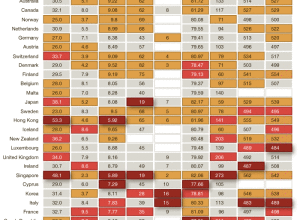
Charles M. Blow has a look at some metrics for the International Monetary…
Statistical Visualization
Finding patterns, distributions, and anomalies.
-
America is not the best at everything
-
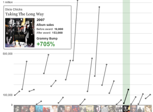
The Grammy winning sales bump
A Grammy win is worth way more than a little trophy and some…
-
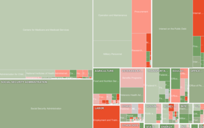
Exploratory treemap for Obama’s 2012 budget proposal
It’s that time of year again. Obama recently released his 2012 budget proposal…
-
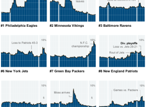
Gamers mimic the real life football season
As you might expect, people who play sports video games tend to play…
-
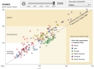
Watch the world get fatter over the past three decades
People are getting fatter everywhere. You know this. But there’s nothing like the…
-
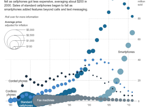
Price and adoption timeline of gadgets
New gadgets, from Web-connected TVs, to smartphones, to Fax machines, always seem to…
-
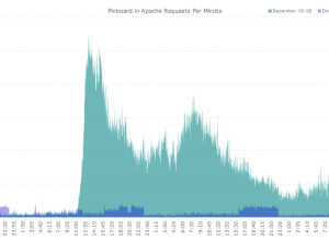
Delicious mass exodus
On news that Delicious is on Yahoo’s sunset list, thousands of people decided…
-
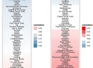
Facebook status updates: young people are self-centered and old ramble
The Facebook Data Team had a quantitative look at status updates by age…
-
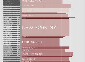
Worst and best commutes in America
I grew up in a relatively small city where it took no more…
-
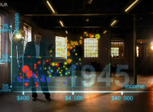
The Joy of Stats with Hans Rosling
The Joy of Stats, a one-hour documentary, hosted by none other than the…
-
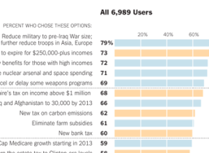
How Twitter users balanced the budget
In a follow-up to their puzzle to balance the budget, The New York…
-
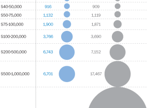
Comparison of Republican and Democratic tax plans
Lori Montgomery of the The Washington Post reports on the difference between the…
-
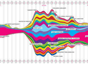
What New Yorkers complain about
Wired, in collaboration with Pitch Interactive, has a look at complaints called in…
-
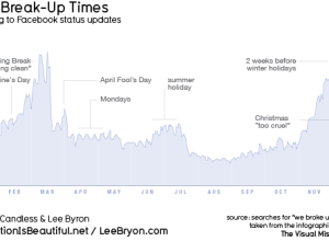
When people break up, according to Facebook updates
For his book The Visual Miscellaneum, David McCandless, along with Lee Byron, had…
-
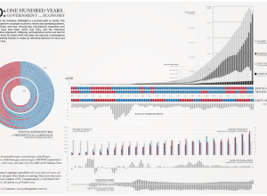
Past century of government and economy
John Palmer has a look at the past 100 years of government and…
-
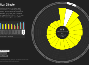
Issues Americans care about
Every year the Pew Research Center asks Americans what their top political priority…
-
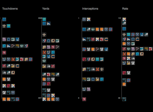
Visualizing NFL statistics
Sports statistics. Always so many tables. Juice Analytics takes a more visual approach…
-
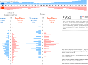
Average age of Congress over time
I don’t know about you, but I tend to associate Congress with an…

 Visualize This: The FlowingData Guide to Design, Visualization, and Statistics (2nd Edition)


