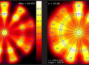
If you play darts just trying to hit the bullseye, you aren’t playing…
Statistical Visualization
Finding patterns, distributions, and anomalies.
-
Optimized dart throwing and other games
-
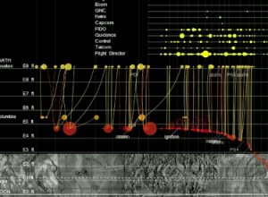
Apollo 11 lunar landing told through data
From Yanni Loukissas of the MIT Laboratory for Automation, Robotics, and Society, comes…
-
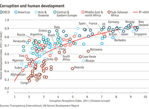
Corruption versus human development
Transparency International released annual data for the Corruption Perceptions Index. The Economist plotted…
-
40 years of boxplots
Famed statistician John Tukey created the boxplot in 1970. It shows a distribution…
-
Kill Math makes math more meaningful
After a certain point in math education, like some time during high school,…
-
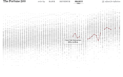
The Fortune 500, 1955 to 2010
Since 1955, Fortune Magazine has published a list of America’s 500 largest companies.…
-
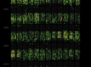
Last.fm scrobbles as calendar heat map
Martin Dittus, a former Last.fm employee, grabbed listening data for staff, moderators, and…
-
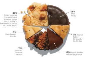
Girl Scout cookie pie chart
With Girl Scout cookie season around the corner, Wired pies it up with…
-
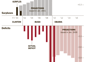
How the deficit got so big
The US continues to rack up more and more debt, with a deficit…
-
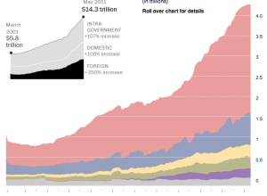
All the countries that the US owes money to
In May 2011, the United States owned $14.3 trillion in debt. A lot…
-
When crime happens in major cities
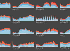
Does more crime happen during the late hours of the night or in…
-
Award-nominated movies vs. highest grossing
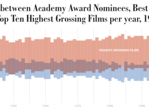
Dorothy Gambrell of very small array continues with her fascination of movie quality…
-
RottenTomatoes trends with Career-o-matic
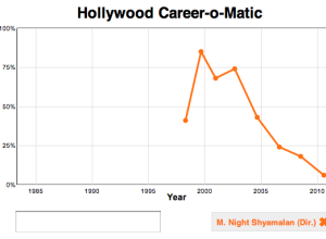
Slate puts together a rough analysis of RottenTomatoes actor and director career ratings.…
-
Rise and fall of housing prices
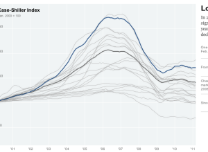
Kevin Quealy and Jeremy White report for The New York Times on the…
-
Reactions to the death of a terrorist
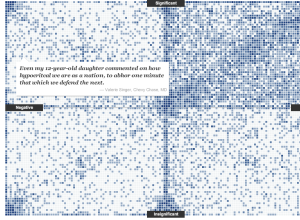
On the announcement of Osama Bin Laden’s death, there was a mixed reaction…
-
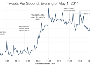
Tweets per second during Bin Laden announcement
As I listened to my young neighbors run around the parking lot chanting,…
-
Dropping movie ratings from the past six decades
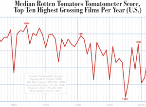
Dorothy Gambrell of very small array charts median Tomatometer ratings of the top…
-
Visual evidence that movies are getting worse
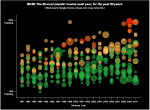
Moki takes a page out of the OkCupid social media playbook and analyzes…



 Visualize This: The FlowingData Guide to Design, Visualization, and Statistics (2nd Edition)


