With Super Tuesday on the way, there’s still a lot of uncertainty for…
Statistical Visualization
Finding patterns, distributions, and anomalies.
-
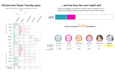
Super Tuesday simulator
-

Making invisible gas leaks visible
For The New York Times, Jonah M. Kessel and Hiroko Tabuchi went to…
-
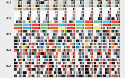
Color breakdown of Scientific American covers
For Scientific American, Nicholas Rougeux and Jen Christiansen show the shift in hues…
-

Fashion runway color palette
From Google Arts & Culture:
We came together with The Business of Fashion… -
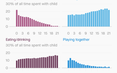
How parents spend time with their kids
For Quartz, Dan Kopf and Jenny Anderson on how time spent with kids…
-
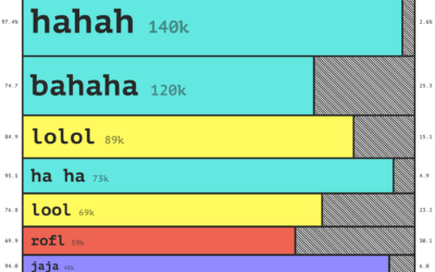
How people laugh online
Laughter online is full of nuances. A capitalization of some letters or a…
-
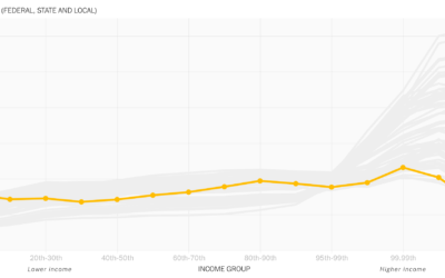
Animated line chart to show the rich paying less taxes
David Leonhardt, for The New York Times, discusses the relatively low tax rates…
-
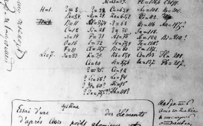
The early beginnings of visual thinking
Visualization is a relatively new field. Sort of. The increased availability of data…
-
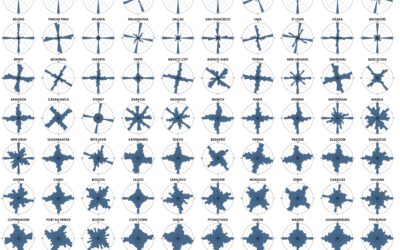
Analysis of street network orientation in cities
Continuing his analysis of street grid-iness in cities around the world, Geoff Boeing…
-
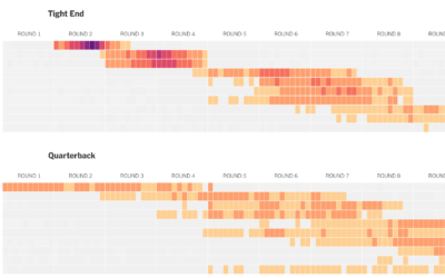
How well players drafted in fantasy football
For The Upshot, Kevin Quealy used a heatmap to visualize fantasy football draft…
-
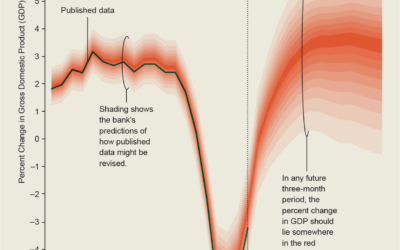
Gallery of uncertainty visualization methods
It must be uncertainty month and nobody told me. For Scientific American, Jessica…
-
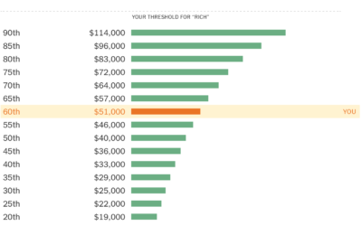
A quiz to see if you’re rich
In a compare-your-preconceptions-against-reality quiz, The Upshot asks, “Are you rich?” Enter your nearest…
-
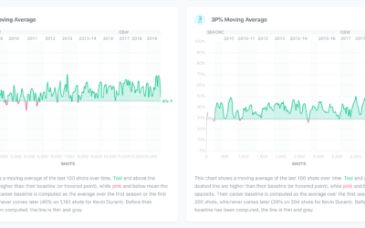
Exploration of players’ shot improvement in the NBA
Wondering whether if a player’s shot improves over the course of his career,…
-
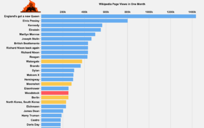
Wikipedia views and every line of Billy Joel’s “We Didn’t Start the Fire”
In the biggest crossover event of the century, Tom Lum used the Wikipedia…
-
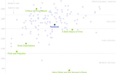
Readability of privacy policies for big tech companies
For The New York Times, Kevin Litman-Navarro plotted the length and readability of…
-
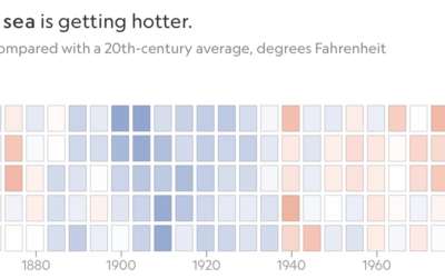
Increasing ocean temperatures, decreasing ice
For National Geographic, Kennedy Elliot made a series of heatmaps that show the…
-
Getting to zero coal in Britain
For The Guardian, Niko Kommenda shows the decrease in coal usage for power…
-
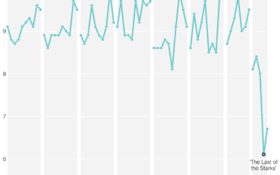
Game of Thrones viewer ratings by season
The last episode is coming. Some people don’t like how it’s ending, and…
Recently for Members
Second Edition
 Visualize This: The FlowingData Guide to Design, Visualization, and Statistics (2nd Edition)
 Visualize This: The FlowingData Guide to Design, Visualization, and Statistics (2nd Edition)
New tools, refined process.
Browse by Chart Type See All →


