Molecular astrophysicist Invader Xan drew spaceships, real and fictional, to scale.
This, my…
Infographics
Telling stories with data and graphics.
-
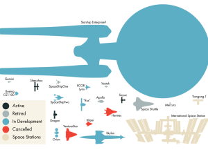
Spaceships drawn to scale
-
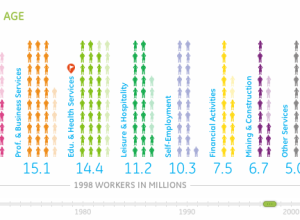
Working in America over the decades
Information visualization firm Periscopic, in collaboration with GE, explores the makeup of the…
-

Fat and calories depicted in food pictures
You would think that fat content and calorie counts would be straightforward by…
-
Overfishing visually explained
As part of their mission to reform destructive fishing practices, Ocean2012 explains the…
-
How a Virus Changes the World
From Take Part, a short video on how a virus spreads and its…
-
Walt Disney: Story of Menstruation
A previously banned Disney cartoon on menstruation. So informative.
[Thanks, Kevin]…
-
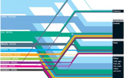
Which nations consume the most water?
This Scientific American article by Mark Fischetti and infographic by Jen Christiansen detail…
-
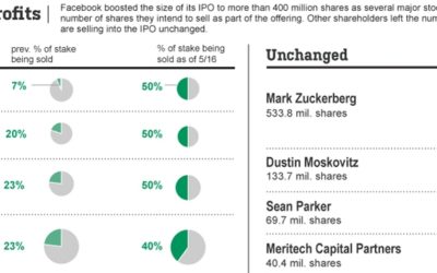
Good use of pie charts
This Wall Street Journal graphic shows who’s selling (or sold) a percentage of…
-
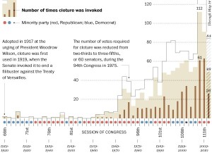
Is the filibuster unconstitutional?
Washington Post’s Ezra Klein busts on the filibuster. Gone are the days of…
-
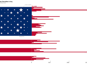
ITP Spring Show: Iraq war and diabetes visualizations
Yesterday I visited the ever popular NYU ITP bi-annual show which is a…
-
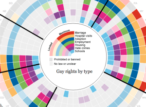
Gay rights in the United States, by state
Gay rights vary across states and by region. The Guardian US interactive team…
-
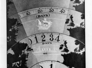
Titanic infographics from 1912
With the Titanic anniversary this year, Chiqui Esteban dug up graphics back from…
-
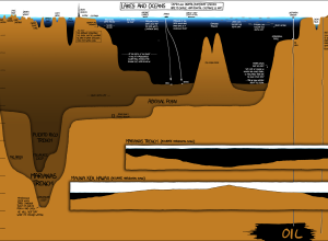
Under the Sea, Under the Sea
In usual xkcd fashion, Randall Munroe plots the depths of lakes and oceans,…
-
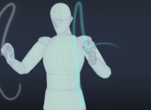
Conducting Demystified
The New York Times, in collaboration with the New York University Movement Lab,…
-

Inception Explained in Animated Infographic
Designer Matt Dempsey explains the storyline of Inception in this fun experiment. There…
-
Spotlight on movie profitability
Movies are a curious business. There a variety of forces that encourage people…
-
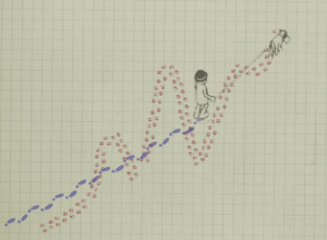
Difference between weather and climate explained
The difference:
In this animated short, the relationship between trend and variation are… -

Point guard fundamentals of Jeremy Lin
You knew this was coming, right? The New York Times describes the point…
Recently for Members
Second Edition
 Visualize This: The FlowingData Guide to Design, Visualization, and Statistics (2nd Edition)
 Visualize This: The FlowingData Guide to Design, Visualization, and Statistics (2nd Edition)
New tools, refined process.
Browse by Chart Type See All →


