You’re on the freeway, traffic is moving along, and for no apparent reason…
Infographics
Telling stories with data and graphics.
-

Why traffic waves and congestion happen
-
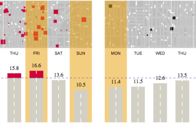
The safest time to drive
As we’ve seen, there are more fatal car crashes during the weekend and…
-
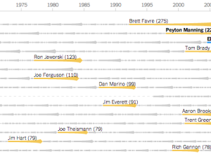
Quarterback streaks →
Mike Bostock, Shan Carter, and Kevin Quealy for The New York Times explore…
-
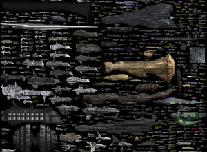
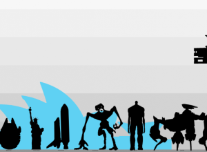
Science fiction starships, an extensive size comparison
A while back we saw a size comparison of random spaceships. That one…
-
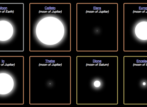
Planet and moon resizer
It can be difficult to imagine the scale of planets and moons, because…
-
Learn to make animated information graphics
Graham Roberts, a graphics and multimedia editor at The New York Times, is…
-

Extensive timelines of slang for genitalia
The title says it all. Jonathon Green, a slang lexicographer, has two new…
-

A second on the Internet →
In a straightforward view of online activity, Designly shows the approximate number of…
-
Size comparison of everything
If you’re like me, you often wonder how big the Stay Puft Marshmallow…
-
Internet critique as infographic music video
I’m not entirely sure how to interpret this music video from Franz Ferdinand,…
-
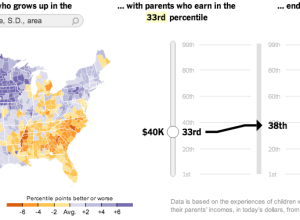
Climbing the income ladder →
In a study conducted by researchers at Harvard and UC Berkeley, data shows…
-
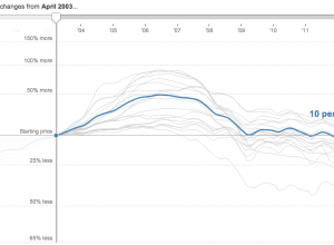
Housing price changes →
Shan Carter and Kevin Quealy for The New York Times updated their housing…
-
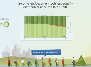
Income inequality, real and personal
In a different take on the income inequality issue, the Economic Policy Institute,…
-
Link
Money on the Bench
The New York Times has a set of tickers that keep track of the money spent on players who are injured sitting on the bench.
-
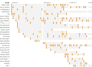
Guide to Arrested Development jokes →
In celebration of Arrested Development’s return via Netflix, NPR combed through the jokes…
-

Lego venn diagram →
Profound.…
-
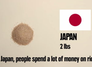
Stop motion video: Food you can buy for $5 in different countries
This stop motion video from BuzzFeed shows how much food you can buy…
-
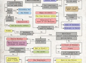
Flowchart for movie time travel →
Mr. Dalliard provides this handy flowchart to organize time travel movies. And yes,…
Recently for Members
Second Edition
 Visualize This: The FlowingData Guide to Design, Visualization, and Statistics (2nd Edition)
 Visualize This: The FlowingData Guide to Design, Visualization, and Statistics (2nd Edition)
New tools, refined process.
Browse by Chart Type See All →


