I’m always up for some scaled perspective. From David Packer:
Anyone need a…
Telling stories with data and graphics.

I’m always up for some scaled perspective. From David Packer:
Anyone need a…

Hurry up, light. We’re gonna be late:
[arve url=”https://www.youtube.com/watch?v=CSqFBbNtt9c” /]
By James O’Donoghue,…
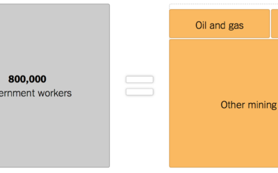
As the shutdown continues, 800,000 government workers wait for something to happen. The…
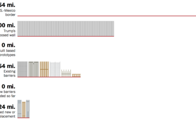
Denise Lu for The New York Times provides a quick overview of the…
Matthew Conlen provides a short explainer of how kernel density estimation works. Nifty.…
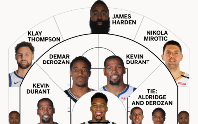
Kirk Goldsberry is back at ESPN. I put this here mainly because it’s…

Euclid’s Elements is a series of 13 books produced in 300 BC that…
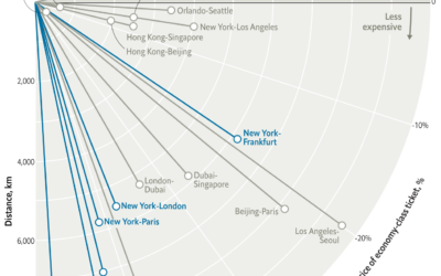
Based on data from Expedia, this is an interesting one from The Economist.…

Multiple people can look at the same dataset and come out the other…
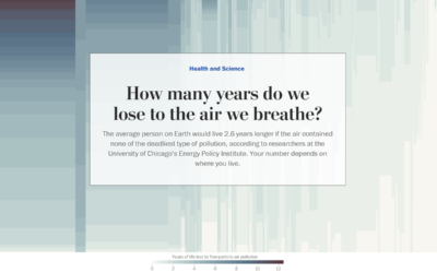
Researchers at the University of Chicago’s Energy Policy Institute estimated the number of…
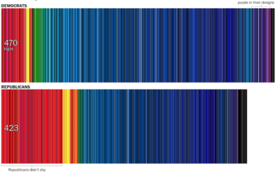
In news graphics, blue typically represents Democrat and red represents Republican. However, the…
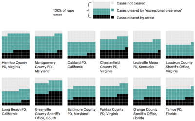
Newsy, Reveal and ProPublica look into rape cases in the U.S. and law…
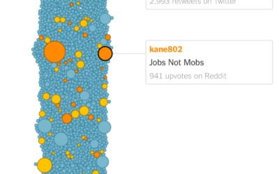
A meme that cried “jobs not mobs” began modestly, but a couple of…

As one might expect, many women, people of color, and L.G.B.T. candidates are…

I really like what The New York Times has been doing with augmented…
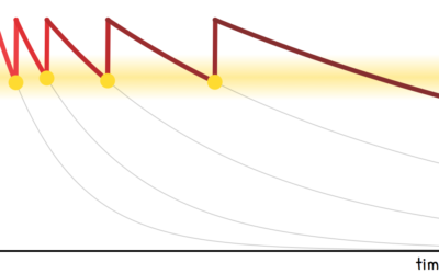
In a time we commit less to memory and rely more on technology…
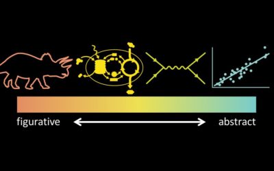
Jen Christiansen spoke about her extensive experience as a graphics editor for Scientific…
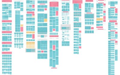
As you click through the news, you can probably almost always figure out…
 Visualize This: The FlowingData Guide to Design, Visualization, and Statistics (2nd Edition)
New tools, refined process.