Between 1802 and 1817, James Sowerby cataloged and illustrated 718 minerals across seven…
Infographics
Telling stories with data and graphics.
-
Illustrated color catalog of minerals
-
What schools might look like if students go back
Dana Goldstein, with illustrations by Yuliya Parshina-Kottas, imagines what school might look like…
-
Spacecraft orbits
For The New York Times, Jonathan Corum illustrated the dozens of spacecraft orbiting…
-
Wearing masks and infection rate
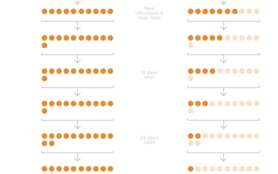
Studies suggest that wide adoption of masks can reduce the spread of the…
-
Words used to describe men and women’s bodies in literature
Authors tend to focus on different body parts for men and women, and…
-
Comparing the coronavirus to past deadly events
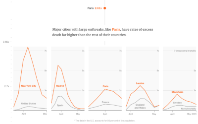
One way to estimate the impact of the coronavirus is to compare it…
-
Why time feels weird right now
For Reuters, Feilding Cage provides a series of interactive tidbits to demonstrate why…
-
Who is responsible for climate change?
Kurzgesagt, in collaboration with Our World in Data, tackle the question of who…
-
Vaccine tracker
As we know, it typically takes years to develop a vaccine that is…
-
Challenges of reopening the meatpacking plant
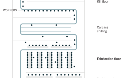
To reopen safely, meatpacking plants have to take precautions to provide space and…
-
Pen plotter used as storytelling device
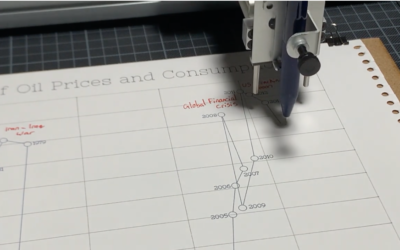
Pen plotters slowly draw out a picture line-by-line, so when you watch a…
-
A comic on spotting misinformation
There’s a lot of misinformation passing through the internets right now. A lot.…
-
54 ways coronavirus changed the world
The coronavirus has changed everything. Larry Buchanan, for The New York Times, goes…
-
An Incalculable Loss
The New York Times used their full front page to list 1,000 names…
-
They Were Us.
This is The New York Times front page for Sunday, May 24, 2020.…
-
Bread Scheduler
Is bread-making still a thing, or is that so two weeks ago? If…
-
Who should receive care first, an ethical dilemma
At greater disparities between low resources and high volumes of sick people, doctors…
-
Possible vaccine timelines
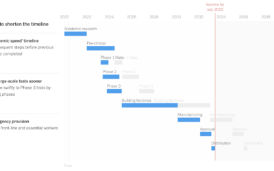
It’d be great if we could conjure a vaccine or a “cure” seemingly…








 Visualize This: The FlowingData Guide to Design, Visualization, and Statistics (2nd Edition)


