I knew things were bad, but I didn’t know they were this bad.…
Mistaken Data
Hm. That does not look right.
-
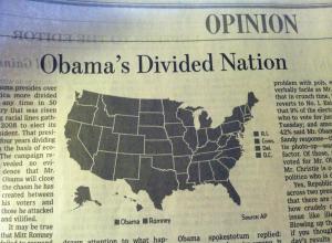
Incredibly divided nation in a map
-
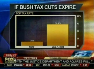
Fox News continues charting excellence
Fox News tried to show the change in the top tax rate if…
-
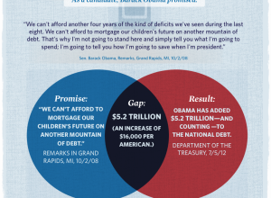
Mitt Romney pseudo-venn diagram, used incorrectly
The Mitt Romney campaign put this venn diagram up a few days ago,…
-
Why are so many men pregnant?
Garbage in, garbage out the old adage goes. Nigel Hawkes, Director of Straight…
-
New iPad battery size is huge
From Gizmodo, this shows battery size in the new iPad versus that of…
-
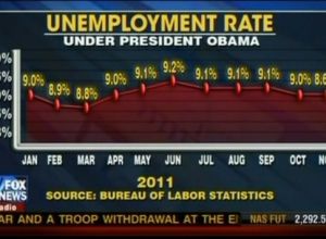
Fox News still makes awesome charts
Charts and graphs are great, because they can let you see a pattern…
-
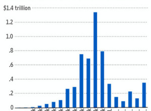
Open thread: Can you spot the wrongness in this tax graph?
The argument behind this graph in The Wall Street Journal is that the…
-
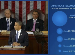
Open thread: Charts during the State of the Union address
President Barack Obama delivered his State of the Union address yesterday, and this…
-
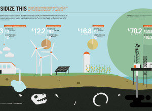
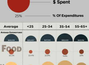
Right versus wrong bubble size
I was going to post this graphic from Good when it came out,…
-
Harvard scientist found guilty of misconduct
Shady research from Harvard scientist Marc Hauser is confirmed:
On Friday, Michael D.… -
Wait. Something isn’t right here…
No clue where this is from, but something seems sort of off, no? I guess we should take the title literally. By the numbers… only. I’m going to give the benefit of the doubt though, and assume this was just an honest mistake. Here’s my guess about what happened.
-
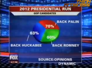
Fox News Makes the Best Pie Chart. Ever.
What? I don’t see anything wrong with it.…
-
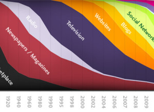
What’s Wrong With this Graphic on the Future of Information?
This graphic on the history and future of information has been making the…
-
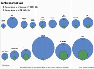
What’s Wrong With this Financial Bubble Chart?
If there’s anything good that has come out of America’s financial crisis, it’s…
-
Fail: Area Circles on Wall Street
I know next to nothing about the economy, stocks, and investments, but I…
-
Atheist Statistics For 2008 – Do You Believe These?
This video shows statistics centered around atheism, claiming that atheism is correlated with…
-
Bad Statistics Leads to Poor Results and a Questionable Trial Verdict
Oxford mathematician, Peter Donnelly gives a TED talk on the common mistakes we make when interpreting Statistics.
-
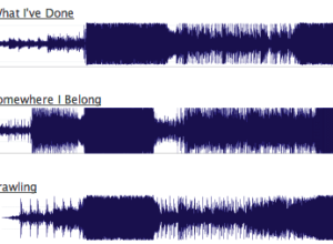
All Linkin Park Songs Look the Same? Maybe Not.
On Last.fm, someone took snapshots of some Linkin Park songs, compared them, and…
-
Misleading Map of Buffalo Snow
I saw this map of the average snow levels in Buffalo. I think…
-
Finding Weirdness in Temperature Data
After parsing Weather Underground pages to grab temperature data, it’s time to look…



 Visualize This: The FlowingData Guide to Design, Visualization, and Statistics (2nd Edition)


