After parsing Weather Underground pages to grab temperature data, it’s time to look at the data. Can’t download all that data and not do anything with it!
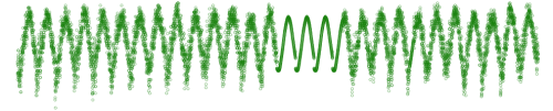
First off, in my initial pass of my parsing script, I accidentally cut the month range short, so I didn’t get any data for December from 1980 to 2005. It should be noted that these plots don’t show this missing data. Um, there’s no axes or labels either. Sorry, I got a little lazy, but that’s not the point now anyways.
Notice anything weird about the above plot? There’s some unusually smooth data in the middle. Here’s a zoom in:
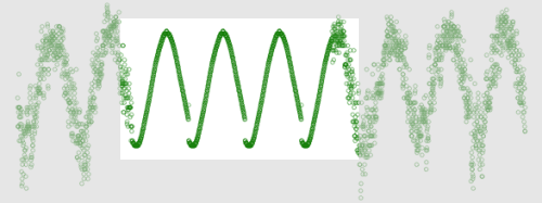
If we look at the data between 1994 and 1997, there’s oddly a lot of smoothness… hmm… HMMM.
It looks like between that time, there was some interpolation going on. I mean, if that’s all you got, that’s all you got, but I wish WU would at least make note of it or provide some annotation.
Anyways, just another example of data posing to be something else. In my opinion, all data sucks until proven worthwhile.
 Visualize This: The FlowingData Guide to Design, Visualization, and Statistics (2nd Edition)
Pingback: Flowing Data / Proving the Non-experts Wrong