If you take away anything from The Visual Display of Quantitative Information, make…
Design
Important in presenting data clearly and beautifully.
-
Learn the rules of data graphics so you can bend them
-
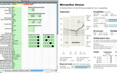
New York Times on how they design their graphics
Leading up to their book, Turning Pages: Editorial Design for Print Media, publisher…
-
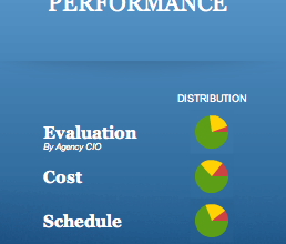
Redesign of the Federal IT Dashboard
About a year after the launch of the Federal IT Dashboard, business intelligence…
-
Process: Mapping War Logs for the Guardian
This is a guest post by Alastair Dant, interactive lead at the Guardian.…
-
Why context is as important as the data itself
John Allen Paulos, a math professor at Temple University, explains, in the New…
-
The path to successful infographics
Most people don’t know what actually goes into a good infographic. There’s a…
-
Visualizing data: ask a question first
There is no way to think up an original and extraordinary design—it can…
-
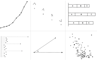
Graphical perception – learn the fundamentals first
Before you dive into the advanced stuff – like just about everything in your life – you have to learn the fundamentals before you know when you can break the rules.
-
Chart Junk vs. Eye Candy: What’s the Difference?
Photo by horizontal.integration
There’s this one phrase that really bothers me when it… -
Important Data – Please Act Responsibily
Photo by nyki_m
Data visualization and infographics come in many forms. Some are…
-
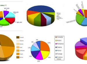
6 Easy Steps to Make Your Graph (Really) Ugly
We spend so much time trying to make our graphs accurate, simple, understandable,…
-
Rise of the Data Scientist
Photo by majamarko
As we’ve all read by now, Google’s chief economist Hal…
-
Data Visualization is Only Part of the Answer to Big Data
How can we now cope with a large amount of data and still…
-
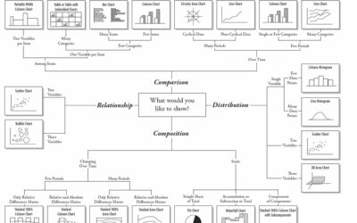
Flow Chart Shows You What Chart to Use
Amit Agarwal, of Digital Inspiration, posts this Andrew Abela creates this flow chart…
-
One Death is a Tragedy; a Million is a Statistic
Photograph by *Your Guide
I posted a comic from xkcd last week that…
-
Steve Jobs on Design
Most people make the mistake of thinking design is what it looks like……
-
Great Data Visualization Tells a Great Story
Think of all the popular data visualization pieces out there – the ones…
-
Sketching Around Personal Brand Tracking
This is a guest post by Miguel Jiménez, a user experience and interaction…
-
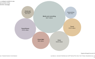
Playful Infographics Triumph Over Pure Analytics (Sometimes)
The New York Times shows how presidential candidates have spent more than $900…
-
Why Should Engineers and Scientists Care About Color (and Design)?
I studied electrical engineering and computer science in undergrad and now as a…






 Visualize This: The FlowingData Guide to Design, Visualization, and Statistics (2nd Edition)


