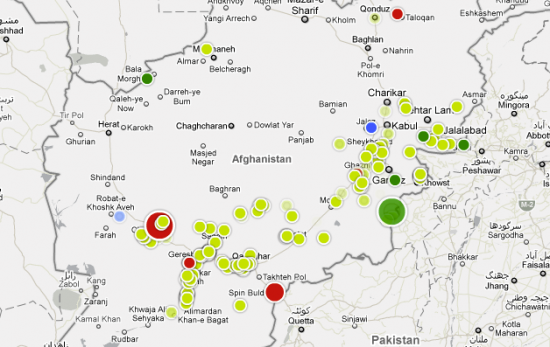
 This is a guest post by Alastair Dant, interactive lead at the Guardian. He describes the efforts that went into designing the recently published war logs map of incidents revealed by Wikileaks.
Our site editor approached me with a serious challenge: could I visualize six years worth of military reports? Up in their makeshift war room, our team introduced me to Julian Assange. While reporters from the New York Times and Der Speigel took photos and video, the director of Wikileaks booted his encrypted netbook and showed me a page from the war logs. I may have looked a little distressed. The gravity of this material was stark and, having never dealt with such documents before, I was uncertain if I wanted to start.
After several days feeling like I’d walked into the Bourne trilogy, David Leigh and Rob Evans put my mind at rest. We wouldn’t be publishing any material that might put anyone at risk and my work could focus on charting the rise in explosive devices from 2004 – 2009.
The Data
By this point, our datablog editor was already knee deep in war logs. Simon Rogers and I sat down and figured out what would be needed to drive the visualization. The full logs contain over 90,000 records and would be far too bulky to show in their entirety. We selected a series of pertinent fields and he produced a redux containing just these columns for the IED events. Most significantly, we left out the full text field containing summary report text. With no time to check all 16,135 records for sensitive information, it was best to remove this information entirely. This had the added benefit of greatly reducing the amount of data that needed to be loaded and parsed. The resultant CSV weighs in under 2mb and is probably approaching the upper limit of what can be sensibly loaded without paging.
The Tools
This brings me on to what may have been the most critical implementation detail. What would the best client side technology be for plotting all these data points in an interactive form? We initially looked into a pure JavaScript approach but decided against it on several grounds. First, the total number of markers needing to be plotted concurrently might exceed the capabilities of the Google Maps JS API. Second, immediate mode rendering can really impair frame rates when large numbers of objects need to be added or removed from the display list at once. Third, CS4 offers a neat workflow for taking the vector designs our graphics team produce in Illustrator and incorporating them into Flash applications. Finally, we’ve spent the last year developing a number of AS3 libraries for features like CSV handling, playable timelines and manipulating time series data. With less than two weeks to turn things around, this wealth of existent code would prove invaluable.
At the heart of our interactive lies a single, overriding problem: how can one fetch, plot and render all of the events for particular time window quick enough for the animation to run smoothly? Video playback quality requires at least 24 frames per second and – as each frame may need up to 15ms of rendering time – this leaves us with about 30ms to construct each one. In the run up to last year’s elections, the number of IEDs reported per week sometimes exceeded 250. This meant that – at worst – our software would need to figure out the times, locations, sizes and colours of several hundred markers in under 30 milliseconds. At times like this, I’m grateful for my former life as a games programmer.
Implementation
In the end, the solution to this problem came in several forms. First, Flash 10 introduced a fixed-sized, strongly-typed Vector class which makes working with large arrays of data much faster. Next, I recently came across skip lists – a deceptively simple data structure that speeds up retrieval of items from time series. Finally, a number of tweaks were required to get the best possible performance from the Google Maps API. On one hand, a marker management routine incorporated object pooling, frame-to-frame reconciliation and the disposal of unused items to ensure as little processing as possible was required to update the map. On the other, two hours of hair tearing frustration yielded the following wisdom. Unless you’re careful, markers are added with a drop shadow option turned on. By default, this seems to be using a bitmap filter per sprite which causes Flash to grind to halt as soon as you need more than 50 rendered at once. This can be resolved by incorporating the drop shadow directly into your custom marker assets and then ensuring that they are cached as bitmaps.

Talking of filters and Google Maps, I should take the opportunity to thank our designer Chris Fenn, who provided me with some proof of concept work he’d done to recolour their tiles in something approaching our house style by crafty application of a colour matrix filter. Moreover, all this talk of technical trickery seems to be ignoring the biggest single reason why we got things delivered in time. Mark McCormick, Paddy Allen and Michael Robinson from our graphics team supplied a combination of fresh design ideas and longstanding wisdom that proved crucial to getting something so complex planned and built so quickly. That said, I must equally credit my manager Igor Clark for his help. Never underestimate the benefits of having someone around to sound out ideas with and consume excessive amounts of caffeine.
Nathan note — My thanks to Alastair for sharing what went on behind the scenes of their interactive. Check it out for yourself on the Guardian. It’s a nice example of what comes out of a group stepping out of their comfort zone and building something more than a standard mashup.

 Visualize This: The FlowingData Guide to Design, Visualization, and Statistics (2nd Edition)

Awesome, thanks for sharing!
This is a great post, thanks for doing it. I thought the interactive on the Guardian site was excellent. Being a Tableau user, my own effort (http://bit.ly/bNVyBO) deliberately tried to do the same thing as the Guardian; it was an exercise to see how close Tableau could come to the Guardian viz.
What I really like about the Guardian viz, and is not possible to implement in Tableau, is the instant drawing update as you drag the timeline bar left and right. One could put a Slider Date filter on Tableau, but it wouldn’t update live – it would only update on the MouseUp event, which is a lot less satisfying than the Guardian’s viz. As a result, I chose to use the line chart at the top as the trigger to update the map.
Keep up the great work (that’s to Flowing Data and the Guardian!)
Andy
Alastair,
Can you explain the decision to not chart enemy deaths here? I can see that you have a color legend for Afghan troops, Civilians, and NATO troops (which I assume were listed in the data as “Friendlies”). But then, for reasons that confuse me, you lump all enemy casualties into “Other” when in fact there are no other “Other” deaths outside of enemy casualties.
But to make matters worse, the “Other” deaths are further obfuscated by the fact that the light green dots don’t actually chart deaths… they chart IED incidents in which may or may not have resulted in some kind of enemy death. Unless the enemy deaths were significant enough to warrant a circle large enough to stand out, we would have to click on the dot to discover if there were any deaths affiliated with that incident.
Now, this might have been understandable if there were only a few enemy deaths… perhaps under a hundred. But there were more enemy deaths in that data set than there were friendly deaths. Could you explain your decision to visually obfuscate this (clearly important) piece of information?
(I use the term “visually obfuscate” because that is exactly what happened here. I brought this issue up on Twitter and had push-back from people who thought I was simply lying because they had so much trouble finding the data point I was concerned with. I had to point to specific incident dates and identification numbers to help them discover the reality of the data set.)
Thought I should provide an example of what I’m talking about. If you go to the “April 21, 2008” date, you’ll see about 30 IED incidents in the “Other” category. There was one IED west of Kabul that looks like all the other non-fatal “Other” IED incidents and yet when we click on it, we see:
APR 18 2008 – IED Found/Cleared
Insurgents killed: 3
Incident identifier:
BC917348-DFA4-32FA-C15BF26E4967B5D1
We can tell how many incidents involved all other kinds of deaths (NATO, Afghan forces, civilians), but there is absolutely no way to really tell in this visualization how many incidents involved enemy deaths.
Pingback: How News Organizations Should Prepare for Data Dumps « The Levisa Lazer
Pingback: How news organisations should prepare for data dumps at Martin Moore
Matthias,
Thanks for your comments. As it happens, we considered that issue during the initial development of the piece and ended up making the compromises we did in order to satisfy all of our editorial team’s requirements in the time we had available. Now that I’m back from holiday, I’ve had chance to review things and hopefully rectify the confusion.
i’ve had a chat with the editors and agreed a richer key system that assigns enemy casualties their own colour and encodes event type in the rings surrounding each marker. Of course, some may consider this extra visual detail a source of confusion rather than clarification…
We’ve just published a new version of the interactive featuring these changes so be interesting to hear what you have to say about it:
http://www.guardian.co.uk/world/datablog/interactive/2010/jul/26/ied-afghanistan-war-logs