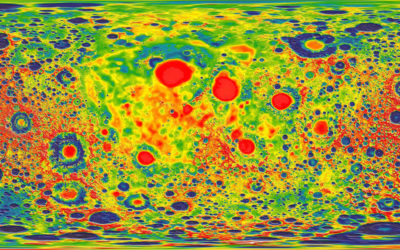
For Knowable Magazine, Betsy Mason looks at the state of (not so good)…
Design
Important in presenting data clearly and beautifully.
-
Why scientists need to be better at visualization
-
Randall Munroe of xkcd on Data Stories
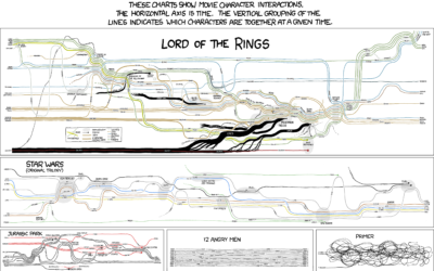
Randall Munroe of xkcd was on the Data Stories podcast. He talks about…
-
How data changes the design process at every stage
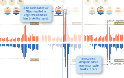
On Multiple Views, the Interactions Lab talks about their experience as a design…
-
Techniques for adding context to visualization
When it comes to meaningful visualization, context is everything. Richard Brath, at the…
-
Differences between enterprise data visualization and data journalism
Toph Tucker used to make graphics for Bloomberg Businessweek. Now he does enterprise…
-
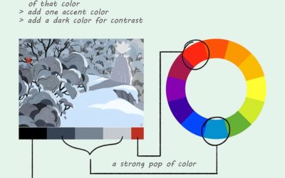
Illustrated color theory
Lauren Baldo illustrated how he applies color theory in his paintings and illustrations.…
-
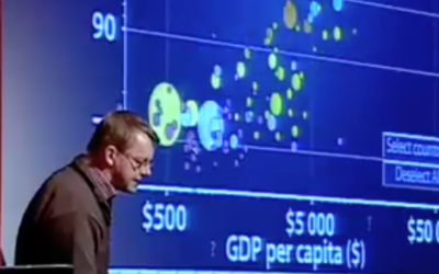
Animation in visualization, revisited a decade later
Rewind to 2006 when Hans Rosling’s talk using moving bubbles was at peak…
-
Four Cs of data and design
Ben Fry using the “tropiest of design tropes”, describes his goals for visualization.…
-
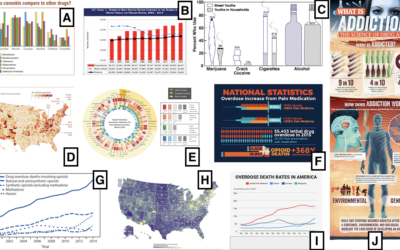
Help people find themselves in the data
Researchers went around rural Pennsylvania, showing people the charts above and asking what…
-
Story formats for data
Financial Times, in an effort to streamline a part of the data journalism…
-
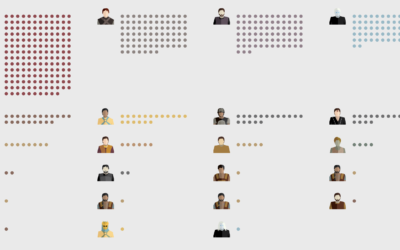
Counting and illustrating Game of Thrones deaths
Shelly Tan, for The Washington Post, has been counting on-screen deaths in Game…
-
Remaking charts from The Economist, by a journalist at The Economist
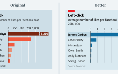
Sarah Leo, a visual journalist at The Economist, looked through the archives and…
-
A visualization book using only hand-drawn illustrations
RJ Andrews has a visualization design book coming out in January called Info…
-
Interactive recreation of an 1821 color guidebook
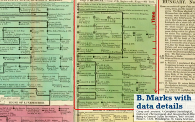
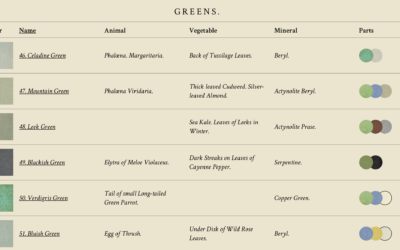
I’m always down for faux vintage, online recreations of actual vintage visualization-related things.…
-
Visualization in the 1980s, just before the rise of computers
Graham Douglas, a data journalist at The Economist, looks back on the days…
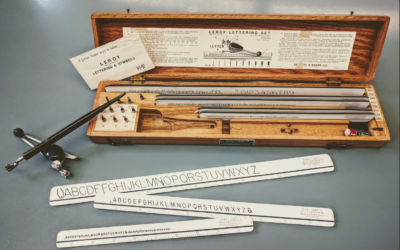
-
Weaponised design
When the web was relatively new, things were more of a free-for-all. Everything…
-
Considering the “valuable-ness” of the things we make
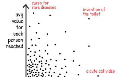
Nicky Case ponders the “valuable-ness” of the things he makes as the product…
-
Optical illusion shows our messed up lightness perception
A gray piece of paper moves along a gradient. You won’t believe your…
-
Collection of data visualization pitfalls
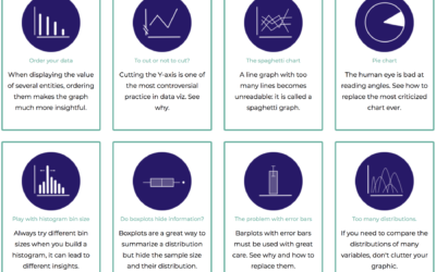
There are many mistakes you can make when you first get into visualization.…
-
Fast and slow visualization
Visualization is often described in the context of speed and efficiency. Get the…



 Visualize This: The FlowingData Guide to Design, Visualization, and Statistics (2nd Edition)


