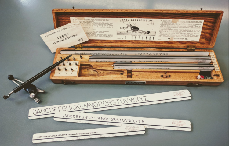
Graham Douglas, a data journalist at The Economist, looks back on the days when getting data and visualizing it was tedious from start to finish:
But even these seemingly simple charts had their challenges and took a lot of time to make. Data were found in books by a research department skilled in the art of extracting obscure economic figures and statistics, which were copied to scraps of paper. We would use rulers, dividers, protractors and geometry (Thales’s theorem) to divide axis lines into equal parts to draw the scale ticks. We would plot the data manually in pencil on a special drawing board and sketch out the wording and title for approval before we inked the whole thing in. Text was added last using stencilling, or later, Letraset dry-transfer lettering. Making a spelling mistake was distressing. Areas were filled with sticky-back plastic pre-printed film cut out with a scalpel.
Maybe grabbing data out of PDF files isn’t so bad.
No. Still horrible.
This reminds me of my dad’s work though. He’s a retired civil engineer. When I was young, he brought home these giant blueprints. He’d roll them out after dinner, and armed with a protractor, a scaled ruler, and a calculator I could never figure out, he’d mark up building plans. Towards the end of his career, he kept everything on a flash drive.


 Visualize This: The FlowingData Guide to Design, Visualization, and Statistics (2nd Edition)
