Here’s the good stuff for August.
Nathan Yau
-
Members Only

Visualization Tools and Learning Resources, August 2023 Roundup
-
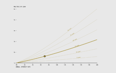
When the Cost of a Mortgage is a Multiple of the Original Loan
Use this chart to see how many times over you’ll pay over the original loan amount, given the annual rate and the number of years of paying.
-

Turn a static SVG into an interactive one, with Flourish
It’s straightforward to share a static SVG online, but maybe you want tooltips…
-
Members Only
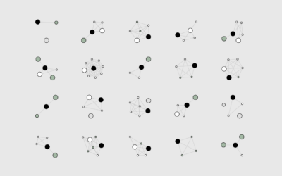
How I Made That: Network Diagrams of All the Household Types
Process the data into a usable format, which makes the visualization part more straightforward.
-

Apple’s global suppliers
Most of Apple’s suppliers and manufacturing happen outside the United States and in…
-

Infinity abstractions
Infinity is an abstraction of endlessness, which seems to suggest that it cannot…
-
Renting vs. Owning a Home, by State
Among households in the United States, 68% are owned and 32% are rented, based on estimates from the American Community Survey in 2021. That breakdown isn’t uniform across the country though.
-
Members Only
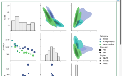
Visualization Integration
If you want to maximize fun, a mixed toolbox is still best.
-

Explorable explanation for matrix transformations
Instead of using a bunch of equations to memorize, Yi Zhe Ang visually…
-
Python is coming to Excel
Excel is getting a bump in capabilities with Python integration. From Microsoft:
Excel… -
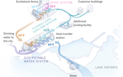
Using cold lake water to cool buildings
There are buildings in Toronto, Canada that make use of a deep lake…
-
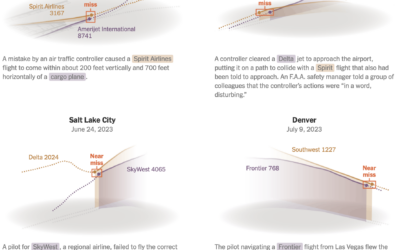
Passenger planes flying too close
Sometimes passenger planes get a little too close to each other on takeoff…
-

xkcd: Pairwise matrix of what to do in an emergency
xkcd has an informative reference for what do in case of mountain lion…
-

Visual breakdowns of iconic hip-hop samples
Hip-hop music producers often sample from previous works. They remake, restructure, and repurpose…
-
Members Only
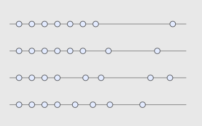
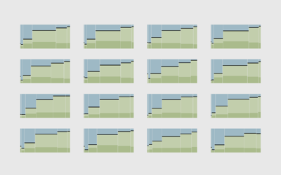
Chart Options for When Time Data Has Uneven Gaps
Visualizing time series data often assumes that your data points are evenly spaced over time, which is not always the case.
-

Hip-hop’s influence on the English language
For The New York Times, Miles Marshall Lewis highlights the etymology of five…
-
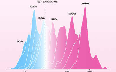
Shifting towards more hot days, fewer cold days
It keeps getting hotter around the world. Not every single day. But over…
-
Supermarket provides AI-driven meal planner and is disappointed by the internet using it to output weird recipes
A supermarket chain in New Zealand offered an AI-based recipe generator, and of…
-

Cultural Midwest, not technically
The U.S. Census Bureau defines the Midwest as the region of twelve states…
-
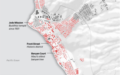
Map of Lahaina buildings destroyed in wildfire
Most of the Maui town Lahaina was destroyed by wildfire. The Wall Street…
Recently for Members
Second Edition
 Visualize This: The FlowingData Guide to Design, Visualization, and Statistics (2nd Edition)
 Visualize This: The FlowingData Guide to Design, Visualization, and Statistics (2nd Edition)
New tools, refined process.
Browse by Chart Type See All →


