Wilson Miner and Paul Smith, two co-founders of Everyblock, post tutorials and a…
Nathan Yau
-
Rolling Out Your Own Online Maps and Graphs with HTML/CSS
-
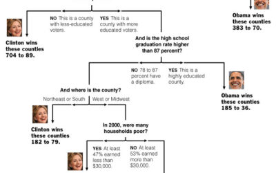
Showing the Obama-Clinton Divide in Decision Tree Infographic
Amanda Cox, of The New York Times, made another excellent graphic (and I…
-
Hierarchical Glossary as Interactive Network Graphs
Moritz has been working on visualization of a hierarchical glossary carefully named “Glossary…
-
How to Learn Actionscript (Flash) for Data Visualization
Tips on how to learn this language for online visualization.
-
Facebook Lexicon – Trends for Writings on the Wall
Facebook recently released Lexicon which is like a Google Trends or Technorati for…
-
3 Rules of Thumb When Designing Visualization
Bernard Kerr, the lead designer for del.icio.us, gave an interesting talk (below) focused…
-
Atheist Statistics For 2008 – Do You Believe These?
This video shows statistics centered around atheism, claiming that atheism is correlated with…
-
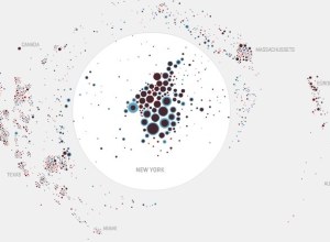
Data Visualization Blogs You Might Not Know About
We all know about information aesthetics, but what other visualization blogs are out…
-
How to Stop Procrastinating – One Month Report
About a month ago, I started my self-experiment to stop procrastinating. I tried…
-
Reflecting on Life After Statistics – R.I.P. Minghui Yu
Rachel, one of the organizers of Columbia’s Life After Statistics, reflects on lessons…
-
H. G. Wells on Quantitative Thinking
The time may not be very remote when it will be understood that…
-
Mapping America’s Most Sinful Cities
Forbes, with the help of Mavin Digital, ranked and mapped cities based on…
-
What Can You Do With a Degree In Statistics? – A Follow Up
This past Friday, Columbia University stat graduate students hosted a symposium on careers…
-
Personal Transactions as a Network Graph Over Time
Transactions Graph, by Burak Arikan, is a piece placing personal transactions in network…
-
Regularities and Patterns Within a Literary Space
Stefanie Posavec, maps literary works at the Sheffield Galleries On the Map exhibit.…
-
Chernoff Faces to Display Baseball Managers From 2007 MLB Season
Check out this lovely use of Chernoff Faces by Steve Wang of Swarthmore…
-
21 (Eco)Visualizations for Energy Consumption Awareness
Eco-visualization creates awareness of energy – something that we cannot see, but use a whole lot of.
-
Your Notes, Snapshots, and Memories Accessible From Everywhere – Evernote
I just signed up for an EverNote account, which lets you store all…
-
World Internet City-to-City Connections and Density Maps
Chris Harrison put together a series of Internet maps that show how cities…
-
Greatest Data Visualization of All Time
Let me introduce you to the greatest data visualization of all time. FlowingData…
Recently for Members
Second Edition
 Visualize This: The FlowingData Guide to Design, Visualization, and Statistics (2nd Edition)
 Visualize This: The FlowingData Guide to Design, Visualization, and Statistics (2nd Edition)
New tools, refined process.
Browse by Chart Type See All →