Essentially, do something more with the data than plopping it front of people. There’s a small niche (for now) as data provider. Demand is much higher for storyteller.
Nathan Yau
-
Link
How to turn data into money →
-
Opportunities in Government 2.0
Vivek Wadhwa talks government data and the (financial) opportunities ripe for the picking:…
-
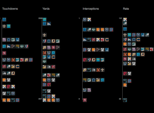
Visualizing NFL statistics
Sports statistics. Always so many tables. Juice Analytics takes a more visual approach…
-
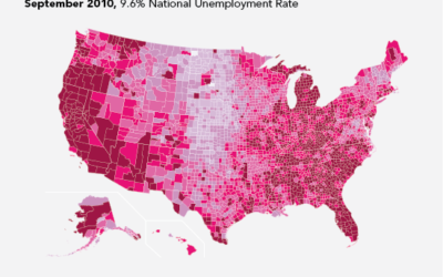
Unemployment rates over this past year
I took a look at unemployment rates about a year ago, and I…
-
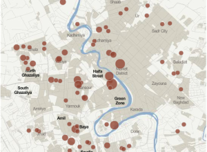
Iraq War logs released by Wikileaks shed new light
This past Friday, Wikileaks released a second batch of reports on Iraq:
At… -
Join FlowingData fantasy basketball pool
The basketball season is going to start soon (finally). To make the season…
-
How to have an idea
Designer Frank Chimero describes how to have an idea with back-of-the-napkin sketches. “Creative…
-
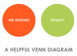
Privacy and the Internet
Simplified. Still a helpful reminder.
[buriednexttoyou via WeLoveDataVis]… -

Q. What schooling should I take to learn about visualization and data graphics?
A few people have asked me this question just this past week. I…
-
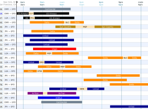
Find your flight via visual interface
Booking flights became so much easier when it all shifted online, but it…
-
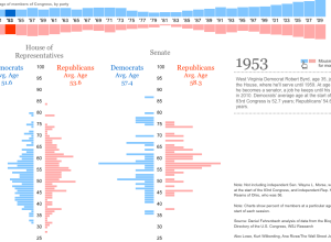
Average age of Congress over time
I don’t know about you, but I tend to associate Congress with an…
-
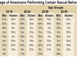
Visualize This: Sexual health data from national survey
It’s been a while since I ran one of these, so you must…
-

Mad Men office floor plan
I’ve never seen an episode, but if my Twitter stream has taught me…
-

Animated graphic on why you should shut off your work computer
Millions of people leave their work computer on every day, thus wasting lots…
-

Why Swivel shut down
Robert Kosara asked former Swivel co-founders Brian Mulloy and Dmitry Dimov about their…
-
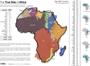
True size of Africa
Online maps that we use for directions use the Mercator projection, and this…
-
Last week in the forums
In case you’re on the market for a data sciencey type job, there…
-
Scrapers dig deep for data on the Web
In their continuation of what online marketers know about you, the Wall Street…
-

Evolution of Batman logos
I’m not sure who made the static version above, but here is an…
-
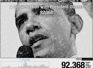
Conversation with Obama: track and ask questions on Twitter
President Obama will be answering questions live at a youth town hall today…
Recently for Members
Second Edition
 Visualize This: The FlowingData Guide to Design, Visualization, and Statistics (2nd Edition)
 Visualize This: The FlowingData Guide to Design, Visualization, and Statistics (2nd Edition)
New tools, refined process.
Browse by Chart Type See All →


