Last week I posted some parallel coordinate plots that related SAT scores and class size. Now it’s your turn to take a crack.
You can find the data that I used (and more) from the National Center of Education Statistics. There’s a link to download the data as an Excel file. You can find pupil/teacher ratios here.
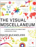
The two best entries each win a copy of David McCandless’ The Visual Miscellaneum: A Colorful Guide to the World’s Most Consequential Trivia as well as eternal glory on FlowingData. Yes. Eternal.
Different Views and Other Factors
There were a lot of great comments on alternative ways to view the dataset and other factors that play into average SAT scores and education quality. Obviously class size isn’t the only thing.
For example, the percentage of graduates who take the SAT in each state plays a big part in the story that wasn’t in my original graphic. Eighty-seven percent of Maine graduates took the test while only 3% in Iowa. There’s going to be a higher average if the only people who take the test in your state are the ones who want to go to college.
Some also suggested a scatterplot with some line-fitting to tell a more complete story while others wanted some actual numbers to see what was up. Both good ideas.
How to Enter
For those new to Visualize This, here’s how it works.
- Take your best crack at visualizing the data
- Submit your entry to this thread in the FlowingData forums
If you haven’t registered in the forums yet (it’s free), you’ll want to do that first.
A few of you posted alternatives in the comments of the original post. You’re welcome to submit those as your entry. Just make sure you post it to the forum thread.
Finally, you’re welcome (and encouraged) to bring in other data if you feel it tells a better story.
Get your entries in by November 24, 2009, 11:59pm EST. One entry per person please.
The Prize
 Like I said, the two best entries will each win a copy of The Visual Miscellaneum. If you’re international, you’ll just have to cover shipping. Entries will be judged based on appropriate interpretation of the data, design, aesthetics, and how well you tell the story of class size and quality of education (not just SAT).
Good luck, everyone. I’m looking forward to what you all come up with.


 Visualize This: The FlowingData Guide to Design, Visualization, and Statistics (2nd Edition)
