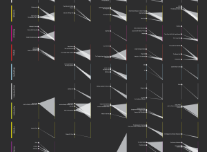
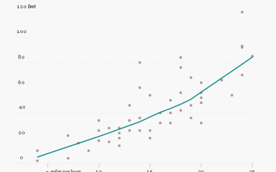
Other than with base R functionality, people typically use Lattice or ggplot2. In this multi-part post, lattice plots are recreated with ggplot2, code snippets included
Nathan Yau
-
Link
Recreating lattice in ggplot2 →
-
Spotlight on movie profitability
Movies are a curious business. There a variety of forces that encourage people…
-
Link
Morris.js →
Lightweight library for time series charts
-
Link
Bikini Chart →
Inversion for clarity; interesting use of gradient
-
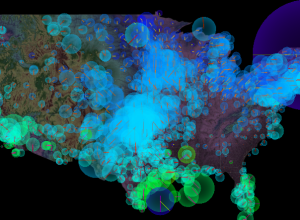
Mobile phone digital traces
In collaboration with Lift and Near Future Laboratory, Interactive Things explores digital traces…
-
Difference between weather and climate explained
The difference:
In this animated short, the relationship between trend and variation are… -
Link
Data-Driven Investigative Journalism →
Newsrooms are changing and some embrace the growth of data-driven stories. Others not so much [via]
-
Link
Mapping secrets from NYT graphics →
Continuing to spread their seeds of knowledge. Strive for clear and simple, learn to code, and sketch a lot. [via]
-
Link
DataMarket for data publishers →
A shift in focus for the once data consumer focused site. This not long after Infochimps launches their big data platform geared towards developers. It’ll be interesting to see what these two are like in three years.
-
Link
The First Google Maps War →
A classic case of “I’m not in your territory. Just look at Google Maps.”
-
Link
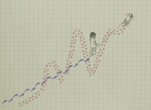
R is like smoking →
“But in the long run, it becomes pleasurable and even addictive.”
-
Link
R turns 12 →
On February 29, 2000, R 1.0.0 was released
-
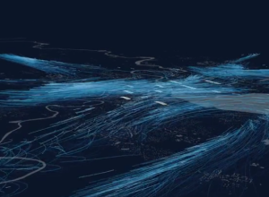
Wind motion patterns animated
Nicolas Garcia Belmonte, author of the JavaScript InfoVis Toolkit, mapped 72 hours of…
-
Members Only
How to Hand Edit R Plots in Inkscape
You can control graph elements with code as you output things from R, but sometimes it is easier to do it manually. Inkscape, an Open Source alternative to Adobe Illustrator, might be what you are looking for.
-
Link
Strata 2012 live stream →
Sold out conference, but you can catch some of the talks here
-
Really old maps online
Maps have been around for a long time, but you might not know…
-
Link
Web scraping with Node →
Lightning talk on grabbing data from pages with JavaScript [via]
-
Link
Arrested for breaking the law of large numbers →
Calling out The New York Times for an incorrect reference to the Law of Large Numbers. Also this
-
Stephen Colbert on Target and predictive analytics
“Target doesn’t just know when you’re buying sheets. They know what you’re doing…
-
Link
What is visualization? →
A quick take on what visualization is to me
Recently for Members
Second Edition
 Visualize This: The FlowingData Guide to Design, Visualization, and Statistics (2nd Edition)
 Visualize This: The FlowingData Guide to Design, Visualization, and Statistics (2nd Edition)
New tools, refined process.
Browse by Chart Type See All →


