25 fine tips on designing graphics that matter
Nathan Yau
-
Link
Infographics Lessons from Malofiej →
-
Link
Using Google Refine to Clean Messy Data →
Thorough step-by-step
-
Link
Jake Porway →
A Q&A with Jake Porway, Data Without Borders founder and all-around good guy
-
Link
A Taxonomy of Data Science →
Obtain, scrub, explore, model, and interpret [via]
-
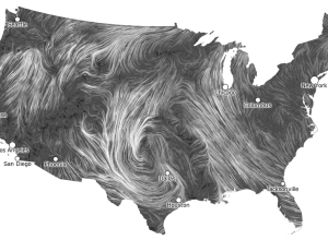
Live Wind Map Shows Flow Patterns
I get kind of giddy whenever I see a tweet from Martin Wattenberg…
-
Link
Data in an Alien Context →
Jer Thorp releases the source code for his Kepler visualization
-

Where Campaign Spending is Going to
Making use of data from the Federal Election Commission and The New York…
-
Link
Political Ad Money →
“If TV stations won’t post their data on political ads, we will.”
-
Link
Infographic that Made Me Cry →
Former Director of Information Graphics at Newsweek remembers one stressful night of infographic-making.
-
Link
Watercolor Process →
Steps behind Stamen’s beautiful computer-generated maps that easily pass for handmade
-
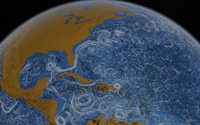
Perpetual Ocean
Using a computational model called Estimating the Circulation and Climate of the Ocean,…
-
Link
Theme Park Maps →
Giant archive from different years and locations. Yeah, the Internet has everything.
-
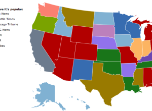
What News Sites People are Reading, by State
Jon Bruner of Forbes, in collaboration with Hilary Mason and Anna Smith of…
-
Link
Beating the New York Times →
Learn to code and edit wisely
-
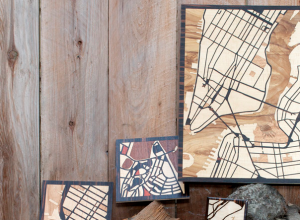
Custom Woodcut Maps
Just choose the location you want via the Google Maps interface, pick what…
-
Link
Bypassing Google Maps →
As the big G charges for map services, some applications are going custom
-
Link
Functional Programming in R →
Improve code performance, knowing what R is actually doing [via]
-
Link
NYT at Malofiej 20 →
As expected, the newspaper and site win top honors in the annual awards with Best of Show going to their graphics on Guantanamo detainees
-
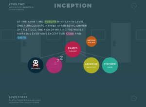
Inception Explained in Animated Infographic
Designer Matt Dempsey explains the storyline of Inception in this fun experiment. There…
-
How Simple Ideas Lead to Scientific Discoveries
Adam Savage of Mythbusters gives a short talk on simple ideas leading to…
Recently for Members
Second Edition
 Visualize This: The FlowingData Guide to Design, Visualization, and Statistics (2nd Edition)
 Visualize This: The FlowingData Guide to Design, Visualization, and Statistics (2nd Edition)
New tools, refined process.
Browse by Chart Type See All →


