Researchers at the School of Computer Science at Carnegie Mellon University investigate the…
Nathan Yau
-
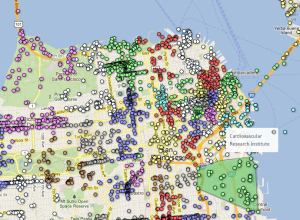
Neighborhood boundaries based on social media activity
-
Link
What Cartography Taught Me about Science Writing →
Keep on whittling until you get to the storyline
-
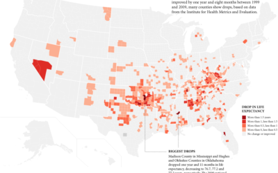
Girls expected to live shorter lives in some counties?
We’ve seen life expectancy at the country and state levels, but the Institute for Health Metrics and Evaluation recently released life expectancy data at the county level.
-
Link
No such thing as too much data →
I’m sure there’s a breaking point, but we’re not there yet. Not even close.
-
Link
Selected Tools →
Good list of software for maps, charts, and ata
-
An era of human-affected Earth
Welcome to Anthropocene:
Scientific concepts like the Anthropocene, planetary boundaries and planetary stewardship… -
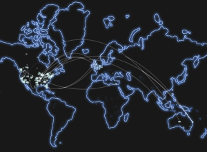
Minecraft server connections
I’ve never played Minecraft, but maybe this map showing live server connections means…
-
Link
R is not enough for Big Data →
Tools are just that, experience is most valuable [via]
-
Link
Federal Spending Transparency on the Decline →
Questionable data quality and less funding
-
Link
Pretty pictures: Can images stop data overload? →
“The results showed that when tasks were presented visually rather than using traditional text-based software applications, individuals used around 20% less cognitive resources.”
-
Link
Mapmaking checklist for map design →
To evaluate how good maps are
-

Titanic infographics from 1912
With the Titanic anniversary this year, Chiqui Esteban dug up graphics back from…
-
Avengers characters first appearances
With The Avengers coming out today in the US, artist Jer Thorp had…
-
Link
From Tiny Links, Big Insights →
Profile of chief bitly scientist Hilary Mason, data hacker at large
-
Link
US health care spending →
Simple graphs in R but effective
-
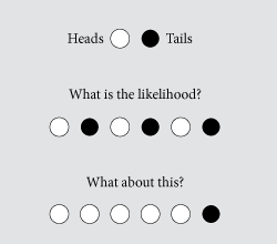
Common statistical fallacies
I’ve been reading papers on how people learn statistics (and thoughts on teaching…
-
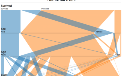
Parallel Sets for categorical data, D3 port
A while back, Robert Kosara and Caroline Ziemkiewicz shared their work on Parallel…
-
Link
How to Muddy Your Tracks on the Internet →
There’s a lot of tracking as your browse the net, and here’s how to limit the bits of you data you put out there
-
Link
Histogrem →
Font to put histograms in your text files
-
Link
Axes in D3 →
Tutorial on built-in formatting
Recently for Members
Second Edition
 Visualize This: The FlowingData Guide to Design, Visualization, and Statistics (2nd Edition)
 Visualize This: The FlowingData Guide to Design, Visualization, and Statistics (2nd Edition)
New tools, refined process.
Browse by Chart Type See All →


